The Google Nexus 6P Review
by Andrei Frumusanu on December 16, 2015 8:00 AM EST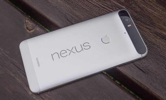
As we have come to know, Google has opted to simultaneously release two Nexus smartphone devices this year. Alongside the smaller form-factor LG Nexus 5X which we’ve reviewed a couple of weeks ago, we also find the larger Huawei-built Nexus 6P. The Nexus 6P is the successor to last year’s Motorola Nexus 6. The new device also marks a first for Google’s Nexus line-up: the introduction of Huawei as a hardware partner.
The symbiosis created by the collaboration between OEMs and Google for Nexus devices is quite unique in the market and is more similar to how ODMs operate. In the case of the Nexus devices the hardware vendors make their design resources and production lines available to Google. This usually means that a Nexus device from a given vendor will most of the time be remarkably similar in build to what the OEM offers for their own product lines at that moment in time. As we’ve seen in the past this has been valid for the last few generations of Nexus’, where for example the Nexus 6 took design cues from Motorola’s own Moto X devices or LG’s Nexus 5X sporting very typical LG build characteristics.
The Nexus 6P is no different in this regard. Huawei has had a long history of producing metal frame devices and in the past few years has even made this a trademark design characteristic of their latest models. In terms of build the Nexus 6P clearly reminds of the Mate series and even has some design cues that are similar to the recently announced Mate 8.
While in terms of design we can see a fair bit of input and design language from the vendors, the actual specifications of the device’s internal hardware are heavily influenced by Google’s own choices. As such, we go over the specifications of the Nexus 6P:
| Huawei Nexus 6P | ||
| SoC | Qualcomm Snapdragon 810 4x Cortex A53@1.56GHz, 4x Cortex A57@1.95GHz Adreno 430 @ 600MHz |
|
| RAM | 3GB LPDDR4 | |
| Storage | 32GB / 64GB / 128GB NAND | |
| Display | 5.7” 1440p Samsung AMOLED Gorilla Glass 4 |
|
| Modem | 2G / 3G / 4G LTE UE Category 10 (SoC Integrated Qualcomm Gobi Modem) |
|
| Networks North America (H1511 / A1) Rest of world (H1512 / A2) |
TDD LTE | B38 / B39 / B40 / B41 |
| FDD LTE | B1 / B2 / B3 / B4 / B5 / B7 / B8 / B9 / B12 / B13 / B17 / B19 / B20 / B25 / B26 / B28 / B29 / B30 | |
| UMTS | 800 / 850 / 900 / 1700 / AWS /1900 / 2100 ( B19 / B6 / B5 / B8 / B9 / B4 / B2 / B1) |
|
| CDMA | BC 0 / 1 / 10 | |
| GSM | 850 / 900 / 1800 / 1900 | |
| Dimensions | 159.3 (h) x 77.8 (w) x 7.3 (d) mm, 178 grams |
|
| Cameras | Rear | 12.3MP ( 4032 x 3024 ) Sony IMX377 Sensor w/ 1.55µm pixels F/2.0 aperture, 26mm eq. |
| Front | 8MP ( 3264 x 2448 ) Sony IMX179 w/ 1.4µm pixels F/2.4 aperture, 26mm eq. |
|
| Battery | 3450mAh (13.18 Whr) | |
| OS | Android 6.0 | |
| Connectivity | 802.11a/b/g/n/ac dual-band 2.4GHz & 5GHz BT 4.2, GPS/GNSS, DLNA, NFC, USB-C 2.0 |
|
| SIM Size | NanoSIM | |
| MSRP USA, UK, Eurozone |
32GB | $499 - £449 - 649€ |
| 64GB | $549 - £499 - 699€ | |
| 128GB | $649 - £579 - 799€ | |
The 6P is powered by Qualcomm’s Snapdragon 810 SoC. This is a big.LITTLE with a quad-core ARM Cortex A57 cluster at 1.95GHz serving as the high-performance cluster and a quad-core Cortex A53 cluster running at 1.55GHz serving as the high-efficiency cluster. Graphics are powered by Qualcomm’s own Adreno 430 GPU which should be plenty to serve the 1440p screen of the Nexus 6P. Over this past year there have been some concerns regarding the Snapdragon 810’s efficiency, and we’ll cover how the chipset affects the device’s performance and battery life throughout the review.
The device comes in two different models: a North American model and a rest-of-the-world / international variant. In terms of frequency bands the NA model comes with frequency bands equipped for NA carriers while logically the second model sports bands for all other global carriers. Connectivity is provided by the integrated modem on the Snapdragon 810 offering up to LTE UE Category 10 speeds of up to 300Mbps down and 100Mbps upload.
The 6P shares the same main camera as found on the 5X: A Sony IMX377 sensor module which sports large pixel pitches coming in at 1.55µm. As such the resolution is more limited at 12.3MP but together with the F/2.0 lens system the larger pixels should provide better light sensitivity compared to other sensors on currently available in devices. On the front camera we find the same module found on other Huawei devices this year; an 8MP Sony IMX179 with 1.4µm with an F/2.4 aperture lens system.
The device has a footprint of 159.3 x 77.8mm in height and width, making this a much smaller device than last year’s 6” Nexus 6. The thickness is also much more reduced at a mere 7.3mm. Even in weight and despite that the 6P is a metal design, in comparison to its predecessor it manages to shed off 6g for a total of 178g. This is a clear change in form-factor and the Nexus 6P is in terms of ergonomics more comparable to last year’s Note 4 than it is to the Nexus 6, which subjectively I would deem it to be a very positive change for the average consumer. Even though the 6P is smaller in every metric, it actually manages to ship with a larger battery than the Nexus 6. The 3450mAh 3.82V or 13.18Whr should provide ample power for a good battery life.
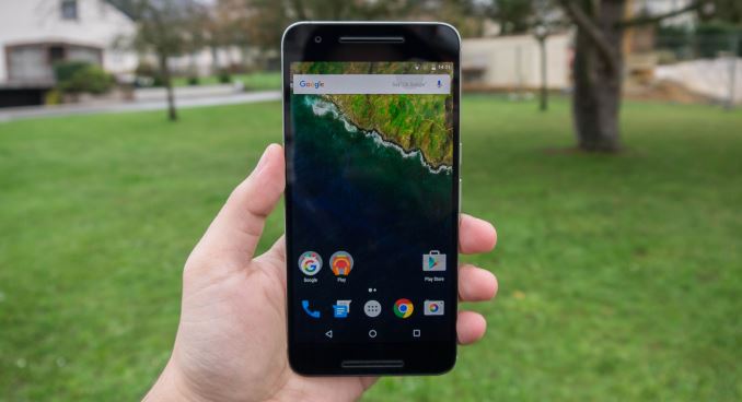
As mentioned, the device sports a 5.7” screen with a resolution of 1440 x 2560. This is an AMOLED screen provided by Samsung Display. The Nexus 6 was notorious for having a rather disappointing panel, but this time around Google and Huawei were able to step it up in terms of quality and the 6P’s panel looks very good.
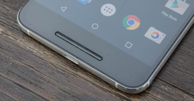
The front of the device is all black and the screen is flanked on both the top and bottom by two front-facing speakers. Actually this is the first phone in my possession with front speakers so I was looking forward to the experience. While it is true that in terms of directionality the Nexus 6P offers a much better experience than mono speakers on other devices, I was a bit disappointed by the quality of the sound output by them. At medium volume the range is very good, even if it somewhat lacks the in terms of bass when compared to Samsung and especially Huawei’s own devices. What I found to be more upset about is that at maximum volume (which is quite loud) we can experience distortions. It’s especially notifications that suffer a lot in terms of quality when at high volume. As opposed to the Nexus 5X’s deceiving speaker design which only offers general audio playback via the bottom speaker, the 6P does offer full stereo experience, but however I found that on my unit the top speaker is ever so slightly louder than the bottom speaker which makes for an odd balance when you view content in landscape. HTC here seems still has a considerable lead when it comes to audio processing and adjusting front-facing speakers for the best experience.
The device’s left side has no features other than the nanoSIM tray, while on the right we find the power button and the volume rocker. I found it weird that the power button was placed above the volume rocker so that’s definitely something out of norm and needs getting used to. The perfectly vertically centred position of the volume rocker also caused me to keep pressing it whenever I picked up the device which I also found to be odd.
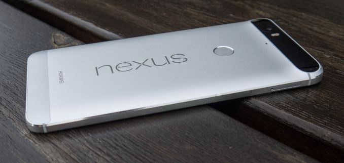
At the back of the device we find the large Nexus logo next to the fingerprint sensor. The back is very solid and has no noticeable flex when trying to press on it. At the bottom we find a plastic cover that acts as an RF window for some of the antennas.
The overall device’s ergonomics are good and the flat sides allow it for a good grip with it being rounded off enough by the chamfered edges and slightly curved back to make for a comfortable grip. Again I fall back to the Note 4 comparison as that’s the most similar device in terms of how the Nexus 6P feels, with of course a metal finish instead of the faux-leather plastic.
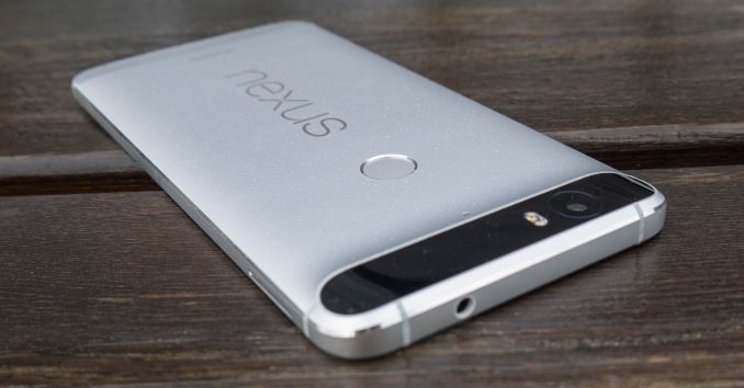
It’s of course at the top where we find the Nexus 6P’s most recognizable characteristic. The “visor”, as it seems to have become norm to call it, features the main camera as well as a dual-LED flash and IR laser which is used by the laser auto-focus system. The whole feature is around 1mm thicker than the rest of the phone and is covered by a black-accentuated glass cover which curves at the side edges. Personally I don’t mind the design at all and it actually provides a feature which better helps you orientate what is otherwise a very symmetrical device.
The phone comes with a USB Type-C connector but the port itself only implements USB 2.0 connectivity.
All in all the Nexus 6P is a very solid device and I think Google made a good choice in sizing down to 5.7” to try to attract a wider user-base who maybe wasn’t so convinced by the Nexus 6’s very large size. I’m a bit biased on giving opinions about phablets – I did run a 5.7” device as a daily driver for several months only to be happy to scale down back to a 5” form factor after deeming the large device is not a good fit for me. My only gripe is that for the amount of bezel that Google put on the 6P, I expected some more impressive speakers as I would have otherwise preferred a larger screen-to-device footprint ratio, such as found on Samsung’s Note series or Xiaomi’s Note devices. Besides that little critique regarding the bezel, I can objectively see how the 6P could be a perfect device for many users who looking for a larger form-factor.





219 Comments
View All Comments
Refuge - Wednesday, December 16, 2015 - link
Thank you! Finally! :DMuch appreciated.
Der2 - Wednesday, December 16, 2015 - link
I cry everytiem when I can't get first.nico_mach - Wednesday, December 16, 2015 - link
Did anyone else find the stock Android complaints puzzling? I switched straight from a tiny iphone 5 to a Nexus 6 and no problems, I think stock Android is a revelation, bright, responsive and with Marshmallow very smooth. I don't use a brightness slider - seems kind of picky. And the back button is, well, fine. It's not like IOS's 'back' button in the upper left is more accessible, right?Finally, there should be gripes about out-of-the-box battery life. Ambient display, Google Now and Location services are too costly in battery to have on by default. Apple ruined music and Google search ruin Android. Irony. At least those can be turned off. Why I have to be prompted about location services when I ask for directions is beyond me - YES turn it back on, I asked for directions!
I can't understand why Google is so keen on defaults that drive people away from Android. It's really very good otherwise. And hopefully they'll fix tablets the way they improved Nexus phones this year.
sleepycujo - Wednesday, December 16, 2015 - link
In fact this is a point most people avoid discussing. I feel it was time somebody brought this up. The stock android feel is exactly what its called. Plain vanilla. Doesnt feel premium and looks just like a 100$ motog(may be lesser). Moreover the simple things you can get used to using OEM skins like swipe to call, message or numerous other features are simply missing unless you root your phone and put in an AOSP Rom with the same look but additional features which is fine on a lower end phone, but shouldnt be necessary on a flagship. I personally think the OEM versions are all upto individual tastes and needs but necessary anyway. LG, Samsung, Huawei and even Mi flavors are what makes Android so loved(and hated!).grayson_carr - Wednesday, December 16, 2015 - link
Lol, swipe to call. I owned a Galaxy S6 earlier this year and hated that feature. I would accidentally activate it when trying to swipe between different tabs (a standard Android interaction) in the dialer app. Not to mention, in the stock Android dialer you just tap to call, which is easier than a swipe. And if you want to message someone, what are you doing in the dialer app? Funny you used that feature as an example because that is exactly the type of feature that annoys me about skins and makes me long for stock Android.lilmoe - Wednesday, December 16, 2015 - link
ExDialer. Never looked back.skavi - Thursday, December 17, 2015 - link
I do that all the time on my S6. God, I hate TouchWiz. Why ruin such an amazing phone with shitty software? Why include 3 fucking gigs of RAM if you don't allow the phone to use it? Just take the good parts (camera app/split screen) and put them on stock Android. Sometimes I feel like they change shit just to change it, even though Google's implementation is clearly better.gochichi - Saturday, February 27, 2016 - link
TouchWiz is clearly a disaster. Until it disappears, I cannot buy another Samsung. Keeping my Note 4 as a little tablet, but I'm just saying no to skins from here forward. Nexus, or iPhone for my phone going forward. It's a real shame. And the lag in updates is plain absurd. No android 6 on S5, S6, Note 4, Note 5... To get android 6 (which is damn old news at this point) get the S7??? Ummm, hell no... Show me some support first. Nexus 5 is smoother phone than Note 4 and when you look at the specs, the only possible explanation is the software is junked up and not even optimized.ACE76 - Wednesday, December 16, 2015 - link
Your implying that there's better availablke in terms of UI from other OEMS? Apple's interface is as boring and "stock" as it gets and doesn't even have a app drawer. Touchwiz is about as ugly and "in your face" as it gets.Devo2007 - Saturday, December 19, 2015 - link
You mean Apple doesn't have a desktop. It's all just an app drawer.....