Android Wear Updates: Wi-Fi, Always-On Apps and Usability
by Stephen Barrett on April 23, 2015 8:00 AM EST- Posted in
- Wearables
- Android Wear

This week Google announced the latest update to their smart watch focused operating system, Android Wear. Google did not specify the exact version number, but the previous version was 1.0.5 and each release has bumped the last digit, so best guess is this is version 1.0.6. This update adds three main features: Wi-Fi support, Always-On application support, and several welcome usability upgrades.
The most significant feature from a technical and business standpoint is the addition of Wi-Fi support. Although it is not clear which (if any) existing Android Wear devices have Wi-Fi hardware to take advantage of software Wi-Fi support, this will absolutely help Google attract device manufacturers to deploy Android Wear instead of something custom such as Tizen or otherwise. As device manufactures deploying Android Wear can only differentiate themselves via hardware, continued hardware feature additions by Google become important. For example, a new Android Wear device launching with this update could possibly boast a first-with-Wi-Fi title. We should expect to see this continue for other presently missing major features such as LTE and camera.
As for the Wi-Fi experience, Google is not exactly clear. Their description of the feature's utility is in one sentence: "As long as your watch is connected to a Wi-Fi network, and your phone has a data connection (wherever it is), you’ll be able to get notifications, send messages, and use all your favorite apps." This description hints that Google is using a cloud service to connect the phone and watch together, therefore eliminating the device to device range aspects of Bluetooth pairing. This is both more and less than expected. I personally love the idea of using Wi-Fi as a range extender, as I often walk away from my desk and leave my phone far behind only to notice later when my watch complains of no connection. However, I would have also expected Wi-Fi to be exposed to apps somehow for watch-to-thing type interactions. For example, pressing a button on the watch to change the channel on a Kodi media center. That may still be possible with this update- Google simply has not provided details yet.
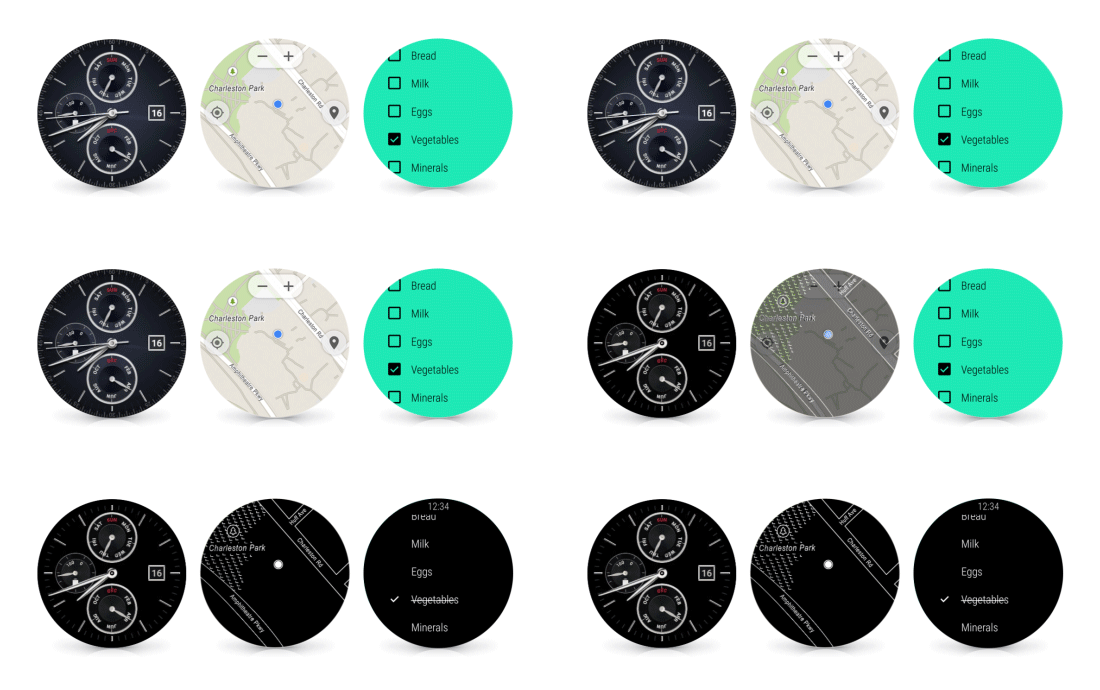
Also in this update is a new feature for applications: Always-On. Previously, all Android Wear applications were subject to a timeout and developers were advised not to rely on continuous screen time. In fact, the developer's guide still contains this now-outdated information. Always-On allows an application which is in full-screen-mode (not simply showing a Google Now banner) to register for permanent display. This pardons the app from the shutdown timeout and therefore keeps it front and center even after the wearer lowers their arm. As Android Wear always returns to the watch face when an app times out, this can save a considerable amount of navigation if the wearer is repeatedly pulling up the same app during an activity such as checking a shopping list. Google has retained the wrist raise-and-twist detection to detect if the wearer is actively looking at the display, and will turn the display black and white if it determines the watch has been lowered from view. Google claims this saves battery life, but in practice this is really only going to be the case for OLED based devices, as the power savings on a LCD based device are going to be minimal (maybe a slight reduction in backlight intensity).
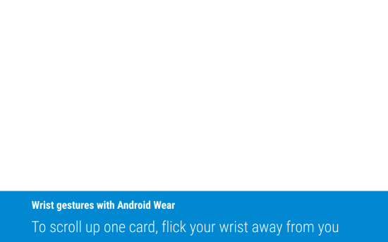
With regards to usability updates, Google has added a new gesture to scroll through notifications via wrist twisting. This allows a wearer to view details without reaching over with the other hand to touch the display, to aid in situations where the wearer's hands are full. I am personally excited about this update as it was often faster to reach into my pocket with the other hand and retrieve my phone than it was to touch the watch display. The smart watch still had utility if I was not near my phone or my hands were both free, but this update should expand its utility farther.

Google has also resolved the absolutely bizarre way that apps had to be launched in the previous versions of Android Wear. From the watch face, the wearer had to tap the screen, scroll to the bottom of a very long list of actions and select the ambiguous "Start..." action to then be presented with the application list. This was far from intuitive. In this update, apps, contacts, and that long list of actions are surfaced in a single sliding pane behind a single tap of the watch face.

Google has also (finally!) added the ability to ask the watch to find the paired phone. Google has not yet described how this feature works, but I am thankful this obvious feature has arrived. It is quite silly, but I often find myself receiving many notifications and have no idea where my phone is- resulting in a frantic search while my wrist continues to vibrate.
Finally, Google has added the ability to reply to messages with a drawn emoji. Presently, this seems impossible to execute well on such a small screen so I look forward to testing this myself. The example Google provides is below, and seems completely implausible unless people are better finger artists than I would expect.

The update is being deployed over the next several weeks to all Android Wear devices, starting with the LG Watch Urbane. The Moto 360 I am using has not yet received the update.
Source: Android Blog


10 Comments
View All Comments
aruisdante - Thursday, April 23, 2015 - link
I mean, you don't really need the watch to be able to connect directly via WiFi to a thing if it can connect via WiFi to the watch which then can connect directly to the thing. Likely a battery-life saving optimization at the cost of some additional complexity.aruisdante - Thursday, April 23, 2015 - link
And by "connect via WiFi to the watch" I meant "connect via WiFi to the phone". Stupid lack of ability to edit posts.Impulses - Thursday, April 23, 2015 - link
Not sure I follow... Wi-Fi uses more power than Bluetooth, presumably Wi-Fi is for connecting to a router when the phone isn't in range, which solves the range issue and also stops the watch from polling for BT connection.TheTurboFool - Thursday, April 23, 2015 - link
WiFi has a higher power drain than Bluetooth LE which is what it currently uses. The purpose of WiFi here is to allow it to communicate with your phone, and possibly the Internet, when out of range of your phone.jjj - Thursday, April 23, 2015 - link
Oh no , the UI navigation is not horribly painful like on the Apple Watch, what are we going to do?!Google and it's lack on insanity ...
Google does need to give us solutions for things we use more often and we need minimal effort for.
I would allow custom small dials on any face that can act as widgets and shortcuts and for home automation even the main dial could be that. The always on apps do help with this but more can be done.
And ofc drawing would be more useful if if was for user defined actions or shortcuts. The current way of using it.. well, we have enough duck pics and boobs.
steven75 - Friday, April 24, 2015 - link
Sounds like until this update, the UI navigation was actually *worse* than Apple Watch. Not sure this is a point worth trumpeting.jjj - Friday, April 24, 2015 - link
No ,not even close to it. Getting to apps was too much work but Apple's navigation is beyond stupid.They got a touch screen, a button and the digital crown that's both a wheel and a button. It's a huge step back. I joke that the crown is like putting a full sized joystick on a phone or replacing the touchpad in a laptop with 2 etch a sketch knobs.
Apple wanted to make things easy to access and instead of finding intelligent solutions,they made a huge mess and the digital crown is no ipod wheel as they hope.
Plus , not 100% sure on this, they likely don't have gloved touch and even if they had, the buttons would be extra annoying in the winter (most of the developed world has winters).
If you have ever owned an electronic watch with buttons,you know buttons are not ideal and some even complain about the fact that a watch occupies both hands. So the need for ease of use and simplicity is fundamental. Apple has overcomplicated things with it's buttons and knobs while Google Wear is pretty much just touch and swipes on the screen. Apple made a Blackberry, Google made an iphone.
For Wear you could even make a BT connected ring with a 40mm2 touchpad so you can use it with the sane hand the watch is on.
Anyway UI navigation is just one aspect of all this mess but one of Apple's biggest (and most absurd) problems.
TheTurboFool - Thursday, April 23, 2015 - link
It's been made pretty clear that this will be unlocked retroactively on already-existing watches. Even Motorola has announced it on the 360.Impulses - Friday, April 24, 2015 - link
That's usually the way Wear works, yes, the article didn't state otherwise:" The update is being deployed over the next several weeks to all Android Wear devices, "
Gadgety - Friday, April 24, 2015 - link
"However, I would have also expected Wi-Fi to be exposed to apps somehow for watch-to-thing type interactions. For example, pressing a button on the watch to change the channel on a Kodi media center."Yes, me too. That would be the main benefit I looked forward to, local wifi network home automation.
Google's new deal seems to go via their servers? OK, so that's nice if it means I can go to the grocery store without my phone, and provided they have wifi, I'd still have access to my Google Keep lists on the Wear device.
By routing everything through their servers, Google maintains data control, enables data mining, user interaction, preference patterns etc. In addition, I guess they could allow/block access for certain device makers/service providers, so going wifi would only work for those device makers that Google accepts.
So this, I guess, would mean that my own little Squeezbox on a RPi would not be controllable via the Wear device over wifi.