Windows 10 Build 10049: Meet Project Spartan
by Brett Howse on March 30, 2015 10:05 PM EST- Posted in
- Operating Systems
- Microsoft
- Windows 10

Microsoft has released a new build to the fast ring for Windows Insiders today. When build 10041 dropped on the 18th of March, we made note that updates would not be coming at a much quicker pace. Little did we know that we would get a new build only twelve days later. There is big news with this build as well with the public availability of Microsoft’s new browser, codenamed Project Spartan.
Back in January we took a look at some of the parts of Project Spartan. At that time, the goal from Microsoft was to include the new rendering engine which would be the heart of Spartan in both Internet Explorer and the new, as yet unnamed browser. Those plans have shifted though. Internet Explorer will still be available for legacy applications (think business) but it will not include the new rendering engine, which is EdgeHTML. Project Spartan will be exclusively EdgeHTML and not include the legacy MSHTML rendering engine for compatibility. Microsoft’s metrics on compatibility with the new browser have shown them that it is really not necessary. So the new browser should be free of any of the legacy code which caused issues with standards.
On our initial look at EdgeHTML rendering within Internet Explorer, we saw some pretty substantial performance gains. We will dig into that again with the new build and report back if any additional progress has been made.
So what is “Project Spartan” then? Technically it is a new branch of Internet Explorer’s Trident layout engine, but slimmed down and built for the modern web rather than compatibility with legacy things like ActiveX controls. If that is needed, Internet Explorer will still be available in Windows 10. For the vast majority of users though, they just need a clean, fast, secure browser. Whether Spartan is any of that will have to be seen, but it is more than just a new layout and ECMAscript engine too.
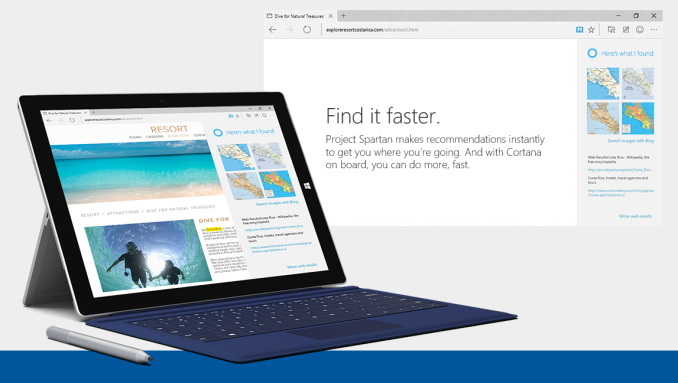
Spartan (I really wish they would just name this browser already) has some interesting technology which Microsoft hopes will bring some mindshare back to their browser. For instance, Cortana, which is Microsoft’s digital assistant and search engine front end, is now built directly into the browser. Being contextually aware should help with relevant search results, and if you type things like “what is the weather” into the address bar, Cortana will respond.
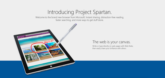
Another feature coming to the new browser is the ability to annotate web pages, and inking is supported for this. The resultant page will be sharable as well, so comments about pages can be shared with friends or colleagues. This may or may not be interesting, but even with the preview just going out, there have already been some clever uses of it shared on social media.
The new browser also supports both Reading List and Reading View, which are extensions to already deployed technologies from Windows 8.1. Reading List is clearly a list of sites, and Reading View offers a distraction-free browsing experience.
One of the best features of the new browser though is that it will be updated through the store, so hopefully the extremely long wait times between feature updates will go away. There was always the capability of this with Windows Update, but Internet Explorer is certainly behind in adoption of new web standard drafts as compared to other browsers.
For those in the Fast Ring, go check your Windows Updates and get a crack at the new browser, but before you do, be sure to check out the list of known bugs, as there are some serious ones in this build such as Hyper-V being broken on this build. Remember though, this is called the Fast ring for a reason!
Source: Windows Blog


23 Comments
View All Comments
Morawka - Monday, March 30, 2015 - link
Hopefull sites will optmize layout to spartan.I would like to see the same browsing experience on my iPad and my Dell Venue 8 pro. Same Image Assets, same zoom, same font, same everything.
Right now, browsing on the Dell Venue 8 Pro is a huge pain compared to my ipad or iphone.
imaheadcase - Monday, March 30, 2015 - link
I doubt that, most sites don't even with Chrome of Firefox. Including anandtech. I don't understand why websites don't scale to fit screen, is it the webbrowser or the website?Leonick - Monday, March 30, 2015 - link
Anandtech does scale to fit the screen, it does have a maximum width of 1001px though which is sensible since having a site span a lot more generally isn't what you want. Reading an article which spans most of your screen isn't a very good experience.iniudan - Monday, March 30, 2015 - link
1001px, what kind of madman made this site markup. =pWithoutWeakness - Tuesday, March 31, 2015 - link
I think it's to account for monitors that are 1024 pixels wide and leave 23 pixels for the vertical scroll bar. If they designed it to fit the whole 1024 pixels they they would need a horizontal scroll bar at the bottom to accommodate the 23 pixels that are overtaken by the vertical scroll bar.Not sure who has a monitor that is 1024 pixels wide though. People with old 1280x1024 monitors using them in portrait mode?
iniudan - Tuesday, March 31, 2015 - link
I know, just a professional deformation of mine, that extra 1px drive me insane. =pAnnonymousCoward - Saturday, April 4, 2015 - link
Not 1280x1024 in portrait. XGA screens: 1024x768.iniudan - Monday, March 30, 2015 - link
Anandtech scale, just not wider then 1024 pixel, as reading area wider just tend to make thing harder to follow with the eye and it's a nice round kibi. But I admit with 4k display it might be a problem, if there is no pixel multiplication in place.Murloc - Tuesday, March 31, 2015 - link
it does fit, but there is a maximum width of course, because long horizontal lines make text difficult to read.There are various studies about this in the field of typography.
Figures vary but if web pages adapted to wide screens they would be unreadable, unless they dynamically put the text on two columns when the screen is wide enough, but that would barely fit even with 1920 if you take this page as an example.
NikosD - Tuesday, March 31, 2015 - link
Spartan is a complete disappointment, as it is right now.Buggy, very buggy it doesn't even support favorites properly.
No new features and no new standards compatibility.
Exactly the same score in almost all benchmarks and standards (HTML5, CSS# etc) tests with IE11.