A New Windows - Windows 10 Announced By Microsoft
by Brett Howse on September 30, 2014 4:25 PM EST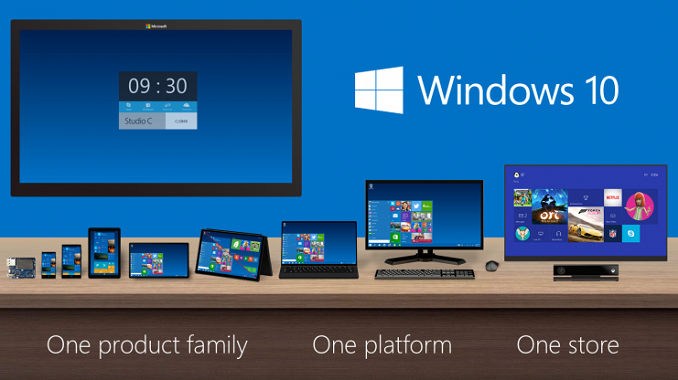
It was only two years ago that Windows 8 was unleashed on the world. Microsoft tried to usher in an era of “Touch First” applications with a new look and feel for Windows. To say that Windows 8 was unsuccessful would be an understatement, and from both Microsoft’s and user’s perspectives, it was certainly a failure. Two years in, Windows 8 and its 8.1 derivative have struggled to gain market share over Windows 7 and XP, which still command the lion’s share of the desktop OS pie. A new interface, unfamiliar to users, did little to sway their wallets, and other market factors have come in to play as well.
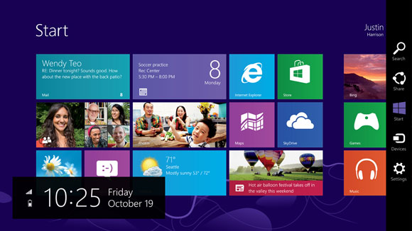
Looking back at Windows 8, it was a big change from a company that traditionally has been called too conservative. Gone was the familiar start menu, replaced with a full screen version. Gone was the ability to move and resize applications into “windows” and instead it was replaced with full screen apps that take command of your desktop. Gone was a lot of what made Windows, well Windows. Add in the fact that Windows 8 at its launch was only half complete, and it is not surprising that the market did not buy into the new world. There were two disjointed interfaces, but one person had to interact with both no matter what form factor they were on. If you are on a touch based tablet, much of the settings and controls were still found in the old Control Panel applets. The file explorer was on the desktop, which was difficult to use with touch. On the other side of the coin, traditional desktop PC users also had to learn the new Start Screen, charms, and other controls which were clearly made for “touch first” and not the mouse and keyboard. Within weeks of the Windows 8 launch, major players in its creation were let go, or given new duties.
Since the day one release of Windows 8, Microsoft has been trying to fix many of the issues people have with the new version of their operating system, and Windows 8.1 was a step in the right direction, fixing interfaces for both the touch interface and the desktop. Windows 8.1 Update, announced at BUILD earlier this year, was a truly desktop-centric update with new keyboard and mouse controls for use in the touch environment, and the ability to control Windows Store apps with a title bar. It was a big help, but also showed off at BUILD were features coming in a later version of Windows, and that version has now come.
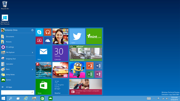
Windows 10 is as dramatic a shift from Windows 8 as Windows 8 was to Windows 7. Gone is the start screen for the desktop, with the familiar start menu back. Gone is the full screen applications taking over your computer, with those applications now being relegated to windows as before. Gone is the touch first interface on top of an operating system primarily used with a keyboard and mouse. However this is not Windows 7.1, and nor should it be. Windows 8 certainly had its faults, but not everything about Windows 8 needed to be thrown out.
Windows 10 starts its journey as the Windows Technical Preview for Enterprises. Microsoft’s core customer base is the enterprise, and this is important that they are starting the discussion with this market group this time around. Beginning tomorrow, people can join the Windows Insider Program and download and install the latest version of Windows for themselves. Microsoft has made it clear though that this preview is actually a preview, and not meant for general availability. Expect some rough edges, and some bugs, which should be worked out by the time the OS ships. As for the consumer side of the story, Microsoft is planning to announce more on that front in early 2015, and for developers, BUILD will be coming sometime after that. The actual Windows 10 launch is listed as “later in the year” with the year being 2015.
There is a lot to go over, and once we get our hands on the preview build we can dig into the new OS and give a full breakdown on what is new. One of the biggest complaints about Windows 8 and 8.1, is that real people do not want a single interface on every device they own. They want a User Interface which is tailored to the usage model. With Windows 10, Microsoft promises to address this.
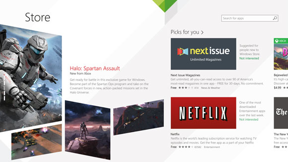
Before we can talk about Windows though, we need to briefly discuss the Windows Store. Windows Store apps are executed in WinRT, which is the Windows RunTime, replacing the old Win32 runtime. WinRT has some advantages as a new framework, with the ability to be resolution independent natively, and support the Windows contracts such as Share. At BUILD in 2014, Microsoft announced Universal Apps, which are a key feature of the Windows store that is not available on any other platform. There is a lot of confusion as to what a Universal App is, and what it is not is a single application that runs on a phone, PC, tablet, and console. A Universal App leverages the common WinRT framework available in Windows, Xbox One, and Windows Phone, to allow a developer to share a common code base, but use a suitable UI for each system, and have all of it available on all platforms seamlessly through the Windows Store. It is certainly a lofty idea, and one that has gained a bit of traction in the store. With Windows 10 though, the concept of a Universal App allows a developer to target a phone, Xbox, tablet, and desktop. If anything is the killer feature of Windows 10, this could be it. Time will tell of course and developers need to buy into WinRT for this to be a reality. Today’s announcement is not developer focused, so we will expect more news on the WinRT API updates later on, at the BUILD conference.
The first place to start, is going to be Start. On Windows 7, clicking the Start button brought up the Start Menu. Windows 8 dropped the start button altogether, but 8.1 brought it back even though it opened the Start Screen. On tablets, the start screen was fine, but on a desktop, it could be unwieldy. It interrupted your workflow to bring you into a new environment, where you can find the application you want and launch it. Windows 10 brings back the Start Menu, but with a twist. Rather than just the traditional start menu of Windows 7, a familiar start menu can now also be populated with Live Tiles from the Windows Store apps. But this is only on the desktop. Tablets will get a different interface, as will the phone. To quote Microsoft: “We’re not talking about one UI to rule them all – we’re talking about one product family, with a tailored experience for each device.”
If Windows 10 is going to be successful, the tailored experience for each device is the key. The new start menu is just the first step towards that, and is especially important for the enterprise and desktop user.
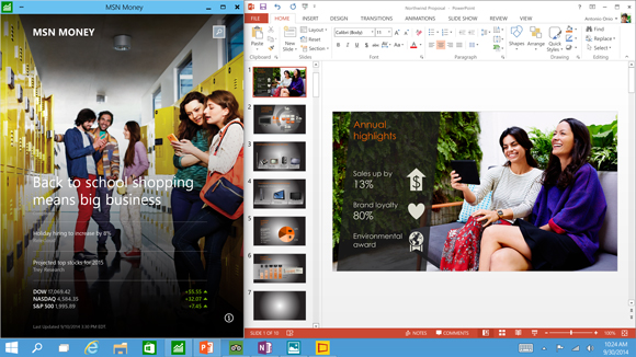
The next interface change, was also announced at BUILD, and that is the ability to run Windows Store apps within a window on the desktop. This is a big change for two reasons. First, on a desktop, full screen Windows Store apps are less useful. Generally you have multiple things going on at once, and to have a single app take over the screen is generally not ideal. The usefulness of Windows Store apps has instantly been increased. The other reason it is important is for developer buy-in. Even though Windows 8 did not light the world on fire as far as unit sales, it is still on hundreds of millions of devices. However the majority of those devices are going to be traditional desktops. Writing an application for the Windows Store practically precluded use by the majority of the user base. By putting these apps on the desktop, it opens up a much larger potential audience. Microsoft needs the Windows Store to be kick-started, and this is one way they can advance that goal.
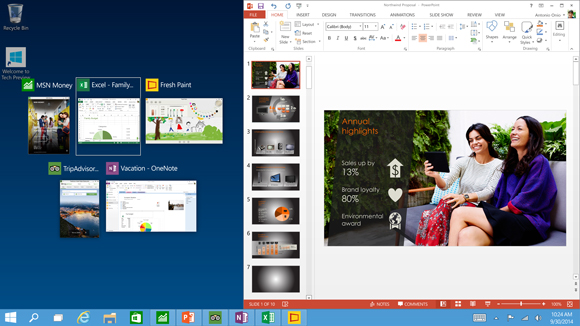
Windows Snap was also debuted in Windows 8, and it allowed two Windows Store apps to be snapped open, with one taking about 70% of the screen and the other using 30%. For multitasking, it was certainly better than other mobile operating systems from 2012, but it was a long way from Windows 7. Windows 8.1 improved Snap, and allows more than two apps to be snapped open on the screen at any one time, and for the snap percentage to be changed. Windows 10 is now offering another update on Snap. Apps can now be snapped to all four corners, giving more real estate to each app than before. Snap was a good feature, and this is a further improvement on it.
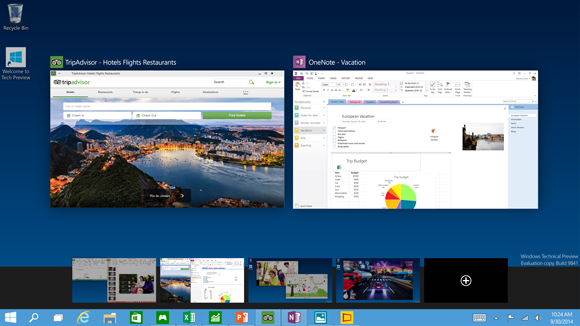
Another long requested feature is now coming to Windows 10 – multiple desktops. Desktops can be designated for different purposes, and users will be able to easily switch among them. There is a small but vocal group who have been asking for this for a long time, and they have finally been rewarded.
Sticking with the enterprise features, data security is always a big concern. Multifactor authentication based on smart cards or tokens is now built right into the OS. Bitlocker is still around, offering full device encryption, but Windows 10 now offers application and file level data separation, which can enable data protection even if that data leaves the device. Though they have not gone into a lot of detail as to how that is done, it likely leverages some of Microsoft’s other technologies such as Active Directory Rights Management Services.
Future updates to Windows should be easier for IT workers as well due to a new in-place upgrade option. And to go along with that, businesses will be able to choose whether to jump on the fast update consumer track, or lock down the updates to only deliver critical security patches, or somewhere in the middle. And this approach does not need to be at the enterprise level – different groups of machines can follow different update patterns depending on how critical the infrastructure is.
Windows 10 also supports Mobile Device Management (MDM) tools, as well as the traditional Active Directory and System Center approach to device management. This should be a boon to any small to mid-sized business who does not want to invest in a comprehensive solution.
Finally, the new Windows Store will allow volume license purchasing from within the store. Companies can re-claim licenses, and re-issue them to new devices. They can also create a custom store for their own computers which can include Windows Store and company-owned apps in the same interface.
Microsoft is trying hard to win back the Enterprise customers who have been turned off by Windows 8. Obviously we will have to wait and see if they are successful, but there is a lot to like in this new release. The “one UI to rule them all” model of Windows 8 has been put out to pasture, and instead replaced with a single platform, with a UI to suit the device it is running on.
Not all was bad about Windows 8, and it is good to see that some of the good ideas have been taken and molded into the new OS, but also tweaked at the same time to make them work better for the device they are on. The Universal App is a powerful idea, and one that has yet to make a big splash so far, but if the WinRT framework can be updated to make it more powerful, then it would certainly add a lot of power to Windows 10. Unlike Win32, WinRT apps support high DPI by default, which is more and more important as we move to higher resolution displays on all sizes of devices. The ability to log in to any Windows PC and get your own custom look and feel, including all of your applications, and data, is a powerful feeling. They have all of the tools they need to do this across all devices now, and it is exciting to see a glimpse at what the future may hold.
Once we get the actual install files for Windows 10, we will be able to provide more coverage on this major release of Windows.




134 Comments
View All Comments
hughlle - Tuesday, September 30, 2014 - link
The name kind of makes sense, although maybe they didnt go far enough. Anything to distance themselves as far as possible from windows 8 as they can.mmrezaie - Tuesday, September 30, 2014 - link
Yes thats why they called it 10! [sarcasm]Byte - Tuesday, September 30, 2014 - link
i really don't understand, why they didn't just call it Windows 720.Death666Angel - Wednesday, October 1, 2014 - link
Windows One was the name I would have expected! :D3ogdy - Wednesday, October 1, 2014 - link
It would've made sense: they left from Windows 8, did a 360 with 8.1 and another 360º spin with this Windows 10. VERY little progress. Still looks the same as Windows h8. These people SERIOUSLY need a design team - it applies to quite a lot of their products, not just Windows 8, 8.1 and apparently, 10.Ranari - Wednesday, October 1, 2014 - link
The Microsoft design team is fine. The issue with Microsoft is that they tend to be a company that can't spot the elephant in the room when they see it. They need to see data, and do research first, when in reality all they need sometimes is to hire a couple of "honest talkers" that'll tell 'em straight up that, "Hey, this is a bad idea." Might save them a few billion dollars. Windows 8 was an excellent product, but you can't change the fundamental design of how people have been using their desktops at both home and work over the last 20 years in a single release. Forcing a tablet experience onto a desktop market? Not going to happen .With Windows 10, the design is what Windows 8 should have been. You offer the same solid, core shell underneath the hood, but you differ the UI depending on the device. This makes sense, and it unifies the operating system across all platforms. I made a prediction years ago back in 2007 when I saw the first iPhone that smartphones would eventually be married into the desktop experience. That is, you walk up to your desktop, place your smartphone in a cradle, and it would power your mouse, keyboard, and monitor. The UI would change to the familiar desktop experience, and the cradle would provide more power to the smartphone device for faster running speeds. True desktops wouldn't be replaced, as there will always be the need for more power, but imagine picking up your "desktop" and taking it straight to your meeting. You'd always have your data with you wherever you go.
With Windows 10, we're starting to see that vision. One OS, all platforms. Finally something smart from Microsoft.
mkozakewich - Thursday, October 2, 2014 - link
I love how close we are, yet we're still painfully far away. Phones are becoming more and more powerful, but are providing all that power up-front with very little energy management. As a result, the batteries only last a few hours on heavy workManufacturers need to be less timid about locking things away. Revealing less of the battery to the user keeps it healthy for years longer, and reducing CPU speeds when heavy loads are detected would help battery life tremendously. Gating RAM might also reduce power usage over the course of a couple days.
I feel like all we need is the proper cultural shift. I had one of those pocket netbooks in 2010, and it was amazing. It was this little blip where the possibilities all converged, right before tablets became 'the thing'. Now there's nothing but half-assed operating systems that hamper one's ability to do real work.
Da W - Wednesday, October 1, 2014 - link
What is it you don't like? They fix all that people complained about, and you still complain? Get a life.inighthawki - Wednesday, October 1, 2014 - link
I love posts like this that are so clueless. They fixed nothing.A start menu? Anyone who really cared about that spent 60 seconds to go install any of the 10 free start menu replacements.
Windowed metro apps? Metro apps are garbage to begin with. Nobody on the desktop even wants to use them, and they're total trash from a productivity standpoint.
The real issues with the OS are the things they reverted and took away from the Win7 experience that cannot be replaced.
Theming was completely butchered - I hate the new metro look and feel. I want aero glass. I want windows with higher contrasting edges. With drop shadows. I want to be able to customize the look and feel of Windows. But guess what? Windows 8 has horrible theming. It's like three steps back from Windows 7. Did you know that you can't use a custom theme that does anything other than having a completely solid color titlebar, because they "optimized" the title bar text rendering by rendering it on an opaque background?
The next big problem is the push for metro and their touch first goals. They want touch to be "a first class citizen" in Windows. This is stupid on a desktop. I don't need, or want a touch based UI on a PC that I will NEVER have touch on. Never ever in a million years. Metro apps are designed so incredibly poorly it's not even funny, The metro design language works almost exclusively only for touch first content-consumption based apps. Trying to do anything productive is just a waste of time.
Windows 10 looks to solve none of the actual fundamental issues with the OS with that. The biggest complaint was metro, so their solution? Push the metro look and feel to the desktop! Windows now have 1px thin window borders - what a terrible idea. Now none of my applications can have contrast with one another. Oh, and let's make the title bar of metro apps look different! Cool, now there's yet one more thing completely inconsistent with the rest of the system UI. Let's not forget that Microsoft's OWN PRODUCTS (Office, VS) do the same and are inconsistent with their OWN OS.
I use windows to get work done, and because it used to be highly customizable. Now it's just garbage. They decided for me that I wanted metro and a flat UI. I don't. I want a UI that I choose, and I want productive Win32 apps. And don't even get me started on the huge joke that the WinRT runtime is for developers. Half the power of the Win32 library, and with twice as many security restrictions. Did you know you can't even open a file handle to a file on the disk if it's outside of the user folders unless you go through the File Picker interface? God what a disaster.
maximumGPU - Wednesday, October 1, 2014 - link
fine, they took away your beloved aero look.Rest of what you're saying is just metro this metro that. I don't get it, is anyone forcing you to use metro apps? I'm on windows 8.1 and with boot to desktop i practically never see any metro app.