Note 4 and Mate 7 side-by-side
by Andrei Frumusanu on September 5, 2014 8:44 AM EST- Posted in
- Trade Shows
- Samsung
- Huawei
- Ascend Mate 7
- Galaxy Note 4
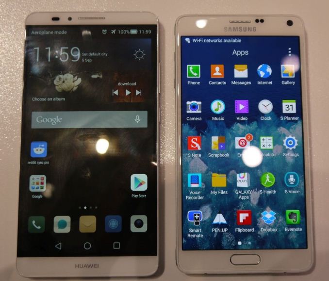
We already saw some pictures that Josh took during his briefing just a few days ago, but I still felt that maybe the Note 4 could use a closer look. Today I managed to talk to a representative at IFA to get some better close-up shots of the device.
The Note 4's new design is really striking. As Josh already mentioned in his hands-on, the improved feeling that Samsung managed to achieve with the new metal chassis is worlds apart from the plastic designs found in its predecessors. I was still skeptical until I got to hold it with my own hands: this is indeed a premium device.
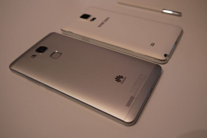
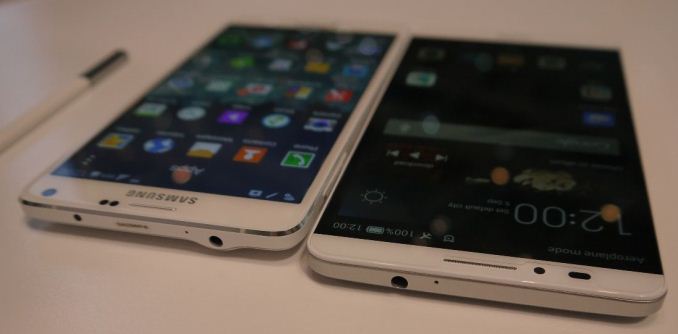
I also had the opportunity to compare it to the Ascend Mate 7. There's definitely a size difference here that is noticeable when you hold both devices. Because the Mate 7 is a tad wider than the Note 4, it isn't as easy to handle. I'd say Samsung made a very good choice in staying at 5.7" and not going larger. One aspect that was immediately visible was the difference in screen quality. The Note 4 was a lot brighter, and due to the large size of the screens, the difference in resolution between 1080p vs 1440p was quite noticeable to me.
The two devices are basically the same thickness, and you won't notice too much in that regard other than a change from feeling the grippy soft-touch plastic of Samsung pleather back to the smoother aluminium of the Mate 7.
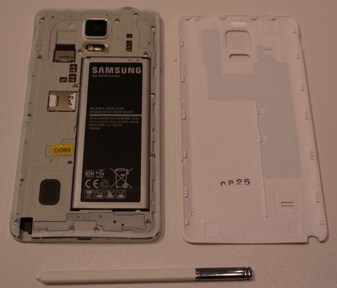
One thing Josh told me he omitted was taking a picture of the Note 4 without the back cover. Here we see that Samsung changed the layout a bit, and no is longer employing their stacked SIM+microSD slot holder that is common in current Samsung devices, and instead separates them again as in older devices.
Some readers in the comments section were asking about how the new S-Pen handled. I tried to play around with it for a bit and noticed no problems with it, as it performed without issue. I couldn't try out the angle-sensitivity of the pen as the stock apps did not support it, and the Samsung representative did not know how to showcase it.
Interestingly, the model I handled was a N910F with a Snapdrgon 805. This could mean that we won't see any Exynos models in western LTE markets such as Europe yet again. This would mean that Snapdragon variants would be the most widely reviewed and distributed. We're still waiting on Samsung to officially relase any information regarding the Exynos 5433 SoC. We're also waiting on Samsung to release a break-down of models and their availabiliy per region.
Yesterday I was impressed by Huawei's new design and build-quality. Today I'm actually torn between it and the Note 4 and can say that the Samsung has stepped the quality of their design as well.
Addendum:
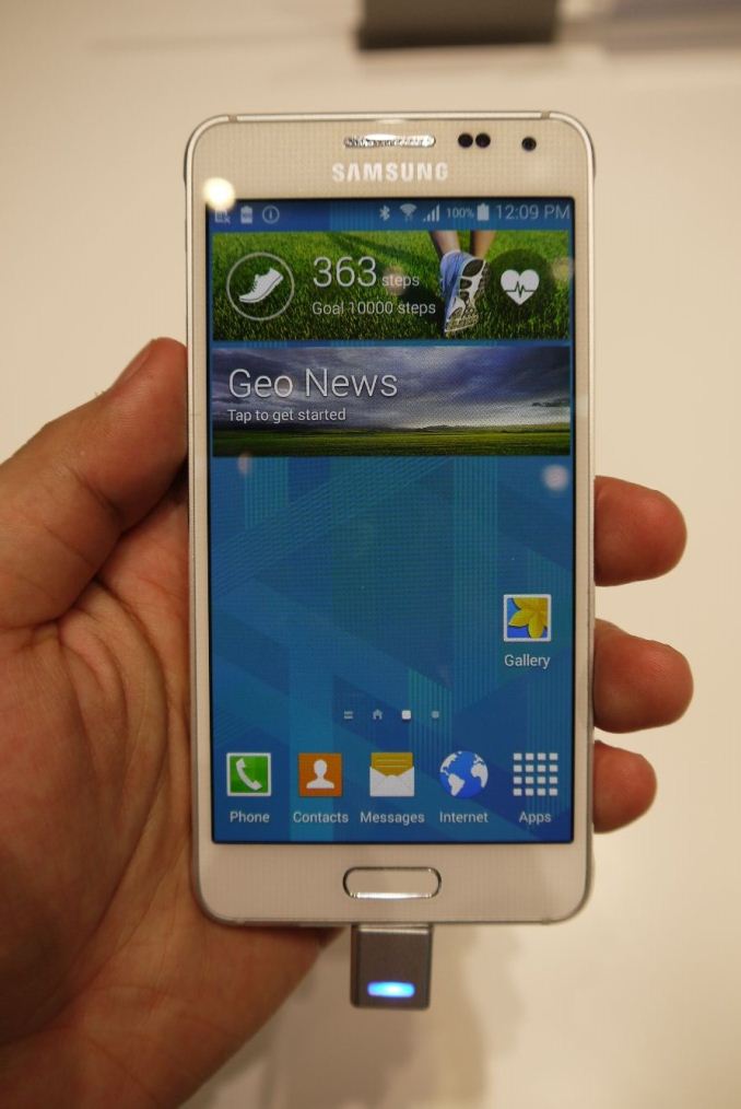
Samsung also had a lot of Galaxy Alphas on display in their hall. Since this was the first time I saw the phone in person, I wanted to share my thoughts on it too. The device provides a great alternative to people who dislike 5"+ phones, as it's very light and thin. I was concerned about the 720p PenTile screen, but it seems that this display employs one of the newer generation PenTile matrices and it was not as visible as I thought it would be. I didn't bother with taking too many pictures as it was a tethered device and there were no press kits available. The Galaxy Alpha is definitely a device to look foward to if that's the form-factor you desire in a phone.







43 Comments
View All Comments
jjj - Friday, September 5, 2014 - link
Samsung doesn't have any performance/high end device between 5.7inch and 8 inch , they should have gone bigger, if not with this one then with something else. They also need to get rid of the home button, it's wasting too much space.seanlumly - Friday, September 5, 2014 - link
I have the exact same complaint about on-screen buttons. I'm not a fan of them on my Android devices.Notmyusualid - Friday, September 5, 2014 - link
On-screen buttons make me want to kill myself!As I'm teaching my father at present how to go from a dumb-phone, to the LG G2 that I just bought him, I am losing hair watching the buttons disappear as they phone hides them as it sees fit.
So on-screen buttons for me = No Bloody Way.
JeffFlanagan - Friday, September 5, 2014 - link
Try touching the screen where the buttons appear, I've never had them remain hidden. The only way I can see this being a problem is if the user has cognitive problems that cause them to forget the buttons exist.lilmoe - Friday, September 5, 2014 - link
Either way, on-screen buttons are absolutely NOT user friendly. The average consumer needs a *constant* point of reference in navigation to avoid confusion, and on-screen buttons and the way they appear and disappear aren't doing anyone a favor. They also take significant screen real estate when texting, browsing, and using non-full-screen apps.mkozakewich - Friday, September 5, 2014 - link
The silliest thing about on-screen buttons on, say, a Nexus device is that there's still this huge bezel on the bottom as if there were supposed to be buttons there. So you lose screen area for no reason.PubFiction - Wednesday, September 10, 2014 - link
Exactly, if you talk about capacitive buttons they are no different than on screen buttons. The real difference comes down to phone design. If ANY company sells you a phone with on screen buttons that has a large bezel, then they are full of you know what and their only reason for doing that was to save their own costs and screw the customer. When ever a phone maker makes a phone with almost no bezel at all they have a right to use on screen buttons. Otherwise they are just ripping you off. If you are going to have a huge bezel at the bottom you might as well but either hard, or capacitive buttons in that space.Also now that Samsung has shown that you can make a phone with a custom resolutions companies have little excuse not to add more pixels to make on screen buttons. Give us another 160 pixels at the bottom and you might have an argument. But screwing us with the same 1080p resolution but wasting the bottom part of soft buttons is a rip off.
Impulses - Saturday, September 6, 2014 - link
Samsung's capacitive buttons turning off too quickly is actually far worse for a newbie than on screen buttons occasionally disappearing in a few apps like Photos.I recently watched an iPhone convert basically never use back or the app switcher on his SGS5 because since he seldom saw them light up he never got in the habit. Basically worked it like an iPhone and pressed home for everything...
Thank God Samsung gives you the option to leave the capacitive button LEDs on, once I changed that it was a total revelation for the guy...
PubFiction - Wednesday, September 10, 2014 - link
Then why don't you be a nice person and take 15 seconds to show the iphone convert how to go into the settings and set the capacitive buttons to always on. Then they are always on if the screen is on.The beauty of the better android makers and options is they are not forced upon you. They decide on a basic set of defaults but give you the option to change them. In addition I wouldn't say he got in the habit when he always had that habit right?
batongxue - Monday, September 8, 2014 - link
You should get an iPhone for your father. Maybe the larger screen version this month.