Samsung Galaxy S 4 Review - Part 1
by Brian Klug on April 24, 2013 12:01 AM EST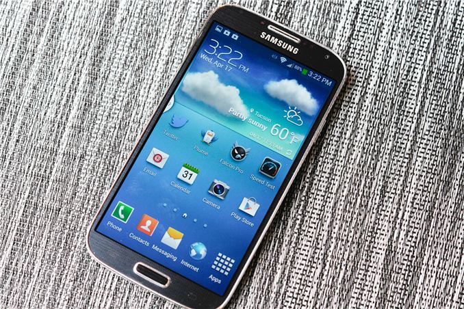
It’s no secret that Samsung enjoyed huge success with Galaxy S 3 (henceforth SGS3 and SGS4 for Galaxy S 4). In many markets, SGS3 was easily the Android handset to beat, even as faster and arguably better hardware became available during the life of its product cycle. Samsung nailed the branding, marketing, and consistency battles with its third generation of Galaxy smartphone, and now we’re a year later and facing down SGS4.
There's always that question about how you follow up something that was wildly successful with another product, and carry over what was good about the previous generation that made it successful. There's no denying that Samsung is in an interesting position here, facing opposition from players desperate to get more market share against the now well-established player that is Samsung. At the same time Galaxy S 4 is by very name an iterative product.
Putting together an Android flagship is superficially a pretty easy thing to do, and the story of the Galaxy S 4 starts out much the same as any other Android flagship from this generation. There's a 1080p 5-inch display on top, the latest and greatest CMOS sensors for front and rear facing cameras (2MP and 13 MP respectively), a powerful Snapdragon 600 SoC (which is really APQ8064AB, but more on that later) with four Krait 300 CPUs running at up to 1.9 GHz and an Adreno 320 GPU at up to 450 MHz, 2GB of LPDDR3 RAM, microSD in addition to built in storage, and removable 9.88 watt-hour battery. On the connectivity side of things we get LTE connectivity in the appropriate markets courtesy of the ubiquitous MDM9x15 LTE/WCDMA/CDMA2000/GSM multimode baseband, WLAN and Bluetooth from the latest and greatest BCM4335 802.11ac/BT 4.0 LE combo chip, and NFC from Broadcom's BCM2079x chip. There's also a new generation of touch controller inside from Synaptics, and Audience's latest eS325 noise rejection and suppression voice processor for calls. Long story short, SGS4 is packed full of absolutely the latest and greatest everything on basically every axis possible.
Samsung has done a good job of answering most of the questions we've had about the Galaxy S 4 prior to ever getting our hands on final hardware. From our earlier preview and experience with the device we got a good feel for the software customizations, as well as what hardware we should expect to see under the hood. Today, armed with final hardware and final software (Android 4.2.2 and TouchWiz atop it), we can try to fill in some of the remaining blanks.
I like to start with aesthetics and hardware. There's no doubt that superficially the SGS4 shares almost all of its industrial design language with SGS3 and the Galaxy Note 2, which themselves are iterations of the design path that Samsung started down arguably with the T-Mobile SGS2 (SGH-T989) and AT&T SGS2 what feels like an eternity ago. At first the "inspired by nature" motif made sense with the rounded appearance on SGS3, with SGS4 it's obvious this is a refresh which capitalizes on everything that made the SGS3 popular. This is the iPhone school of thinking — you have an industrial design now that is borderline a trademark, it's selling well, and if you have something that's popular, why change it?
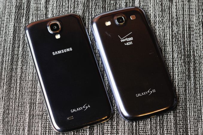
That's not to say there aren't changes, the SGS4 feels shockingly different in the hand than the SGS3. The SGS3 previously had a very tapered backside with a large radius of curvature. The SGS4's profile is now more squared off basically everywhere. The result is a handset that feels thicker because it is — at the points which previously were thinnest on the SGS3.
Samsung continues its liberal use of its favorite thermoplastic with SGS4, but what's always intriguing to me is how much it tries to make its thermoplastic exteriors look like something else. The SGS3 undoubtedly tried to mimic a faux aluminum appearance, with SGS4 there's now a faux carbon fiber motif going throughout, with a diamond checkerboard pattern that prevails on the front and back. The edge lip is still a faux brushed chrome metal material which I thought we had moved past with SGS3.
Much debate has been made around Samsung's continued use of plastic vs. metal in the industrial design of its smartphones and tablets. Unfortunately, the Galaxy S 4 isn't exempt from this debate. Samsung's public stance has always been that it optimizes its material choice to keep weight as low as possible. That's a noble way to take things, although the unmentioned benefit is that it obviously keeps costs low as well. The weight argument is an interesting one. If you compare the all-plastic Galaxy S 4 to the all-metal HTC One, there's a difference of 13 grams. Whether or not the weight difference is noticeable really depends on the user, but it's clear that cost reduction is just as big of a factor (if not more) in Samsung's affinity for plastic than simply saving weight. There's no getting around the fact that other OEMs are bringing increasingly sophisticated materials choices to bear with their designs, and this is an obvious weak point for SGS4.
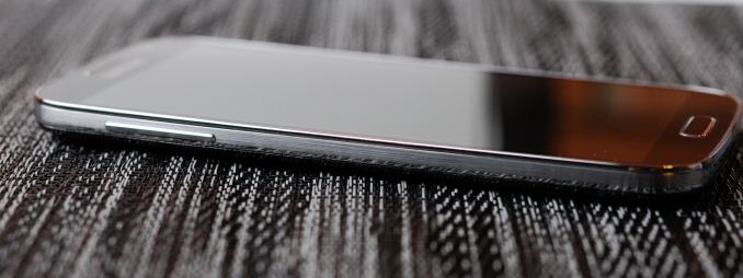
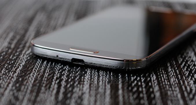
What has improved dramatically with SGS4 are the buttons, which now are surprisingly awesome. There's a beveled edge around the outside, which makes them sharp and locatable with a finger instantly. I have to admit I always loathed the rounded glossy buttons on the SGS3 which blended into the equally glossy shiny plastic around it. Even the physical home button gets this treatment, and feels much more communicative and clicky. Also worry not, they're all still in the same places, with the power button about three fourths up the right side, volume rocker three fourths up the left side. Samsung's capacitive menu and back buttons are unchanged, Samsung still hasn't gotten around to reading Google's "Say goodbye to the menu button" post, which still is a hilarious read in the context of the release and review of what will probably be 2013's most popular smartphone, which still carries a menu button. Or maybe Google just can't enforce this particular decree? Either way, for SGS3 users upgrading to SGS4 all of the buttons and human input outputs will be familiar territory.
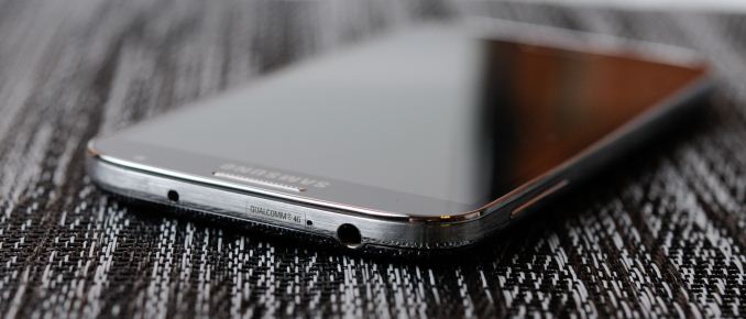
Up top there's the earphone jack, secondary microphone port for noise cancelation and stereo audio in video recording, and an IR port. I can't emphasize enough how happy I am that we finally are getting IR back in devices.
At bottom in the middle is microUSB, we're long past this being at the top or some other weird place. Next to that is the primary microphone.
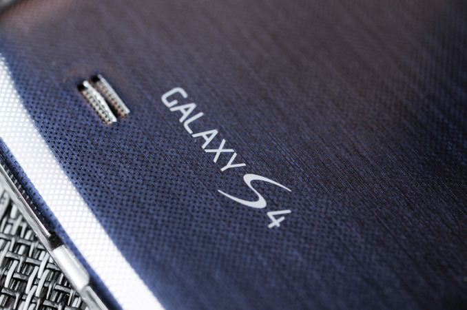
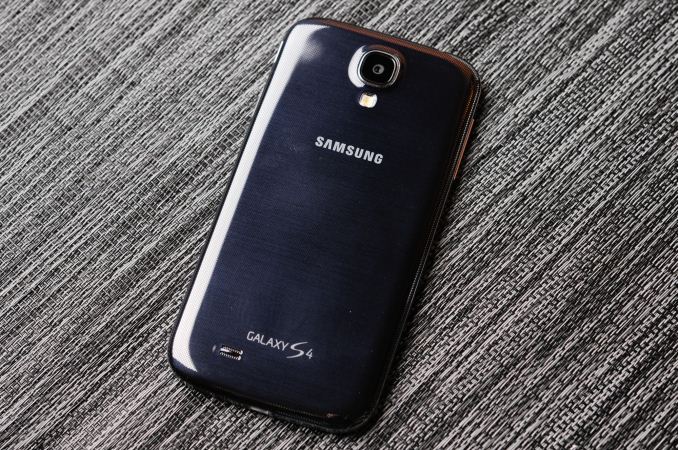
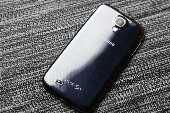
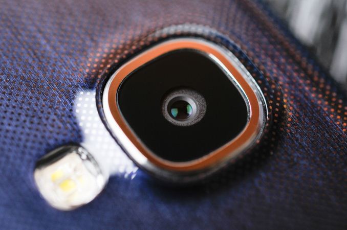
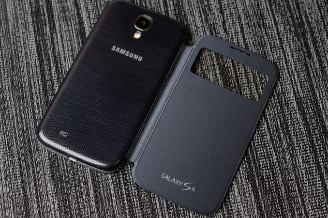
On the back the SGS4 starts to look a lot different from the SGS3. The flash is now below the camera module, and the camera port and black region is now correspondingly much larger, with a bit of a pronounced bump. There's no Sprint branding on this particular variant, just Samsung at the top and Galaxy S 4 (no IV, no Roman numerals, it's 4 this time) at the bottom. At bottom left is a cutout and small raised bump for the speakerphone.
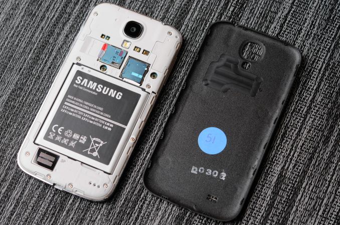
Samsung continues to differentiate its phones by including a removable back cover, and underneath it, removable battery, microSD expansion, and microSIM card tray. I'll admit that I instantly popped in my SanDisk Ultra microSDXC UHS-1 64 GB card when I got the SGS4 just because I can.
The reality is that inclusion of even these basic features overrides any industrial design tradeoffs for many shoppers, so it's probably something which will continue to be a dominant feature on Samsung flagship handsets. Along with that obviously comes the ability to run an extended battery with a different, accordingly larger battery cover.
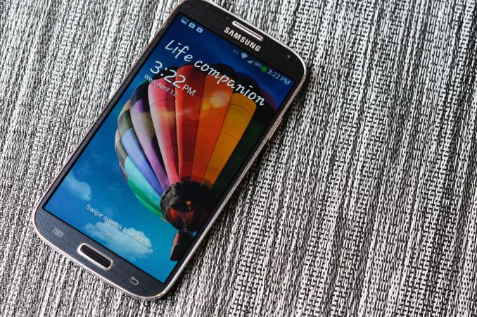
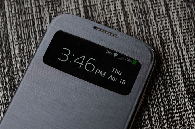
That brings me to the S View Cover, which is perhaps one of the cooler new additions on SGS4. This is an improvement on the flip cover which debuted with SGS3. What's different is that now the cover both unlocks the phone when opened and no lock screen password or code is set, and also there's a small window up top which includes information like notifications, the clock, status bar, and call screening information. It's an awesome feature and one of those things that only Samsung can do with SAMOLED.
When it comes to software, I'm grateful that Samsung is running Android 4.2.2 on the SGS4, even if the next version of Android is just around the corner.
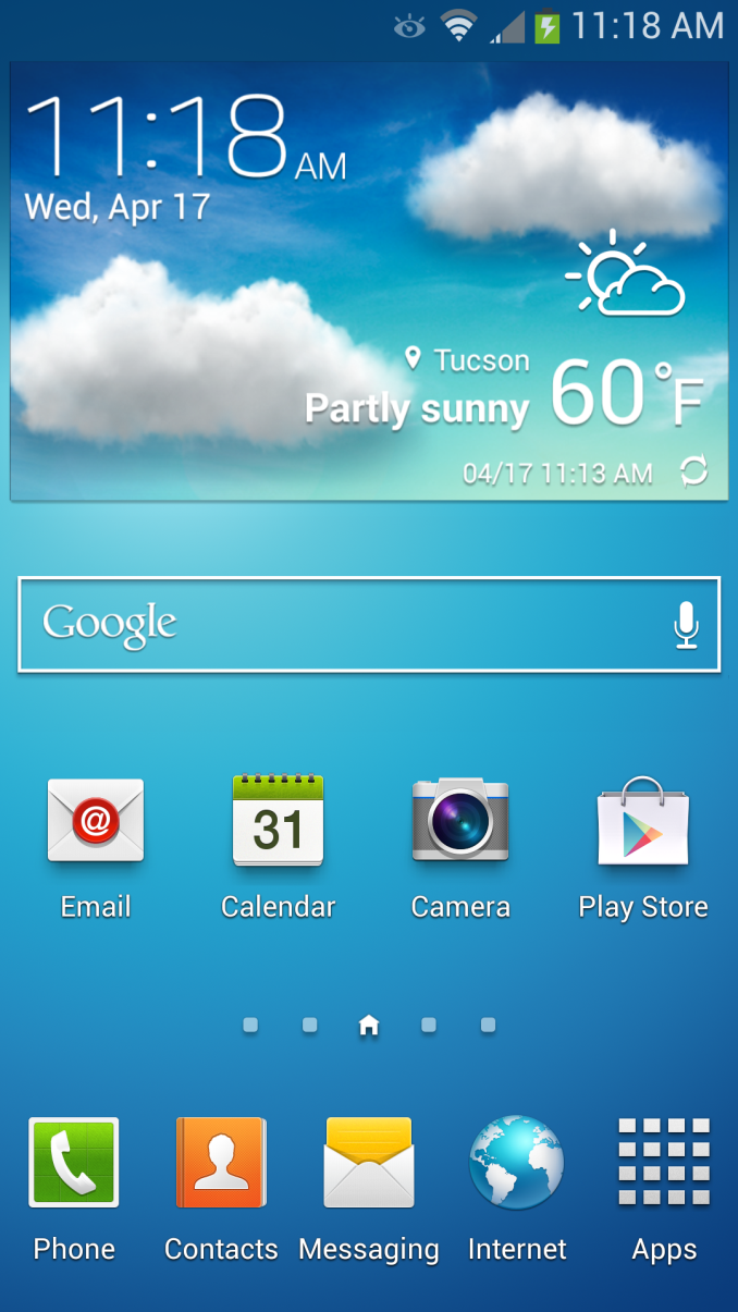
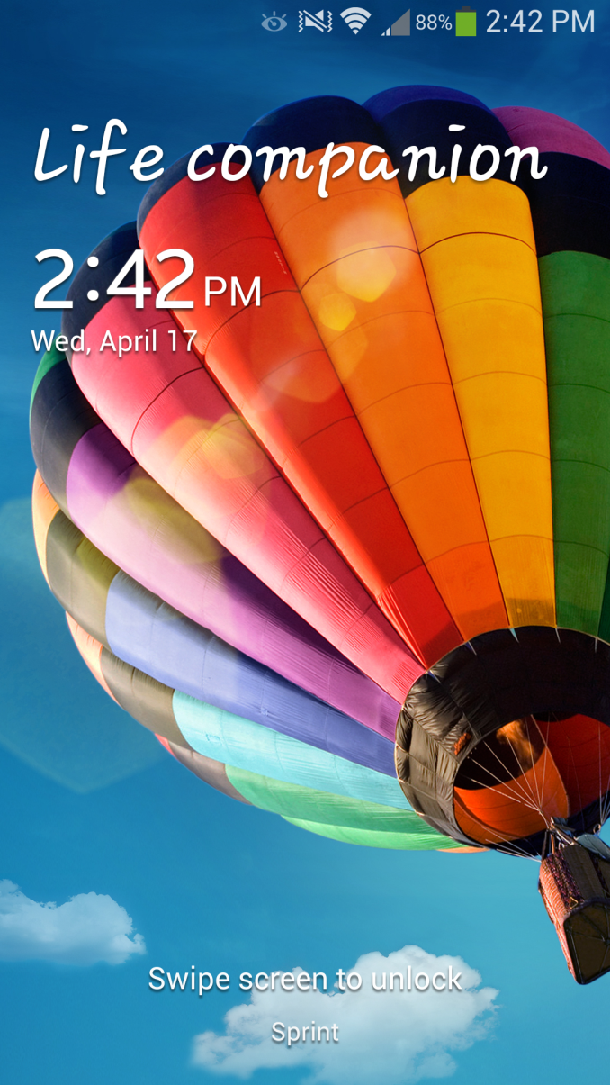
The TouchWiz story is really a short one — it's still there, and it's fundamentally unchanged, there's just more of it. The launcher, widget panels and home screens are all the same as they were in previous iterations. Messaging looks superficially different, and SwiftKey now seems to power some parts of the stock keyboard's correction engine, even if the stock Samsung keyboard for me still is difficult to use with its very conservative autocorrection settings.
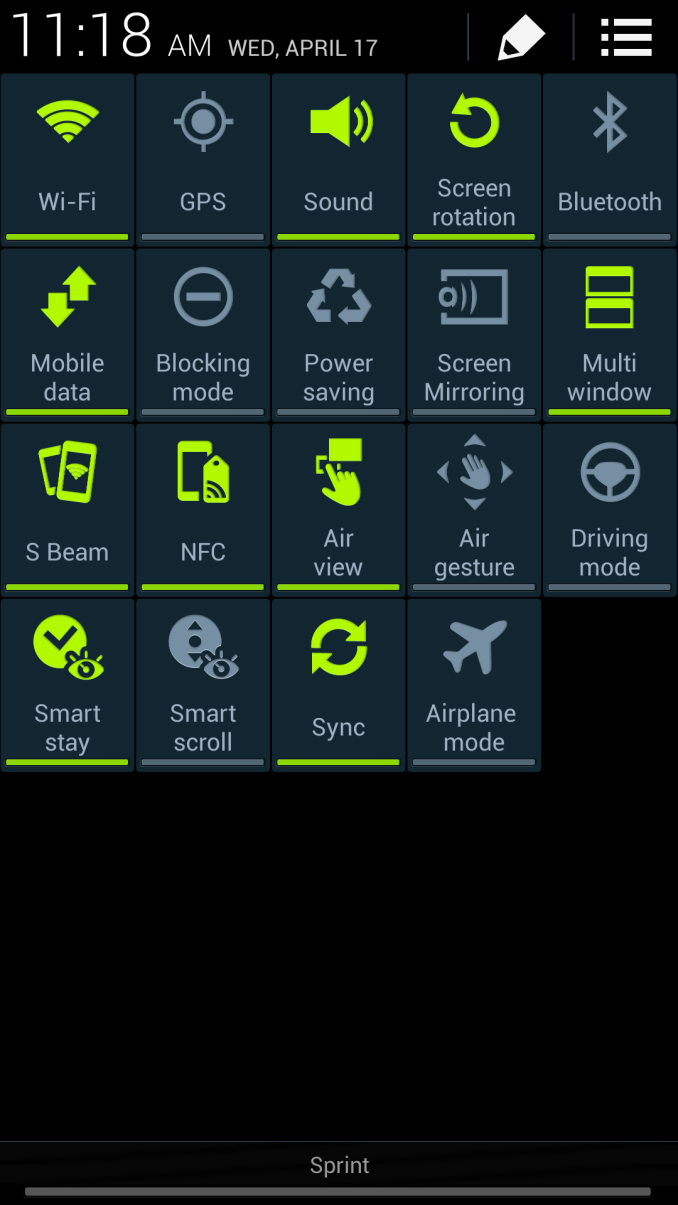
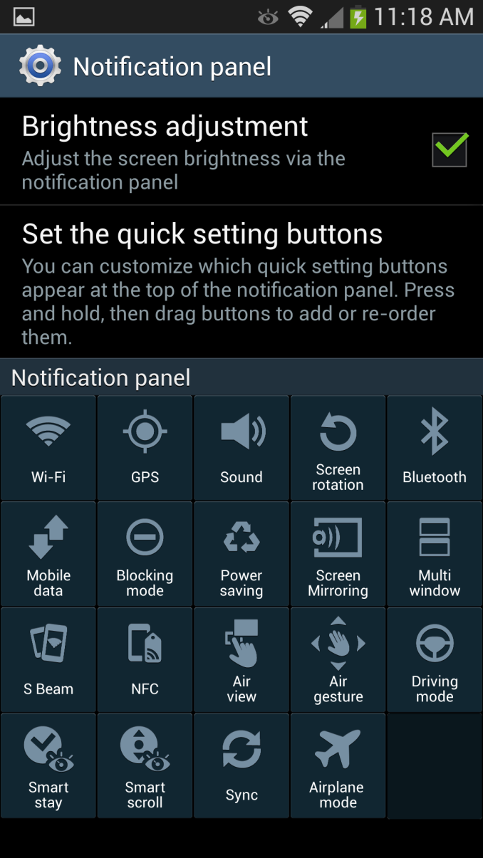
What gets a big change on SGS4 is the notification panel, which builds on the stock 4.2.x feature with a ton more toggles (19 of them). It's almost overwhelming at first, of course you can still get to these by scrolling the top settings pane left and right just like in the previous version. These are also customizable.
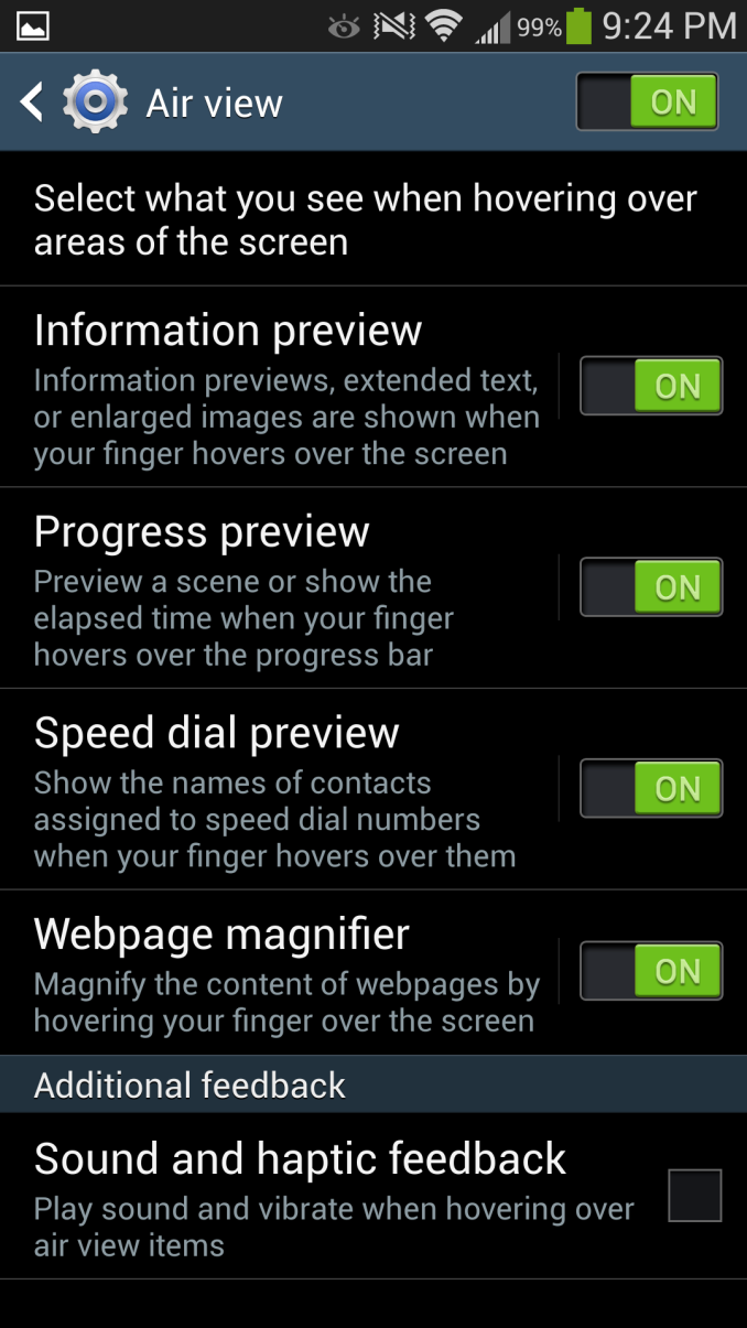
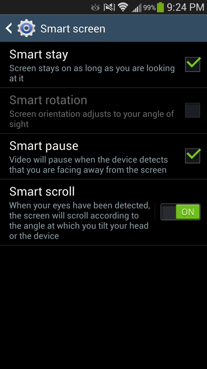
Also present are Air View which works with the new generation of Synaptics touchpad to detect a finger hovering over some part of the display. Basically all of the first party Samsung applications have some sort of Air View functionality, exposing either additional information, a preview, or zooming (in the browser) content when you hover your finger over a region for an extended period of time. I find it difficult to hover my finger over the screen without touching it, but in the gallery and sock browser it is admittedly sometimes useful. Smart pause and Smart scroll also are new features which build on the eye and head tracking features built into the hardware and exposed previously as Smart stay. I found that Smart scroll does work in the browser surprisingly well for scrolling content, you have to look pretty fiercely at the bottom or top regions, but it works. Smart pause works, but I sometimes had issues with it pausing while I was still looking at video, either in YouTube or the gallery. Of course both of these rely on the front facing camera and need your face to be well exposed.
I think credit is due to Samsung for at least trying to convey a useful software and feature side of the story for the hardware – after all, if it's there, you need to demonstrate it.
I also like that the multi window functionality carries over to SGS4. My use case frequently involves looking at twitter and the web side by side, which is perfect with the official Twitter client and Chrome, or Falcon Pro and Chrome. I wish my IM client of choice (imo.im) worked with this feature so I could have chat side by side with another application, that would really sell me on TouchWiz delivering something which functionally changes my use patterns above other variants.
I should say that despite our limited time with the device, Samsung took a step in the right direction by giving us a week with the Galaxy S 4. I still believe that flagship devices need about a month of real use for a complete evaluation, but at least we had more than a couple of days with the Galaxy S 4. There's still a lot more we want to do on SGS4 and even though this is our review there's still more that needs to be fleshed out. For now, think of it as a part one of sorts. There's also the Exynos 5 variant of the SGS4, which is the device both Anand and myself are really interested in.
Now for the bad news. According to Samsung PR, in an effort to get us a device as soon as possible an unusual sacrifice had to be made: our Galaxy S 4 review sample operates exclusively on the Sprint network. AT&T, T-Mobile and Verizon review units would soon follow (apparently there were a handful of T-Mobile review units set aside for specific sites at the behest of T-Mobile), but for now all we've got to review is the Sprint Galaxy S 4. Like the 3rd generation model that preceeds it, the Galaxy S 4 ships with identical specifications across all US mobile operators - so the hardware here should be identical to what you'd get on AT&T or any of the other operators. The downside is that it's near impossible to use the Galaxy S 4 as a stand-in for any other device in our normal day to day usage thanks to just how bad Sprint's cellular performance is on 3G/EVDO, especially in my market:
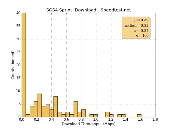
Obviously in areas where Sprint has LTE deployed the situation should be better, but as we found in our early testing of Sprint's LTE network that is not necessarily the case - not to mention the bigger issue being that Sprint LTE just isn't widely available at this point. None of this really matters to the Galaxy S 4 as a device, but it does prevent us from investigating a lot of the things we normally would in the process of reviewing a flagship smartphone, to say nothing of impacting the ability to offer our thoughts about using it as a real daily driver.







335 Comments
View All Comments
tarun.chatwith - Wednesday, April 24, 2013 - link
HTC One without a doubt.Enough of plastic
FITCamaro - Wednesday, April 24, 2013 - link
You're just going to wrap it in a plastic/rubber case anyway most likely. So to me it's not much of an issue. I just got a new phone at work and went with the Note 2. Loving it so far. A tad large but I have big hands anyway and can text with holding it in one hand so I'm good.UpSpin - Wednesday, April 24, 2013 - link
Don't generalize. I never used a plastic/rubber case or a screen protector, only used a sleeve/bag to protect and clean the display while in the my pocket. You might enjoy plastic, others enjoy aluminum. Both materials have their advantages and disadvantage, in the end it's a personal decision. However aluminum looks and feels more expensive and looks of higher quality, and considering the price you pay for such a smartphone, it's understandable that people want that the device looks the way it costs.danbob999 - Wednesday, April 24, 2013 - link
It's a phone. Why would you care how expensive it looks?DigitalFreak - Wednesday, April 24, 2013 - link
VanityThud2 - Thursday, April 25, 2013 - link
The vanity of trying not to appear vain.darwinosx - Wednesday, April 24, 2013 - link
Because when you pay money for something you want it to look and feel good. Obviously.Notmyusualid - Wednesday, April 24, 2013 - link
+1danbob999 - Wednesday, April 24, 2013 - link
Even if it means being larger, heavier, with a smaller display, a smaller battery, and no more resistant?UpSpin - Wednesday, April 24, 2013 - link
But this isn't the case here. It has a larger bezel because of dual front speakers which are obviously better than mono back speakers. As long as it's comfortably weighted, heavier doesn't mean worse. (see complaints about too light iPhone). The display is smaller, but the size is a personal decision. The battery life is identical or even better, not worse. The shiny plastic gets easier dirty, is softer and easier to scratch than the anodized aluminum, it's also easier to break thin parts of the frame and thus buttons than to break a unibody case. But alumium is easier to dent.