AT&T's HTC One X Gets Updated, Changes Task Switcher Button, Coming to all One S and X Devices
by Brian Klug on August 4, 2012 3:40 AM EST- Posted in
- Smartphones
- AT&T
- Update
- Mobile
- Android 4.0
- HTC One
Probably one of the most interesting and controversial decisions about the HTC One series involves something as basic as button placement. Rather than use on-screen buttons like the Galaxy Nexus, the HTC Ones implement back, home, and task switcher as capacitive buttons below the display, concurrent with the official Android platform guidance that deprecates the menu button. The result is the official version of Google's vision for button placement. Official platform direction is one thing, however many real Android applications still haven't implemented the action bar and instead use a menu button for legacy reasons. The result is that HTC shows a small black action overflow bar with the menu button in many applications. At the end, you get a UI with the same vertical pixels lost on rendering on-screen buttons.
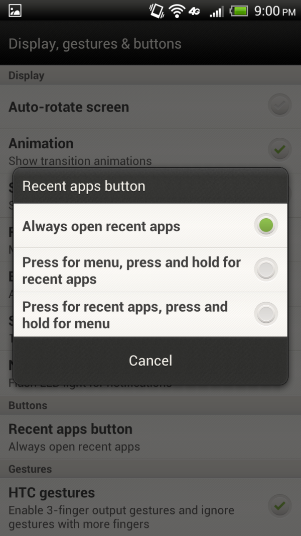
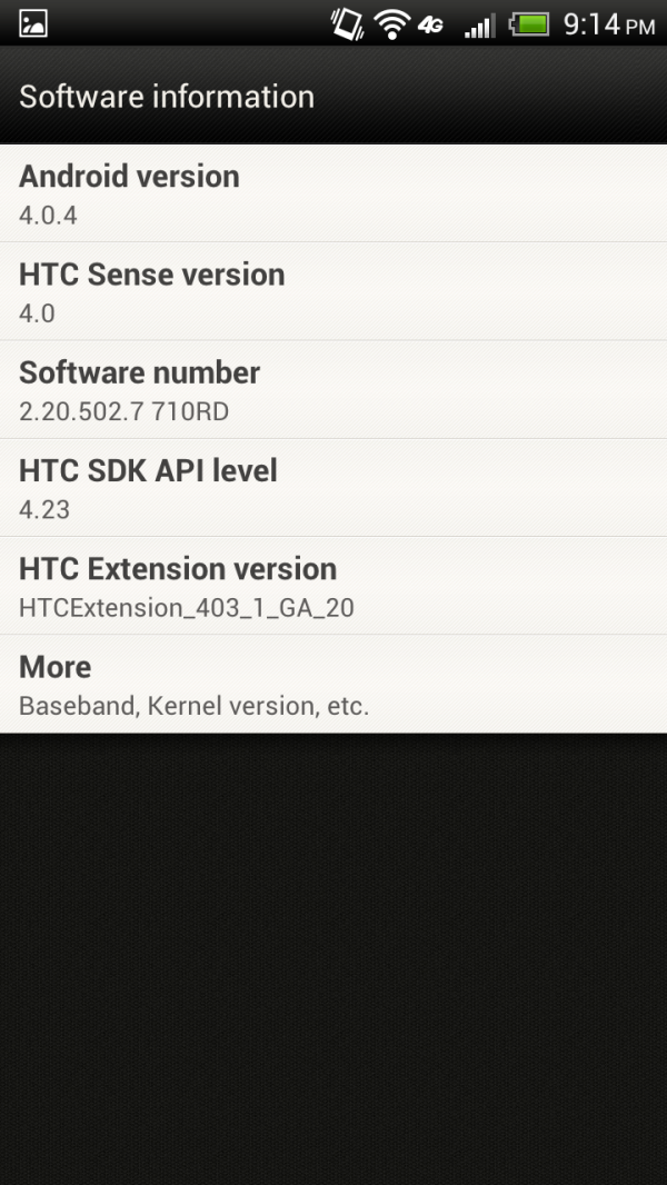
On August 2nd, AT&T started pushing out an update which bumped the Android platform version from 4.0.3 to 4.0.4. In addition to further improving WiFi connectivity and stability (a changelog is below), the update adds a new tab under settings which lets users change the function of the task switcher button. Users can now optionally choose to have the task switcher button act as a menu button, with long press activating the switcher. Choosing one of two options as shown above removes the maligned menu button entirely. This is a much needed change that remedies probably the most outstanding user complaint.
New features:• Additional NFC Capabilities• More content choices in HTC Hub• Car application update to provide access for third party music applicationsFixes/Updates:• Wi-Fi connectivity improvements• Improved Bluetooth automobile compatibility• Increased 3G/4G connectivity• HTC Sense improvements• Contacts synchronization enhancements• Network time correction
What's especially surprising is that the AT&T HTC One X (MSM8960) was first to get this update, instead of the International HTC One X (Tegra 3). We reached out to HTC who confirmed that all HTC One S and One X devices will get this update which adds the option to re-purpose the task switcher button. No word yet on other Ones or the EVO 4G LTE.


16 Comments
View All Comments
leexgx - Saturday, August 4, 2012 - link
glad they are offering this but need to fix some software issues (ok they can't fix the power button and vol placement)after playing with an Samsung s3 the HTC ONE x seems half baked
power button placement not well thought out for the size of the phone (Samsung worked that out on the s3,)
the cam geo tag GPS Feature does not work correctly on the one x(you have to open google maps first get an GPS fix and then open the cam software so it uses last known GPS lock, as its not using the GPS like my old HTC desire and most others phones use actively GPS when taking picture when Geotaging is on)
WiFi and mobile turns off at night to about 6am even when plugged
the phone seems to have been made for left hand users as well, power button is on the top right should be top left or the right side of the phone,(vol is norm on the left side of the phone) the hang up and answer has been flipped (answer should be on the left and hang up on the right as that's how all phones are first 4 times I did it I was dropping the call it's still incorrect way when the phone is unlocked as well ) if your an left hand phone user you love this phone
some other things as well above is the main issues
bearxor - Saturday, August 4, 2012 - link
It's amazing how much I disagree with you about the power button. The power button should be on the top.I can't count how many times I've tried to turn off the GNex and ended up lowering the volume or taking a screenshot. And not being able to power or off because I'm squeezing one of the volume buttons while trying to press the power button.
RaLX - Saturday, August 4, 2012 - link
It's funny how I partially disagree with both of you. I prefer the right side power button (as in Galaxy Nexus) for larger phones because it's awkward to reach the power on top with one hand. At the same time if the power button is on top I definitely prefer the right side once again because even if I'm right handed I mostly use the phone one handed with my left and I was never able to easily reach the top left power button in the only phone I've seen with this disposition recently, the Sony Xperia S.Belard - Monday, August 6, 2012 - link
You are all wrong.Samsung has the best arrangement with the power button on the side, vol buttons on the left side. This is for right handed people (but the phone is in the left hand).
Because of the power button arrangement on the HTX One X (actually ALL HTC phones) at the top is why I didn't buy it. Its a stretch to reach it. The power connector on the HTX is odd at the side, which means it could be in the way of your hand if you are charging your phone.
Apple Phones home button makes things easy because its in the front. And the SGS3 puts a home button on the front as well, which is nice.
But it looks like I'll get the Motorola Atrix HD which has power/VOL buttons on the right side. Having the vol. button there is a bit awkward after 2 years of Samsung... but I think it'll be fine.
PS: Funny thing on Lumia900 phones... pressing all the buttons on the right side at the same time will factory reset the phone - DELETING all the data from the phone. No warning, no confirmation... gone.
kmmatney - Monday, August 6, 2012 - link
All of you are wrong. Wherever the iPhone 5 buttons are will be the best way.nafhan - Tuesday, August 7, 2012 - link
On 3.5" to 4" screen phones, the top is a great place for a power button, IMO. Could definitely see it being an issue with larger phones, though.KamikaZeeFu - Sunday, August 5, 2012 - link
I use my phone right handed. Volume is perfectly placed to be used by my thumb. I also use the power button with my thumb, so no problems here as a right handed person :Dmfenn - Saturday, August 4, 2012 - link
First paragraph, the word you are looking for is "deprecates".MadMan007 - Saturday, August 4, 2012 - link
No! The menu button is worth less now.seamonkey79 - Saturday, August 4, 2012 - link
That's how the menu works on my Nexus 7 with the tablet interface while running Paranoid Android. It's a not bad solution for some of the kludge remaining because app developers haven't fixed stuff to not need the menu button. Touch and it pops up recent apps and long press it pops up the menu for apps that still have it. I do have to turn the tablet interface one, it's not set that way for the 'phablet' interface, but it's a step.