ASUS Eee Pad Slider Review
by Anand Lal Shimpi on October 4, 2011 6:48 PM EST- Posted in
- Tablets
- Eee Pad
- Tegra 2
- Asus
- Honeycomb
- Mobile
- Android 3.2
- Eee Pad Slider
- NVIDIA
I understand the appeal of tablets. Regardless of OS, they all provide a far more intimate experience when browsing the web and reading emails. I genuinely prefer doing both of those things on a tablet than on a notebook or desktop. Then there are the apps. Photos, maps, ebooks, videos and even IP cameras are comfortably accessible from tablets. Obviously you can do the same on a notebook or desktop, the tablet form factor combined with a responsive touch UI simply means you can do these things in a more relaxed position.
What has always frustrated me with tablets however is what happens when you have to give any of these apps a significant amount of input. While the virtual keyboards on tablets are pretty mature, the form factor doesn't allow for quick typing like on a smartphone. A smartphone is easily cradled in both of your hands while your thumbs peck away at the keyboard. A tablet however needs to be propped up against something while you treat it like a keyboard. Put it on your lap and you have to hunch over the thing because the screen and input surface are on the same plane (unlike a notebook where the two are perpendicular to one another). Try to type in a reclined position on a couch and you end up lying awkwardly with your thighs and thumbs supporting the tablet. Ever see the iPad billboards and note the really awkward leg placement in them?
The excuse for the tablet has always been that it's a consumption device, not one for productivity. But what if I want to browse the web and respond to long emails? Must I keep switching between a tablet and a notebook, between consumption and productivity device? That has always seemed silly to me. In striving for comfort and efficiency it seems that having to constantly switch between two large devices would be both uncomfortable and inefficient. After all, who browses all of the web then switches to only writing emails without intermixing the two. Perhaps these discrete usage models are somewhat encouraged by the lack of true multitasking (rather than task switching) of modern tablet OSes, but eventually things must change.
Windows 8 alone will bring change as it finally addresses the issue of having two things on your screen at once. On today's tablets, for the most part, once you're in an application that's all you get to interact with. One of the biggest issues I have is it's virtually impossible to carry on an IM conversation on a tablet while doing anything else. Without constantly (and frustratingly) switching between apps, it's impossible to have a conversation and browse the web for example.
What about on the hardware side of things? Bluetooth keyboards and keyboard docks have existed since they very first of this new generation of tablets hit the market. These accessories have all been very functional but they do tend to hinder the portability of tablets. With its Eee Pad Transformer, ASUS addressed the issue by offering a keyboard dock that would turn the tablet into an Android netbook while extending its battery life. The end result was an extremely flexible device, but it still required that you either carry around a significantly bulkier tablet or made a conscious decision to take one or both pieces of the setup (tablet + dock).
Continuing down this road of experimenting with transformable tablets, ASUS' next attempt to bring the best of both tablet and netbook worlds comes in the form of the Eee Pad Slider.
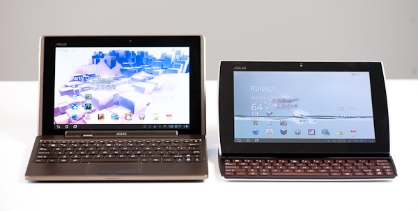
Eee Pad Transformer + Dock (left) vs. Eee Pad Slider (right)
The Slider takes the same basic Eee Pad tablet from the Transformer and integrates a slim, sliding keyboard. You only get a single battery (25 Wh) but you get a much thinner and lighter form factor than the Transformer with its dock.
| 2011 Tablet Comparison | ||||||
| ASUS Eee Pad Transformer | ASUS Eee Pad Transformer + Dock | ASUS Eee Pad Slider | Samsung Galaxy Tab 10.1 | |||
| SoC | NVIDIA Tegra 2 (Dual ARM Cortex A9 @ 1GHz) | NVIDIA Tegra 2 (Dual ARM Cortex A9 @ 1GHz) | NVIDIA Tegra 2 (Dual ARM Cortex A9 @ 1GHz) | NVIDIA Tegra 2 (Dual ARM Cortex A9 @ 1GHz) | ||
| GPU | NVIDIA GeForce | NVIDIA GeForce | NVIDIA GeForce | NVIDIA GeForce | ||
| RAM | 1GB | 1GB | 1GB | 1GB | ||
| Display | 1280 x 800 IPS | 1280 x 800 IPS | 1280 x 800 IPS | 1280 x 800 PLS | ||
| NAND | 16GB | 16GB | 16GB | 16GB | ||
| Dimensions | 271 x 175 x 12.95mm | 271 x 183 x 16 - 28mm | 273 x 180.3 x 17.3 - 18.3mm | 256.6 x 172.9 x 8.6mm | ||
| Weight | 695g | 1325g | 960g | 565g | ||
| Price | $399 | $550 | $479 | $499 | ||
The price isn't as attractive as the base Eee Pad Transformer. At $479 for the 16GB WiFi version you're now well into Galaxy Tab/iPad 2 territory, but you do get a built-in keyboard. Samsung's keyboard for the Galaxy Tab is priced at $50 while Apple's Bluetooth keyboard for the iPad 2 (and Macs) will set you back $70. When viewed this way, the Slider is still a steal but if the recent TouchPad sale and Kindle Fire release taught us anything it's that there's a huge market for non-Apple tablets, just not at $500. ASUS was on the right track by pricing the Eee Pad Transformer at $399, but the Slider at $479 takes a step in the wrong direction.
The Display & Hardware
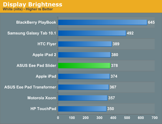
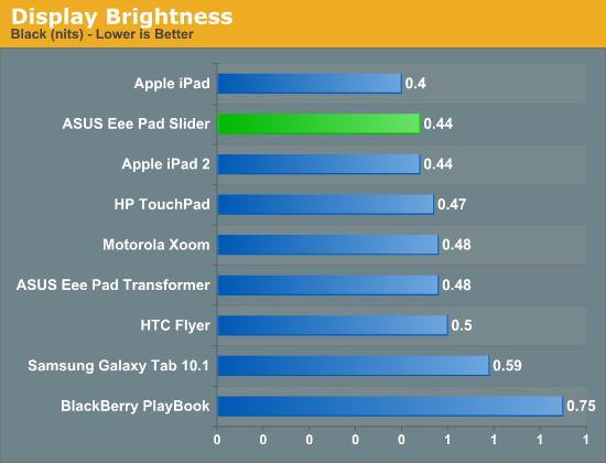
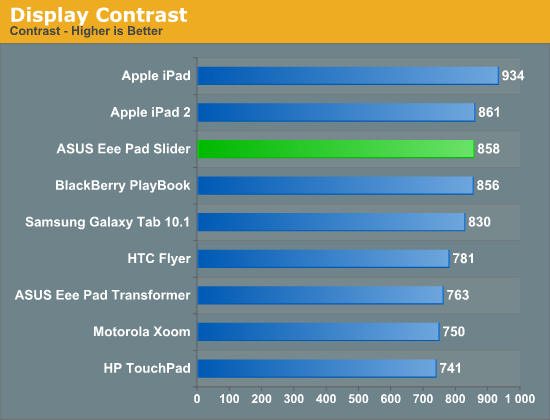
The Slider starts out very similarly to the Transformer. You get a 10.1-inch IPS panel with a Honeycomb-standard 1280 x 800 display (1920 x 1200 will be what the next-gen of Android tablets will sport). The display is near-identical to what ASUS used in the transformer. Max brightness ends up at an iPad 2-like 378 nits, while overall contrast ratio appears to have improved a bit thanks to deeper blacks in our review unit's panel.
ASUS does need to start calibrating these panels at the factory though. The Slider's white point is set to 7700K.
Viewing angles are all great, the only issue with the Slider's display is the large gap between the outermost glass and the LCD panel itself. We complained about this in our Eee Pad Transformer review as well, but by not tightly integrating the LCD and capacitive touch layers you end up with a gap in the display construction that can cause annoying reflections. The additional glare is a problem in any case where there's a direct light shining on the screen. Most of these tablets aren't good outdoors in direct sunlight to begin with, but this issue does make the Slider a bit more annoying to use compared to the iPad 2 or Galaxy Tab 10.1 for example.
All of the outward facing materials are either glass or soft touch plastic, a subtle but noticeable improvement over the Transformer. The smell of the soft touch plastic is distinct but not all that pleasant. Here's hoping it fades quickly. The durability of the soft touch coating is also a concern. My review unit developed a couple of scratches and I honestly didn't use it any differently than the other tablets I've reviewed, nor did I handle it particularly roughly.
ASUS was smart enough to include five rubber feet on the back of the Slider. With the keyboard deployed the Slider's back serves as its stand, so the feet are necessary to keep your Eee Pad pristine. The overall design is clearly ASUS' own creation, but I wouldn't call it particularly memorable. What matters the most is that it's functional and there can be no question of that.
The perimeter of the Slider is ports-a-plenty. On the right edge of the tablet is a full sized USB 2.0 port and headphone jack. On the left there's a microSD slot and along the top there's ASUS' dock connector and mini HDMI out (type C connector). Charging is handled via the same USB adapter that shipped with the Eee Pad Transformer.
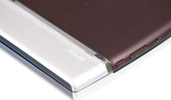
Power, reset and volume up/down are also located on the left side of the tablet. Yes, that's right, there's an actual reset button on the Eee Pad Slider. The button is recessed as to avoid any accidental activation. A single click of it will reset the Slider, no questions asked.
I'm actually very happy there is a reset button the tablet. As these devices become even more PC-like expect them to encounter the same sort of stability issues any hardware running complex software has to deal with.
The Slider has two cameras: a 5MP rear facing module and 1MP front facing unit. There's a subtle, smartphone-sized bulge around the rear camera module. The bulge is noticeable but it doesn't clear the height of the rubber feet so you don't have to worry about resting your tablet on the rear camera.
The Slider is significantly heavier than the stock Eee Pad (without dock) for obvious reasons. And compared to the Samsung Galaxy Tab, well, there's just no comparison there. That being said, the Slider is still much nicer to carry around that the Eee Pad + dock (it's far less bulky) and it's more convenient than most notebooks in this price range. You really do get the full tablet experience with much of the notebook experience thanks to the integrated keyboard.




35 Comments
View All Comments
secretmanofagent - Tuesday, October 4, 2011 - link
"The keys are hardly full sized, I measured x mm compared to mm on Apple's chiclet keyboard."Should there be numbers there?
Anand Lal Shimpi - Tuesday, October 4, 2011 - link
Yes there should, fixed :)Take care,
Anand
Death666Angel - Tuesday, October 4, 2011 - link
"I measured 14 x 11mm compared to 16mm2 on Apple's chiclet keyboard."Do you spot the mistake? In this scenario, the Apple keyboard has keys which are 4mm x 4mm = 16mm², whereas the Asus has 14mm x 11mm = 154mm². You probably meant to write (16mm)² or somesuch. :D
Anand Lal Shimpi - Tuesday, October 4, 2011 - link
err you're very right, fixed again :)Take care,
Anand
Zink - Tuesday, October 4, 2011 - link
So in depth. Are you using a teleprompter?tsnorquist - Thursday, October 6, 2011 - link
Of course not, he's not the president =)mythun.chandra - Tuesday, October 4, 2011 - link
Good job on the video/review! :)Hope to see more of them moving forward.
Death666Angel - Tuesday, October 4, 2011 - link
"the tablet form factor combined with a responsive touch UI simply means you can do these things in a more relaxed position."All you people seem to have quite uncomfortable desks! :D The only place that is more relaxing and comfortable in my house than my desk and desk chair is in bed, snuggling with my wife. ^^
quiksilvr - Tuesday, October 4, 2011 - link
The Transformer with Dock is 2.9 lbs. This slider is 2.1 lbs. Yes it is cheaper than Transformer + dock but I have seen combo sales all the time, and considering the holiday season coming up, I wouldn't be surprised to see Transformer + Dock selling for $399 with a case for good measure.To me, thickness isn't really an issue with something like a tablet. It's 10 millimeters thicker (barely 0.4 inches), but you get:
1) An extra USB port
2) A full SD card slot
3) A trackpad, giving a much more PC feel
4) Pretty much the equivalent of "lugging" a light netbook around
5) Ridiculously high battery life (that in itself is worth the extra $70. 15 hours vs 7 hours is a no brainer)
So in short, I would recommend the Transformer + dock when there is a sale. Newegg had a combo sale for those two for $399 (not anymore) so that gives me high hopes for this holiday season for other retailers to mimic it.
TrackSmart - Tuesday, October 4, 2011 - link
I'm glad the Transformer serves you well, but I've already got a laptop that weighs just 3 lbs.The idea of a 2.9 lb (or even 2.1 lb) tablet with keyboard is not appealing. It's basically laptop weight, but not as useful for real work due to the limitations of Android/IOS productivity software.
My ideal tablet would be less than 1 lb and have a much smaller form factor. Imagine how small the 7" galaxy tab would be if it had hardly any bezel. It would be about 4" x 6" and about 12 ounces. The size would be perfect for rapid thumb typing. And I could fit it into a coat pocket. Perfection.