Samsung TouchWiz UX Review: Honeycomb Gets Skinned
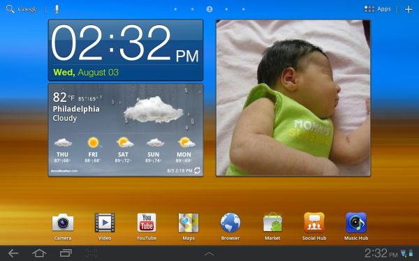
by Jason Inofuentes on August 5, 2011 11:52 AM ESTIt wasn’t long after the thinner, lighter, better Galaxy Tab 10.1 was announced that we heard Samsung would bring its TouchWiz skin to Android’s tablet OS, Honeycomb. After much debate over whether Honeycomb was truly ‘open,’ and not a closed iOS like environment, here we are. Starting today, Samsung Galaxy Tab 10.1 owners will start to see OTA updates pushed to their devices, offering the first skinned Honeycomb experience. We’ve got it now, and this is more than just a few widgets. Was it worth the wait, or will users avoid this optional update as long as they can?
Skins are Evil/Great
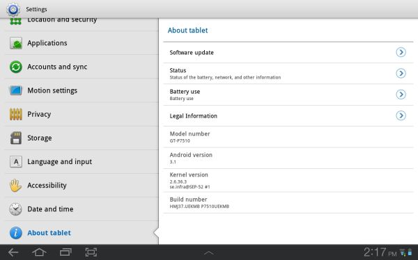
Let’s go over a few things that this update is not. This update is not Android 3.2; however, we did receive assurances that the heavy lifting for TouchWiz has already been done so there should be no delay in rolling out 3.2 and it’s graphics and UI enhancements. This update is not a cure for all the bugs that continue to ail Honeycomb; the occasional sluggishness and random Force Close events persist. This update is not a lag inducing crime against Android users; any enhancement that burdens the CPU or GPU at all will inherently result in some worsening lag, either in the UI or in opening, closing or using apps. But the lag we’ve seen is nothing too jarring, nor is it so far off from what’s normally found on Honeycomb. So, what is this update? Samsung described three key areas they wanted to enhance with what’s known now as TouchWiz UX; Ease of Use, Fun and Entertainment, Open for Business. By far, the most outward of these enhancements is Ease of Use, so we will start there.
Widgets and Apps
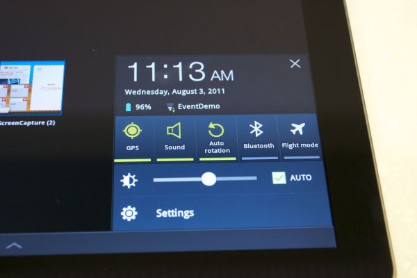
TouchWiz introduces three major enhancements, LivePanels, MiniApps and the Quick Panel. The last is the simplest of the lot and the easiest to dispense with; the same set of toggles we’ve seen stuffed into most skinned UI’s on Android is now present within the Notification shade, allowing users to manipulate all the devices radios, volume, screen brightness and vibrate functions with just a press. Hardly revolutionary but a good way to bring up some settings that were previously buried in menus.


![The Task Manager MiniApp alone on one homescreen [above], and then overlaid over another homescreen with populated widgets [below].](https://images.anandtech.com/doci/4582/Mini App Task manager and overlaid_575px.jpg)


30 Comments
View All Comments
migfig - Friday, August 5, 2011 - link
And your closing statement for TouchWiz on Honeycomb is about Appple? smhzeagus - Friday, August 5, 2011 - link
I think it's a valid point. The only competition is Apple, and the ending thought, though perhaps strangely structured is that the author hopes this helps Android devs to be able to do amazing things to compete and to keep the level of competition high so we, as consumers win. They need to do something, since the numbers backtracking game shows that something like 964 of every 1000 tablet pageviews on the web is viewed from an iPad.amf66 - Friday, August 5, 2011 - link
Did you even read the last paragraph? It's about how competition is good and how he hopes that innovation in Android will force Apple to innovate as well.Lurk moar.
FlyBri - Friday, August 5, 2011 - link
TouchWiz is not the first skinned Honeycomb experience...the Asus Transformer had the first skinned Honeycomb experience. It might have been lightly skinned, but skinned nonetheless.mlj11 - Friday, August 5, 2011 - link
"Samsung is also launching a device recovery service, courtesy of their Samsung Dive website... This service is premiering on the 10.1 but will be available on future Samsung handsets and tablets."Incorrect. This has been available on my international SGSII out of the box.
Also, I think Samsung's Bada phones may have had access to it even earlier.
mongo lloyd - Friday, August 5, 2011 - link
Yeah. It's been available on the original SGS (international version) for a while as well.solipsism - Friday, August 5, 2011 - link
… it's about the competition getting a real slice of the tablet market. The way things are going and the aggressiveness Apple showed at their iPad 2 special event earlier this year points to Apple wanting the iPad to be another iPod in market dominance, not an iPhone.Even though the iPhone does take 2/3rds of the world's handset profits Apple move is clearly to make the tablet market an iPad market with not only revenue and profit domination, but unit marketshare domination. A natural monopoly. The window for non-Apple tablets is closing.
If Apple can release a 2048x1536 iPad for the same price points it's a done deal for the foreseeable future.
JasonInofuentes - Friday, August 5, 2011 - link
We're hoping that's not the case. As Brian has pointed out, the lead time on tech innovation has typically been about 15-18 months. This appears to be getting faster. In addition, the fierceness of the competition has made each of these manufacturer's try harder, both in the phone and tablet space. HTC is putting out some stunning designs with a variety of body types and construction techniques. Motorola has produced consistently effective designs and strived to stretch Android beyond the phone with WebTop. Samsung has produced a stunning device that will, eventually, be available on every US carrier, as it did with the first Galaxy S. Even LG has strived to innovate with the first dual-core phone (ostensibly) and the first 3D phone.So basically, as much as my review ends on a bit of a down note, every single one of these manufacturers is running on all eight cylinders. They are racing to the finish, and we're going to get to enjoy the ride.
name99 - Saturday, August 6, 2011 - link
You're assuming that people buy tablets because of the hardware. This seems a dubious assumption.What Apple HAD in the past was
- hardware that worked well and did not feel cheap. The competitors are headed there but aren't there yet
- software that worked well. The competitors aren't close to that (read this review, which is full of apologies for crashes, slowness, poor resource usage), and by the time they have reached where Apple is now, iOS will be at version 5.
- a media infrastructure that works well. Android still doesn't have that; what they have is a bunch of more or less lame media player apps, and a completely fragmented media market.
What Apple WILL have soon is iCloud, not in the stupid sense of a smarter dropbox, but in the sense of an infrastructure (servers, protocols, APIs, design patterns) to allow apps on multiple devices to synchronize their behavior. Naturally Android (and MS) will try to copy it, but once again they will be lagging Apple by a year.
cr1b - Sunday, August 7, 2011 - link
Win 98 is fast but its very ugly. The same on iOS. Comeon man iOS only have to show 5 screens of icons with no widggets or animations and for the price of the devices its the minimal result that they can deliver.I give you the web browsing experience witch in better but no more.