T-Mobile MyTouch 4G Slide Review - Photographers Wanted
by Vivek Gowri on August 12, 2011 8:45 PM EST- Posted in
- Smartphones
- Snapdragon
- HTC
- 4G
- Mobile
- T-Mobile
- MyTouch
- Slide
When T-Mobile launched the G2, I was super psyched. It was an HTC-designed slider, ran the stock Android UI, and happened to be one of the first phones running Qualcomm’s 2nd-generation Snapdragon (S2) chips. I was so psyched that I ended up buying one, three days before launch (thank you Radio Shack!) I must say, I loved that phone. The hinge mechanism was an initial concern for me, but the rest of that phone was absolutely brilliant. I still regret selling it to buy an HD7, but I had some major durability issues with the hinge. It started loosening up majorly after the four month mark, and it was out of my life by month five. If HTC had seen fit to equip it with a normal spring-loaded slider, I would almost definitely still have it.
T-Mobile EOL’d the G2 last month, and I was sad to see it go. But it set the stage for the MyTouch 4G Slide, which released last week and on paper looks like the ultimate slider phone. There’s one dual-core Snapdragon S3 processor, one real slider with one brilliant HTC keyboard, and one very highly touted 8.0MP camera. It joins the HTC Sensation and the T-Mobile G2x atop the T-Mobile smartphone list.
| Physical Comparison | ||||||
| T-Mobile MyTouch 4G Slide | Motorola Droid 3 | T-Mobile G2x (LG Optimus 2X) | HTC Sensation | |||
| Height | 122 mm (4.8") | 123.3 mm (4.85") | 123.9 mm (4.87") | 126.3 mm (4.97") | ||
| Width | 66 mm (2.6") | 64.1 mm (2.52") | 63.2 mm (2.48") | 65.5 mm (2.58") | ||
| Depth | 14 mm ( 0.55") | 12.9 mm (0.51") | 10.9 mm (0.43") | 11.6 mm (0.46") | ||
| Weight | 184 g (6.49 oz) | 184 g (6.49 oz) | 139.0 g (4.90 oz) | 148 g (5.22 oz) | ||
| CPU | 1.2 GHz Dual Core Snapdragon MSM8260 | 1 GHz Dual Core Cortex-A9 OMAP 4430 | 1 GHz Dual Core Cortex-A9 Tegra 2 AP20H | 1.2 GHz Dual Core Snapdragon MSM8260 | ||
| GPU | Adreno 220 | PowerVR SGX 540 | ULP GeForce | Adreno 220 | ||
| RAM | 768 MB LPDDR2 | 512 MB LPDDR2 | 512 MB LPDDR2 | 768 MB LPDDR2 | ||
| NAND | 4 GB NAND with 8 GB microSD Class 4 preinstalled | 16 GB NAND, up to 32 GB microSD | 8 GB NAND with up to 32 GB microSD | 4 GB NAND with 8 GB microSD Class 4 preinstalled | ||
| Camera | 8 MP AF/Dual LED flash, f/2.2, 1080p30 video, VGA front facing | 8 MP with AF/LED Flash, 1080p30 video recording, VGA (0.3MP) front facing | 8 MP with AF/LED Flash, 1080p24 video recording, 1.3 MP front facing | 8 MP AF/Dual LED flash, VGA front facing | ||
| Screen | 3.7" 800 x 480 S-LCD | 4.0" 960 x 540 RGBW LCD | 4.0" 800 x 480 LCD-TFT | 4.3" 960 x 540 S-LCD | ||
| Battery | Removable 5.62 Whr | Removable 5.65 Whr | Removable 5.6 Whr | Removable 5.62 Whr | ||
The easiest way to describe the MyTouch 4G Slide (referred to as either the Slide or the MT4GS from here on) is that it’s basically a MyTouch 4G with Sensation internals and a physical keyboard. All three are HTC devices, so the use of Qualcomm processors and some form of Sense along with a general recycling of parts is a given, but even by those standards, the accuracy of that statement is striking.
Dimensionally, the MyTouch 4G Slide is pretty similar the original MyTouch 4G, with the Slide adding four millimeters to the width and three mm to the thickness to accommodate the hardware keyboard, but otherwise sharing a very similar look from the front. That three millimeter difference makes a surprisingly big difference in how the Slide feels, it’s definitely a bulky phone compared to the supermodel thin slates releasing currently. Even against another landscape slider like the Droid 3, it definitely feels large.
Now, where this becomes a problem is in how much wasted space there is in the MT4GS design. The Droid 3 and the Slide are basically the same dimensionally, just a fraction here or there separating them - the D3 is 2mm taller, 2mm narrower, and 1mm thinner. And yet, while the D3 has a 4.0” qHD screen, the MT4GS makes do with the same 3.7” S-LCD WVGA display from the much-more-compact G2. Nothing against that screen, it was pretty good looking, but in this day and age, where the average Android device has a 4” screen, the 3.7”er feels a bit cramped. Think about it - Galaxy S/Nexus S, LG’s high end linuep, most of the new Sony Ericsson devices, and the HTC Incredible S are 4”ers, while the Galaxy S II, Sensation/EVO+, Thunderbolt, Droid 3/Droid X2/Droid Bionic are all 4.3”ers. Even the original MT4G had a larger 3.8” display.
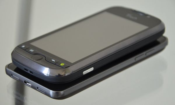
I’m usually not a person that makes a big deal out of the whole screen size thing, especially if the resolution doesn’t change, but the amount of wasted space in the MT4GS is fairly maddening. Here’s a device that has a nearly identical footprint to phones with 4” WVGA (Optimus 2X) and 4” qHD (Droid 3) screens, but has to make do with a 3.7” display because a larger panel wouldn’t fit with the design language. In an era of design minimalism, you know something is wrong when you’re using design details to justify functional shortcomings.
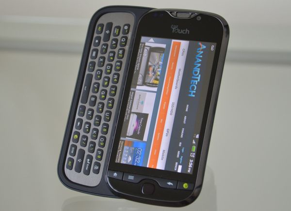
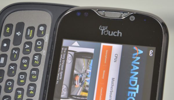
The MT4GS aesthetic is very rounded, with a lot of organic curves and tapering edges. The entire display half of the device is ringed by a ribbon of polished metal that tapers inwards, cutting down on the area of the front face. That’s what I’m referring to with “wasted space” - if that taper isn’t there, there’s easily space for a 4” qHD or WVGA screen. Even then, there’s a decent amount of bezel, especially above the display. The space below the display is well used, with four hardware buttons for Home, Menu, Back, and Voice Command, which replaces the traditional Search button, as well as an optical trackpad. But above the display there’s about half an inch worth of dead space between the speaker grille/front facing camera and the display that basically just has the MyTouch logo. It just serves to make the display look even smaller. The metallic speaker grille is a gaudy piece, a chrome intrusion into an otherwise clean front face. The silver-ringed front facing camera, ambient light sensor, and proximity sensor are next to the earpiece, while the lock/power button and the headphone jack are at the top of the phone, where God intended them to be. The left side has the volume rocker near the top, as well as the micro-USB port near the bottom of the phone, with the mics being located on the bottom of the phone. The right side is completely clean except for the two-step camera button, another button that’s quickly being phased out in Android phones.
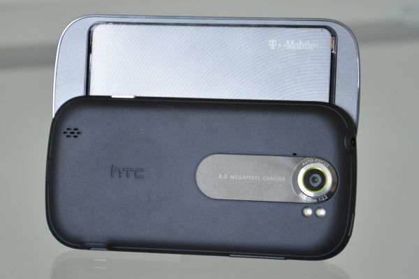
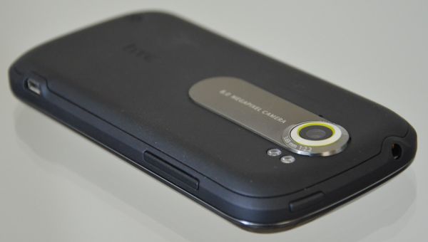
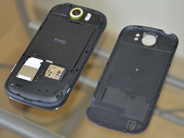
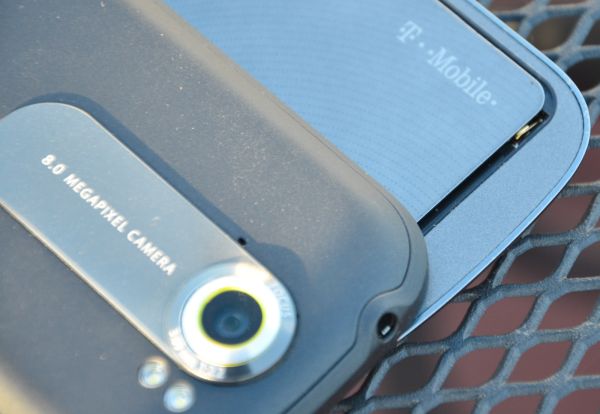
The battery cover spans the entire back of the device and is rendered in a soft-touch black plastic. Near the top, there is a metal surround for the camera. The camera protrudes from the phone, so there’s a cutout in the battery cover for the lens and dual LED flashes, but the tolerances are much tighter than what we saw in LG’s Optimus 2X. Dust is still a concern, but a relatively minor one. The speakerphone is also located on the battery cover, housed behind a grille near the bottom left corner of the phone.
Unlike with the G1 and G2, HTC went for a real sliding mechanism here. The MT4GS has an in-plane slider that isn’t spring-loaded, but has smooth rails and positive detents at both ends of the travel. The operation feels pretty solid and sturdy enough to hold up over the long term.
The industrial design as a whole borrows a lot from the original MyTouch 4G - from the front, it’s really easy to confuse the two. Some of the very minor details are different - the metal ring around display is larger, the shape of the buttons are very slightly different, the chrome earpiece is now a darker polished metal, but we’re talking about things that are really, really splitting hairs. I wasn’t kidding when I said the ID was basically the same for both devices.
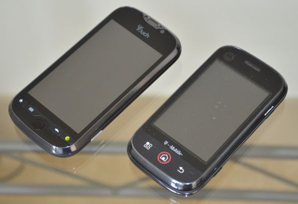
Now with that in mind, look at the similarities between the MyTouch 4G Slide and a much older Android slider on T-Mobile. That’s right, this is the much-maligned Motorola CLIQ (and rightfully so, it was terrible.) The CLIQ was another phone that had a screen too small for the body (read: wasted space), a weird UI skin (Sense 3.0 isn’t as bad as BLUR by any stretch, but we’ll get to the software in a bit), and a rather bubbly-looking industrial design with a lot of soft, rounded edges. The ID isn’t the same, but the MT4GS was definitely “inspired” by the CLIQ. It’s like T-Mobile higher ups were really cut up about the CLIQ’s failure in the marketplace, and had HTC build the ultimate version of that phone. Weird, right?




24 Comments
View All Comments
Impulses - Friday, August 12, 2011 - link
" Anand is going to do a deep dive into the dual-core Snapdragon microarchitecture in our forthcoming EVO 3D review. "Been hoping it'll come out already for a while! Any ETA? Also, can you share some specifics about how the battery tests are run? I'm not doubting the results, I'd just like to do my own testing here, my EVO 3D (which I'm still unsure if I'll keep) doesn't seem to be in the same league as the Sensation despite nearly phenyl identical internals.
Impulses - Friday, August 12, 2011 - link
Great review btw, as always from AT... You guys go into way more detail than anyone else out there, it's really appreciated. I think the software side could use even more depth tho, ultimately people will customize phones and install their own apps, launchers etc but if you're gonna harp on manufacturer skins for what they get wrong, you should also highlight some of the value that some of them do add, beyond the obvious (lockscreen, camera interface, etc.).Take the print feature for instance, I dunno if the MT4G has it but the Sensation and EVO 3D sure do, and it's really really handy... True Wifi printing that works without a computer or a cloud service and seems to work even with older printers (at least it worked with my 5+ year old HP AIO).
Or how about the ringer settings for pocket mode, speaker on flip, and quiet on pickup? How about the power saver mode? Sense's FB contact integration tho done in a less-than-elegant manner (adds a tag to your Gmail contact notes) at a technical level still works better at a user level than FB's own app imo. The calendar is a vast improvement over past versions of Sense, tho I guess that's not saying much since they had really butchered it.
My biggest beef with Sense, besides the launcher (easily remedied) continues to be the browser. Generally it works pretty well, I like the big previews of open windows and bookmarks, the couple extra settings HTC tucks in, and the full screen mode... But why do they continue to limit you to four open tabs/windows at a time?! It's maddening, to an extent it keeps me from leaving stuff I intend to read/do open in the browser forever, but AFAIK everyone else is doing 8 no? 16 on tablets?
FrederickL - Saturday, August 13, 2011 - link
"But why do they continue to limit you to four open tabs/windows at a time?! "
I cannot of course say for certain but might it not be that the average smartphone even high-end still has a relatively limited amount of RAM (max currently AFAIK is 1Gb) and they are concerned about the browser crashing?
Impulses - Saturday, August 13, 2011 - link
Crashing or getting cached out of memory? I rarely see my stock browser crash on Gingerbread, I don't think it happens more than once a month... I used to see it get closed and tossed out of memory a lot on my EVO 4G whenever I switched to other apps (games, gmail oddly enough, or a combination of various apps would often do the trick). On the EVO 3D it seems to rarely happen thanks to the extra memory, which is really nice.I haven't taken notice of how much memory each tab may consume while open, but the browser as a whole usually hovers at around 100MB; higher than most other daily use apps but low enough that it still leaves 100-200MB free (while also having another dozen apps loaded I'm memory, totaling about 150MB). It seems the OS itself and Sense + the stock widgets consumes a beefy 400MB...
I've avoided customizing it too much while I make up my mind about it, freezing the Sense launcher and using ADW with some lighter widgets would probably free up a decent chunk of that 400 MB.
FrederickL - Saturday, August 13, 2011 - link
Yep, I suspect you are right as far as the amount of RAM being used by Sense in Gingerbread is concerned (although I have not had any big issues with my updated Desire Z). Certainly the less than stellar offering from HTC to its original Desire customers of a crippled Gingerbread/Sense upgrade, "install at your own risk", would seem to confirm my suspicions that the producers are (all of them) currently putting the absolute minimum RAM in most of their phones that they think that they can get away with at the time. Until there is a bit more customer pressure over the issue I do not see the tactic changing any time soon. The current attitude of the producers appears to be "if you want more than one upgrade, buy another phone". Given that the price of a modern high end smartphone lies in the range 650 - 800 dollars (unlocked), I find that attitude pretty contemptible. The only reason they can get away with it IMHO is that the US market is the leading market world wide and most in the US buy on a "plan" from the carriers. If a significant proportion of the customers in the US bought unlocked then the producers would probably be experiencing a much more negative attitude from their customers than they currently get.
Impulses - Saturday, August 13, 2011 - link
Problem is there is no incentive to buy unlocked, plans cost the same on all carriers regardless of whether you got a subsidized phone or not. T-mobile's the only exception to that and a) the discount is only like $10 b) it looks like they'll soon be part of AT&T.Nevermind that buying unlocked isn't even an option for customers withe two other major carriers (Version and Sprint), since they use CDMA.
FrederickL - Saturday, August 13, 2011 - link
Indeed, I see your point. That then raises the question of what is going on here with regard to prising. How is it, that there is no "bonus" in regard to plan costs if you buy unlocked? There is something very wrong and illogical with a "market" where that could possibly be the case. It is very strange that a deal that involves signing up for a "plan" which in *addition* provides you with a phone should (apparently) cost you the same as if you bought unlocked and *then* bought your plan. A market where such a phenomenon is possible ought to be the subject of *very* close investigation by the federal competition authorities. There is something that smells here and it is not pleasant.
andrewbuchanan - Sunday, August 14, 2011 - link
Yeah. I am pretty upset with the attitude that one or two upgrades is all you get. But I'm also upset that htc cuts corners.I had an htc dream with android 1.5, it never got any upgrades. Even though the dream got 1.6 on other carriers... The phone had very little internal flash which didn't leave much room for upgrades.
I have an htc desire, which is a nice phone, but they cheaped out on flash so it doesn't have room for htc's version of android 2.3 (the desire z, desire hd, got it because they came out slightly later and have more internal flash).
Anyways, if I had known they would stop supporting the phones after 6 months, I wouldn't have bought them. Carriers push 3 year contracts, but then the phones are only supported for 6 months. I'm sure a motivated individual could sue. And hopefully somebody does.
I'm not much of an apple lover, but they support their stuff for at least 3 years. And the microsoft ones seem to be as well.
Impulses - Saturday, August 13, 2011 - link
It'd be interesting to get those kinda memory usage stats in reviews, it'd probably explain some of the performance drags that manufacturer customizations often incur.FrederickL - Saturday, August 13, 2011 - link
Agreed, that would be most useful information.