The Samsung Galaxy S20+, S20 Ultra Exynos & Snapdragon Review: Megalomania Devices
by Andrei Frumusanu on April 3, 2020 9:30 AM ESTDesign, Continued: An Ultra Mega Phone
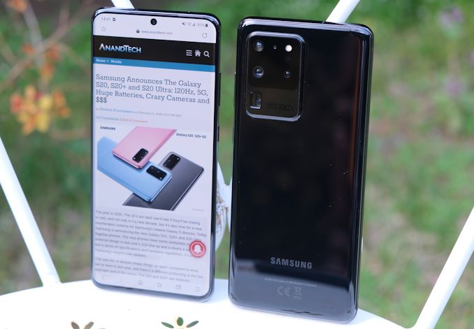
Of course, the flagship entry in the 2020 Galaxy line-up is the Galaxy S20 Ultra. Samsung here literally supersized the design, making a much larger and heftier version that goes beyond what the “regular” plus models offer. While the S20+ fits in the same form-factor as the S10+, the S20 Ultra is clearly a bigger phone, more in line with the behemoth that was the rare S10 5G.
The biggest differences in the design aren’t found in the front of the phone – here the Ultra essentially just looks the same as the other two S20 devices and you’d be hard pressed to tell them apart other than their size. Turn it around though, and you’ll see the Ultra’s enormous camera housing that is very distinct from any other phone on the market.
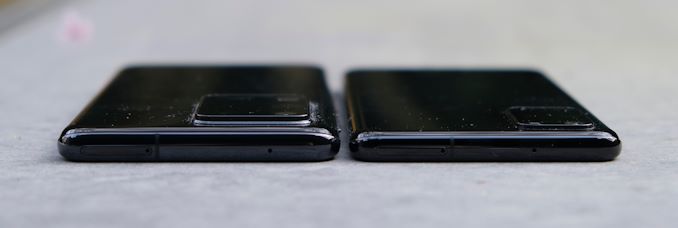
The first thing you’ll notice when handling the Ultra, beyond it having a larger footprint, is that it’s clearly a thicker phone. It’s 1mm thicker than the S20+, which is a 12.8% increase and is very noticeable. The sides of the phones are still curved as on the S20+, however the curve is now deeper, and the metal frame on the side of the phone is a sliver thicker than on the smaller variants.
The ergonomics are still good for a phone of this size, but of course, you’ll need to be used to having a phone this size.
Another aspect where the S20 Ultra just outsizes the S20+ is in terms of weight. At 220g, the phone is much closer in weight to an iPhone Max than it is the lighter, 187g S20+. With the weight does come a larger battery, which is now 5000mAh (typical capacity), an 11% increase over the S20+’s 4500mAh capacity.
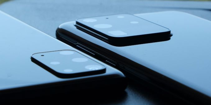
Then there’s the camera bump of the Ultra. There’s no better word to describe it other than "enormous". The problem here isn’t that Samsung had to extend the camera housing thickness in order to integrate the complex camera modules and optics which the Ultra offers, but that they did so in what I find to be a very boring and ugly manner.
Most notably, the rim of the camera housing is just a raised metal element that protrudes out, which is in contrast to the curved design of the rest of the phone. Samsung probably decided that leaving such a big protrusion doesn’t look so good, so they added in another step in the frame between the glass back and the full protrusion – best way to describe it is that it looks like a gasket. The whole thing just looks very cheap and doesn’t compare to the filleted glass design from Apple or even the filleted “gasket” that Huawei uses in the recently announced P40 Pro. My biggest pet peeve about Samsung’s design is that it’s super prone to collecting dust in the three grooves around the camera – both of my S20 Ultras are full of it right now as I’m writing this. It feels like a rushed design with very little manufacturing refinement.
One other difference I noticed is in the speaker audio quality. The S20 Ultra does sound fuller and a bit less high pitched, probably due to the larger internal reverberation space of the design. It’s the better sounding phone of the S20 series.
Whether the S20 Ultra can justify its existence will largely depend on how its special camera hardware will be able to differentiate itself from the S20 and S20+. In terms of design, other than it being a big phone, I do think Samsung somewhat missed the mark with the camera housing. A filleted edge of the camera protrusion could have done wonders, so hopefully it’s something that the company will look into for future designs.


137 Comments
View All Comments
Shadowfax_25 - Friday, April 3, 2020 - link
Excellent article, Andrei. The team over at XDA Developers managed to identify the adb commands which would allow you to set the display to either of the other refresh rates, so I'm sure Samsung could in some way introduce variable refresh rate switching.Here's the article for your perusal: https://www.xda-developers.com/samsung-galaxy-s20-...
Andrei Frumusanu - Friday, April 3, 2020 - link
Yea I saw that. In an ideal case Samsung would actually implement their own pseudo-VRR mode that switches between the display refresh rates based on content.Shadowfax_25 - Friday, April 3, 2020 - link
One more thing: it appears as if the commentary around the speaker evaluation is missing.Shadowfax_25 - Friday, April 3, 2020 - link
Ignore, looks like it was a caching issue on my side.eastcoast_pete - Friday, April 3, 2020 - link
Yes, but that would make sense, and this is Samsung we're talking about here. Still, there's hope, I guess.CecilFitzgerald - Monday, October 12, 2020 - link
Machine learning is in great need now. During the coronavirus period, it would be nice to identify some dependencies and foresee what will happen next in the world. By the way, if you also need to write an essay on machine learning, then i advise you to turn to https://buypapercheap.net/affordable-term-papers-f... which offers writing term papers at affordable prices.yeeeeman - Friday, April 3, 2020 - link
Andrei, amazing review TBH. You have outdone yourself once again and, fie vorba intre noi, cred ca esti succesorul cel mai potrivit pentru Anand. Esti cel mai profi si cand vine vorba de detalii tehnice, dar si de idei interesante de comparatie intre diferite device-uri. Am scris in romana sa nu se supere colegii tai.Please try to add to the energy efficiency table, Ice Lake scores and maybe some energy usages like you have for mobile devices? That would be amazing!
Unashamed_unoriginal_username_x86 - Friday, April 3, 2020 - link
avem traducere Google, tipuleyeeeeman - Friday, April 3, 2020 - link
Tipule, era o glumita. Logic ca poti folosi traducerea.abufrejoval - Saturday, April 4, 2020 - link
Born German with Latin as my first foreign language, and with fluent Spanish and French picked up later, written down Romanian isn't nearly as hard to understand as the spoken language... bine, bine!