The Sony Xperia 1 Review: A 21:9 Take of the World
by Andrei Frumusanu on July 26, 2019 8:00 AM EST- Posted in
- Mobile
- Sony
- Smartphones
- Xperia 1
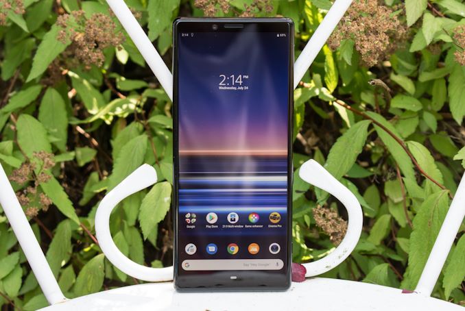
Sony is a company that we don’t talk nearly as much about as one would expect when it comes to their smartphones. In fact, here at AnandTech we had the odd circumstances of never actually been able to review a Sony phone. Be it unfocused marketing on Sony’s part or just bad luck on our part, it was a coverage area we’ve been looking to address for some while now.
This year, after numerous quarters of financial losses of the division, Sony’s mobile group was in particular turmoil as the company division has been going through some major restructuring. The most major change is that the Xperia Mobile division has been now grouped into Sony’s TV, audio and camera product lines, ending its time where the group would operate completely independently from Sony’s other divisions. In a way, this is a good change; we’ve in particular seen statements from the company’s spokespersons that past Sony smartphones suffered from the disconnect to other company divisions, for example having to figure out camera processing on their own as the Alpha camera team would not be allowed to help the smartphone team.
We’ve met with Sony back at MWC earlier this year and had a preview of the new Xperia 1 in its earlier stages. The one thing that I took away from that meeting is that the mobile division is now a lot more hopeful and motivated under the new management, and the new Xperia 1 is the first phone that’s really been affected by the new reorganisation. In general, Sony is hoping to turn the page on several years of lacklustre success, and bring back the mobile division into form.
With the new Xperia 1 thus representing the first flagship device under the new organisation, it’s an incredibly important device for Sony, and a phone we didn’t want to miss out on reviewing. The phone is characterised by its unusual 21:9 screen aspect ratio on 4K OLED screen and a new triple-camera setup. Today, we’ll be putting the Xperia through our usual test suite and look if Sony has been able to deliver on its promises.
| Sony Xperia 1 | ||||
| Sony Xperia 1 | ||||
| SoC | Qualcomm Snapdragon 855 1x Kryo 485 (Cortex-A76) @ 2.84GHz 3x Kryo 485 (Cortex-A76) @ 2.42GHz 4x Kryo 485 (Cortex-A55) @ 1.80GHz Adreno 640 @ 585MHz |
|||
| DRAM | 6GB LPDDR4X | |||
| Display | 6.5" AMOLED 3840 x 1644 (21:9) HDR |
|||
| Size | Height | 167 mm | ||
| Width | 72 mm | |||
| Depth | 8.2 mm | |||
| Weight | 178 grams | |||
| Battery Capacity | 3330mAh 18W USB-PD Adaptive Charging |
|||
| Wireless Charging | - | |||
| Rear Cameras | ||||
| Main | 12MP 1.4µm Dual Pixel PDAF f/1.6 78° lens with OIS 960fps video recording |
|||
| Telephoto | 12MP 1.0µm f/2.4 45° 2x zoom with OIS |
|||
| Wide | 12MP 1.0µm f/2.4 130° fixed focus |
|||
| Extra | - | |||
| Front Camera | 8MP 1.12µm f/2.0 |
|||
| Storage | 128GB UFS 2.1 | |||
| I/O | USB-C no 3.5mm headphone jack |
|||
| Wireless (local) | 802.11ac Wave 2 Wi-Fi Bluetooth 5.0 LE + NFC |
|||
| IP Rating | IP65 & IP68 | |||
| Other Features | Dual Speakers | |||
| Dual-SIM | 1x nanoSIM + microSD or 2x nanoSIM |
|||
| Launch Price | $949 / £849 / €949 | |||
In terms of hardware specification, the new Xperia 1 is in line with most other flagships this generation and employs Qualcomm’s Snapdragon 855 SoC. We’ve covered the chip extensively over the past few months and the piece has impressed us with its speed and efficiency, and should represent a great foundation on which the new Xperia 1 can build upon.
Sony is equipping the phone with 6GB of RAM, whilst not quite as aggressive as some other vendors, is still plenty sufficient and enables an excellent multi-tasking experience. On the storage side of things the phone comes in a sole 128GB UFS 2.1 storage configuration, however Sony still offers a microSD slot which is something that is becoming a rarity nowadays.
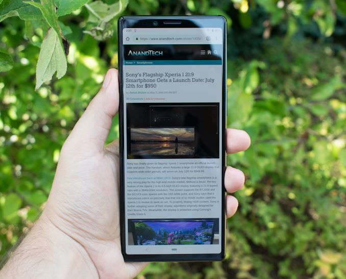
Moving on to the obvious, the phone’s key feature is the new 21:9 OLED screen. It represents the Xperia 1’s defining characteristic which makes it stand out from all other phones in the market. Although the screen is 6.5” in diagonal, as with other phones these past few years, the metric doesn’t really mean much anymore in terms of it defining a phone’s size. So even though the diagonal sounds a bit scary at first, due to the 21:9 aspect ratio, the Xperia 1 is still only 72mm wide, which is smaller than other “plus” sized devices in the market, and the phone is in fact smaller than say a Galaxy S10+.
Sony I think nailed the form-factor and I do greatly enjoy the size as for me it falls into the sweet-spot between screen real-estate and one-handed usability and ergonomics. Of course, this is also quite a long phone, so while its width can be narrower than most of the competition, it’s absolutely longer than any other mainstream devices out there with a very height of 167mm.
Sony’s rationale for the 21:9 aspect ratio lies mainly in viewing 21:9 video content, however I found this to play second fiddle to the actual benefit: more vertical content space in your web-pages and applications. While yes there are very much benefits to viewing native 21:9 movie content on the device, I still think most consumer video content will be staying at 16:9 for the foreseeable future. Here I had wished Sony’s marketing had put a bit more focus on the more important benefit of having more content in vertical mode.
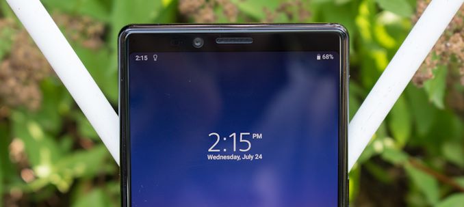
The display’s design is relatively straightforward, but that’s not really a bad thing. There’s no notch and the bezels aren’t exactly ground-breaking either, but for some people this can also be a benefit as there’s also no distracting screen cut-outs and the flat display doesn’t add additional reflections as seen in other recent curved screen devices.
The screen itself is also one of marvel: It’s a 4K (3840 x 1644) resolution OLED which, while not the first 4K display phone, is the first OLED of its kind in a consumer device. Sony makes some big claims about its capabilities in regards to HDR and colour spaces, some of which do pan out while others aren’t quite as honest. The one big thing that I do need to mention here in the intro is that Sony is a bit misleading as to the 4K resolution. While the panel is indeed 4K, only certain media content such as the native photos gallery app as well as video playback in some applications is in fact rendered in 4K, as the default software rendering for most other applications happens at 1440p. It’s something we’ll address later on, but it’s something one should be aware of from the start.
The “forehead” of the device is small. The right side doesn’t contain much as it lies over the SIM tray, but the left side is filled with the usual sensors as well as the front camera. There’s also a notification light – odd that I have to mention this, but I do miss the feature on other recent devices. What I’m not too sure about is Sony’s design of the earpiece; it’s quite recessed at over 1mm in the front-glass cut-out, and while it has a very fine mesh/membrane protecting it, I can see that it’ll be a dust collector over time.
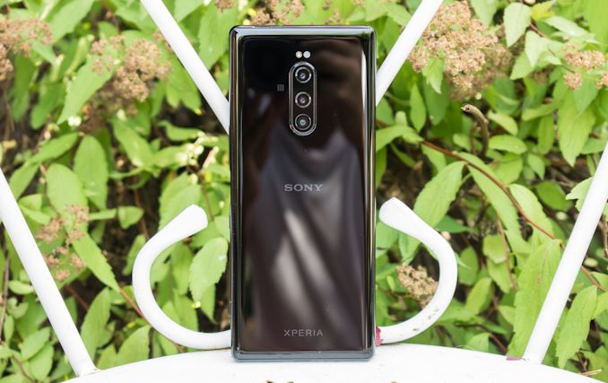
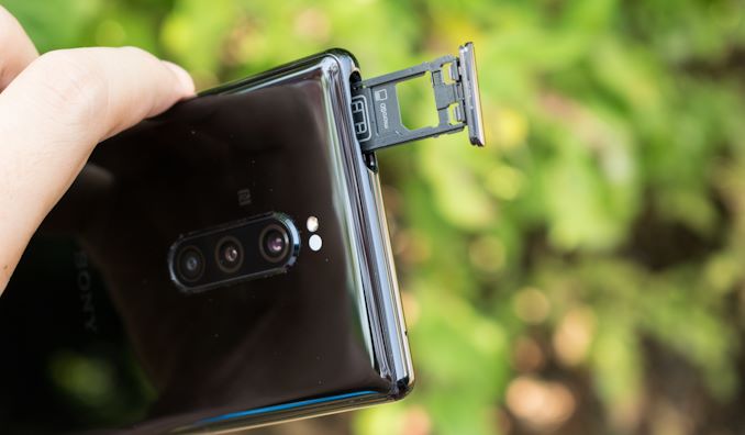
The rear of the phone is characterised by its triple-camera setup. Sony opted for a vertical layout, which works well for the elongated phone. The cameras are triple 12MP units. The main sensor is a full dual-pixel PDAF design with 1.4µm pixels, and features a f/1.6 lens with OIS. The telephoto and wide-angle sensors are of 1.0µm pixel pitches and both have f/2.4 aperture lenses. The 2x zoom module’s viewing angle is 45° (78° on the main camera), while the wide-angle is a very wide 130°. The wide-angle is of a fixed focus design with no OIS, while the telephoto unit does have OIS.
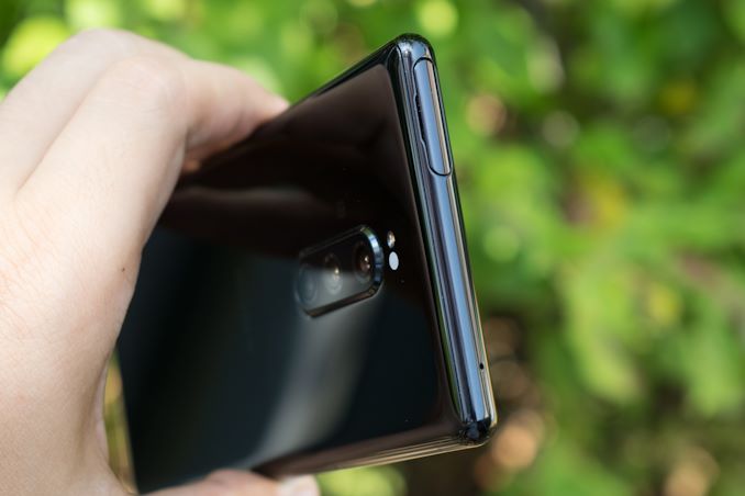
Unlike the front of the phone, the back glass is slightly curved on its sides which, together with the round frame design of the phone, gives it quite nice ergonomics even though at first glance the phone might mistakenly appear quite boxy.
The weight of the phone is also kept in check at 178g. Although the weight and the phone’s 8.2mm thickness, Sony only managed to employ a 3330mAh battery into the phone whilst other vendors have managed to cram in 4000mAh units in similar form-factors, and this is definitely one of the phone’s weak-points in terms of the hardware design.
Sony’s SIM tray design is quite unique in that it doesn’t need an ejector tool. You can just use your fingernail to pull the cover and pull the tray. I’m still a bit paranoid about accidental prying open the tray (Particularly for an IP68 phone), but it does feel well designed and robust.
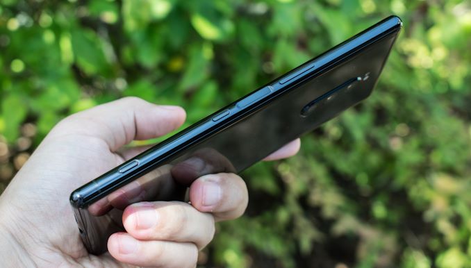
The left side of the phone is barren of buttons as they’re all located on the right side. Here we find a volume rocker, a fingerprint sensor, power button and a dedicated camera button.
The fingerprint sensor is good, although I wasn’t too impressed with the unlock speed. The issue here isn’t the fingerprint itself as it does seem it’s able to recognize it quite fast as demonstrated by the vibration feedback, but the screen turns on just a bit later than that, which I found a bit slow. The phone can be woken up by double-tap to wake, the fingerprint sensor, the power button, or with the camera button. Interestingly enough you don’t need to unlock the phone when waking it with the camera button and you’re free to take pictures or videos like this – however you’re sandboxed and can only view content during that session.
The camera button is also a two-stage button, pressing it lightly in the camera app is akin to focusing, and pressing it fully will capture a photo/video.
On the bottom of the phone we find the USB-C port and the main speaker grill, which by the way along with the earpiece speaker are able to play back in stereo. What’s obviously missing here is the 3.5mm headphone jack, and it is quite the travesty of Sony to abandon it. Sony had a promotion bundle of offering the Xperia 1 with one of its own wireless headsets, so I think the company has fallen prey to the anti-consumer move of attempting to gain profits by trying to sell accessories on top of its devices. The phone still offers a 3.5mm dongle adapter, and the kicker is the included headphones are 3.5mm themselves.
Overall, I liked the Xperia 1’s hardware design. The elongated aspect ratio was something fresh, and in general the device’s ergonomics are excellent in my subjective view. The phone still managed to somewhat continue Sony’s Xperia industrial design, yet also evolves it into a different direction that is quite enjoyable.




75 Comments
View All Comments
yetanotherhuman - Friday, July 26, 2019 - link
I'd rather they'd bring back the Compact series, and don't compromise it this time with lacking headphone jack and so on. The last one they made was super thick and yet lacked a headphone jack or wireless charging. Ugh.yetanotherhuman - Friday, July 26, 2019 - link
Oh, and make it actually compact, like the older Compact ones. I use a Z3 Compact still as my work phone, and it's so goddamn nice in the hand compared to other phones I come in contact withExodite - Friday, July 26, 2019 - link
+1 for the Z3C! :)Still using my green one, though the front glass is starting to come off and I really should get that fixed. It's coming up on 5 years old soon and it's by far the best device I've owned.
It's unfortunate AT got to review Sony devices now that they're past their prime. Their current units drift ever more toward the generic curved-screen, camera-hump-endowed, subpar aspect-ratio blandness that most other vendors offer.
While the Z3C was, and is, great and unique there's nothing particularly compelling about The Xperia 1 over competition from, say, One+.
boredsysadmin - Friday, July 26, 2019 - link
No 3.5mm jack = no sale, at least not for me. The lag on BT phones is unacceptable for gaming and they can shove their 'orrible dongles or semi-proprietary usb-c phones up their collective asses.pmcorriveau - Friday, July 26, 2019 - link
I don't know why more companies don't at least include 2 USB-C ports. I have C headphones, but I'm still frustrated by not being able to charge and listen at the same time. Stopping a movie on a plane just to charge my device sucks.yankeeDDL - Friday, July 26, 2019 - link
I think a USB port takes up more real estate than a jack.I like bluetooth, but I constantly use plugged in headset while working: on huge phones there's no excuse.
s.yu - Sunday, July 28, 2019 - link
But it's thinner, the excuse was thickness, it was always an excuse but a second C port doesn't add to thickness. I can live with a C port substituting a 3.5mm, but not without a second port of any kind.Jay1984 - Sunday, July 28, 2019 - link
Why do that if there is wireless charging?eldakka - Sunday, July 28, 2019 - link
There are dongle's that allow charging and headphones simultaneously.Unfortunately, it does mean carrying around more stuff with your phone, which reduces the mobility aspect of mobile phones...
flyingpants265 - Monday, July 29, 2019 - link
Pretty soon, they'll start integrating those dongles INTO the phone itself. Futuristic technology...