The Windows 10 Review: The Old & New Face of Windows
by Brett Howse on August 25, 2015 8:00 AM EST- Posted in
- Operating Systems
- Microsoft
- Windows 10
Continuum
Windows 10’s mission in life seems to be to correct the failings of Windows 8. I think the touch based UI worked pretty well on Windows 8 when using it on a tablet, however forcing that same UI onto traditional PCs was a tough pill to swallow for many people. Windows 10 takes a very different approach, and rather than try to shoehorn a single UI into all devices, the UI itself adapts to each device. Microsoft is branding this transformation as Continuum. You can enable this functionality by turning on tablet mode, which can be enabled as a setting, or if you have a 2-in-1 device, the system will prompt you asking if you want to switch when you move to or from the touch mode. You can of course control how this happens, and even enable it to automatically switch for you without a prompt.
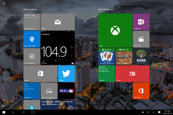
Windows 10 on the PC has a tablet mode which morphs the UI into something that works better with touch. The Start Menu expands to fill the display, much like the Start Screen in Windows 8. This allows the live tiles to take center stage. The UI feels a lot like Windows 8, which is a good thing when using it on a tablet, but there have been some tweaks here too.
Windows 8 went with a lot of hidden gestures to get things done. The charms menu was a swipe in from the right, but there was no obvious way to know that other than stumbling upon it. Multitasking was swiping in from the left to switch between apps, or you could bring up the task switcher with an even more obscure swipe in from the left and then swipe back to the right. Apps could access their options either in the charms or from an app bar that could be opened by swiping up from the bottom or down from the top. There is nothing really wrong with hidden UI gestures but there has to be a way to teach people that they are there. Out of the box on Windows 8 there was very little training. Some was eventually added, but it was pretty sparse.
Windows 10 really moves away from the hidden gestures, and moves things like search to the task bar. Task switching moves from a complicated gesture to the task view button, and there is a back button added as well. Closing apps can be done with task view, or you can still drag the window down off the screen like Windows 8. You can still use some of the gestures, but almost all of the functions can now be accessed by findable onscreen elements.
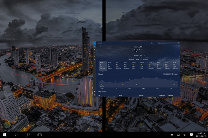
The one function that is not obvious anymore though is multitasking in tablet mode. In Windows 8, you could swipe an app over to the side and it would snap it there. Windows 10 does not work like this anymore and you have to swipe the app down as if you are going to close it, and then bring it to the side to snap it. It’s actually a pretty easy gesture, it’s just hard to discover on your own. However when you do snap a window, you get Snap Assist again to help you find what you want to snap to the other side.
So there have certainly been some nice changes to the tablet interface as well, and Windows 10 brings some nice features to the touch above and beyond Windows 8. However one thing that I find a step back is the Start Menu when in Tablet Mode. There is a lot of wasted space now, and the Start Menu looks like it is somewhat handicapped to work on a phone display. The tiles now arrange themselves in groups which can be no more than three medium tiles wide. Windows 8’s Start Screen was scrollable horizontally, and Windows 10 only scrolls vertical. Looking at something like the Microsoft Surface 3 shows wide gaps of unusable space when in landscape mode, but switching it to portrait mode means you only get to see a single group, which is a big step back in density over Windows 8. On the Surface 3, there is easily room for three groups of tiles when in landscape, or the groups could be made wider to let you get more on the screen at once. How it is right now though feels very sparse.
Still, Continuum is a much better solution to having Windows 10 adapt to different device types than what has been available before. Forcing a touch UI onto desktop PCs was always going to alienate users. Over the time of Windows 8’s lifecycle, it did evolve to get better on the desktop, but it was never going to win over the fans of Windows 7. With Windows 10, both traditional PCs, tablets, and 2-in-1s can all get the right UI for the right time. It is a big step up for the PC, and on a touch device Windows 10 is pretty nice to use, despite my issues with the Start Menu in full screen. I think this can be sorted out, and I hope it does happen. The new tablet interface offers a lot more in discoverable actions, and it offers quite a bit of customizability.


293 Comments
View All Comments
StevoLincolnite - Tuesday, August 25, 2015 - link
FINALLY! And First. :Pwebmastir - Tuesday, August 25, 2015 - link
Typical YouTube user.dsumanik - Tuesday, August 25, 2015 - link
Would just like to say this is the first Non garbage pseudo viral marketing advertisement "review" I've read on Anandtech in months. Well done sir.Please pass on some editorial tips to Joshua Ho and Brandon Chester, imho, the two most corrupt authors working for this publication.
kenansadhu - Wednesday, August 26, 2015 - link
Came to a house and insult the owner. Classy.ddriver - Wednesday, August 26, 2015 - link
If truth is insulting to the owner, he outta stop and think about what he is doing.Windows 10 is the worlds largest and most obnoxious spyware, and it just sucks to see how many people are getting paid to shower it with accolades.
quidpro - Tuesday, September 1, 2015 - link
MS is allowed to compete with Google, Apple, and Facebook, or anything else you may have account for and are willing to sign in with which adds convenience of syncing of personal info across devices. To lambaste MS for playing catch-up is ridiculous. A keyboard on an android phone or iphone "tracks your keypresses". It has to. You can't have GPS and turn by turn worth having without allowing a service know where you are or where you intend to go. You can't have your contacts pulled down across devices unless you allow for access to your data. You can't get from one website to another without divulging your IP. This is the way things are. These are the services people want to make their lives easier and better. Windows 10 isn't the most obnoxious, it's just late to the game. As is your criticism.ibudic1 - Saturday, November 7, 2015 - link
dittobs grinder - Tuesday, December 26, 2017 - link
how many pieces of silver does ms pay u for ur quid pro bs????john rayburn Williamsburg nm
Lerianis - Thursday, October 1, 2015 - link
ddriver, cut the bull. Windows 10 tells you EVERY SINGLE THING that it will send back to Microsoft and allows you to opt-out or turn off the functionality that requires that stuff being sent back to Microsoft.Not a big issue in the real world and it is past time to realize that Windows 10 is not spyware anymore than OSX or Linux are.
zman58 - Thursday, October 15, 2015 - link
You are dreaming, you have no idea what is or could be gathered and sent at any point in time. Read the EULA, you agree and bless whatever they decide to collect and send for whatever reason they see fit. And you give up far more than that when you click "I agree".