The Windows 10 Review: The Old & New Face of Windows
by Brett Howse on August 25, 2015 8:00 AM EST- Posted in
- Operating Systems
- Microsoft
- Windows 10
Return of the Desktop and Start Menu
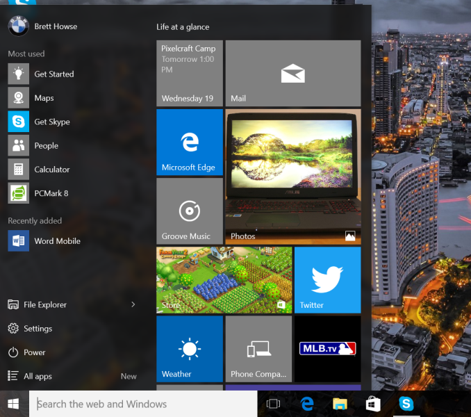
Windows 10 moves back to the strength of Windows over its lifetime, and the desktop is certainly that. The Start Menu has been a staple of Windows since all the way back in Windows 95. It has evolved over the years, but the layout and functionality was always there. Windows 8 removed the Start Menu and replaced it with a Start Screen, which was great on a tablet but certainly less than ideal on a desktop. It was jarring to move from the desktop to the start screen, and the layout of it was inefficient when accessing it with a mouse or trackpad. Windows 10 brings back the Start Menu, but with some changes.
The hierarchical nature of the Windows 7 start menu, with Start leading to All Programs, then individual folders, and shortcuts inside, has been replaced with a miniature version of the Start Screen from Windows 8, including the live tiles. While this may not please everyone, it is still functionally a lot easier to access than the Start Screen, and most importantly there is not the jarring sensation that Windows 8 had. The live tiles do fit in well though with the new look, and they still offer the extra information that live tiles are known for. The one issue with them is that it can be difficult to find apps when the image changes. This is somewhat exacerbated when you have multiple devices and the live tiles are not in the same location. One of the features that I quite liked in Windows 8 was being able to sync the start screen layout among devices, and for reasons I can’t understand that has been removed from Windows 10.
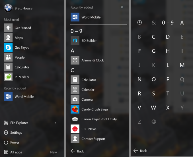
Accessing all apps is different than Windows 7. Instead of a heirarchical list of folders there is just an alphabetical list of all apps that you can scroll through, but the list can itself contain folders so there can be some organization. You can also click on the letter headers to bring up an alphabet in order to jump to any letter. This is not new to Windows, but it will be new to people moving from Windows 7. Being able to sort applications into folders is obviously nice when you have a lot of apps. One possible solution would be the live folders from Windows Phone, and perhaps they will make their way to Windows 10 at some point. Regardless, on the desktop, the Start Menu functions a lot better than the Start Screen ever did. When you move to a touch mode, the Start Menu switches to a full screen mode for use with touch, and as we will get into in the touch section, evolving the UI to work for the different user interfaces is a lot better solution than trying to make one UI work for both.
There is also one bug with the Start Menu which may affect some users. The Start Menu can only handle around 512 apps, and while that is a pretty large number, it is still going to affect some people so hopefully this can get sorted out quickly. If you do go over the limit, the list is truncated. I have not run into this myself, but be warned if you are a heavy user of software that consists of lots of applications.
If the Start Menu was the only change to the desktop, it may have been enough for Windows 10. Windows 8 and 8.1 brought some nice upgrades to the desktop that were overshadowed by the Start Screen changes. The new task manager, for instance, is much improved over the Windows 7 version. It also brought the ability to natively mount ISO images, file copies were improved, and many other things that were nice benefits to Windows 8. But luckily, Windows 10 goes far beyond just a Start Menu when discussing desktop improvements.
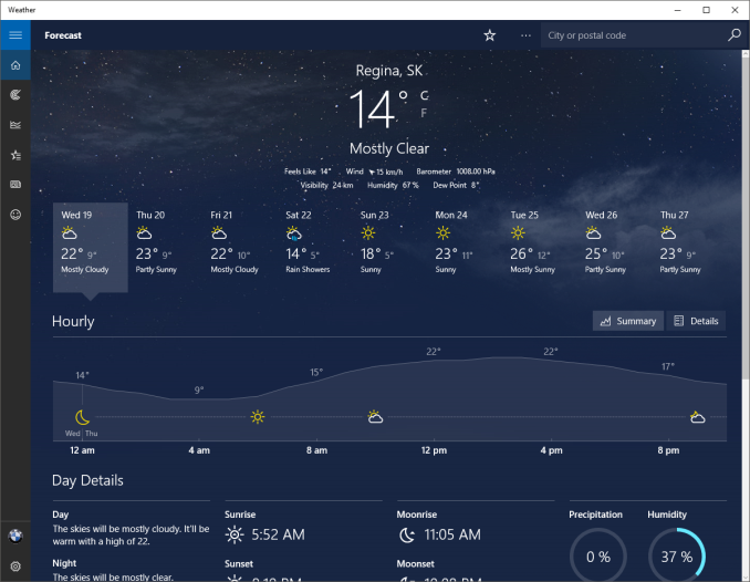
The most obvious change, and perhaps even more welcome than the Start Menu, is Windows Store apps can now run in a window. Most of my frustrations with Windows 8 was how when you double clicked a photo file, the default app was the Windows 8 version of photos and it would take over the entire display. Like the Start Screen, it was a jarring experience, and when you are on the desktop this is just a poor UI decision. With Windows 10, when running in non-tablet mode, apps like photos now correctly open in a window which can be resized and moved around. In Windows 8, the tablet mode was forced upon all, and although you could change what the default apps were and avoid that interface to some extent, it was the default. With Windows 10, rather than force the tablet apps upon users, the tablet apps themselves can now morph from windowed mode to tablet mode, which is a much better solution.
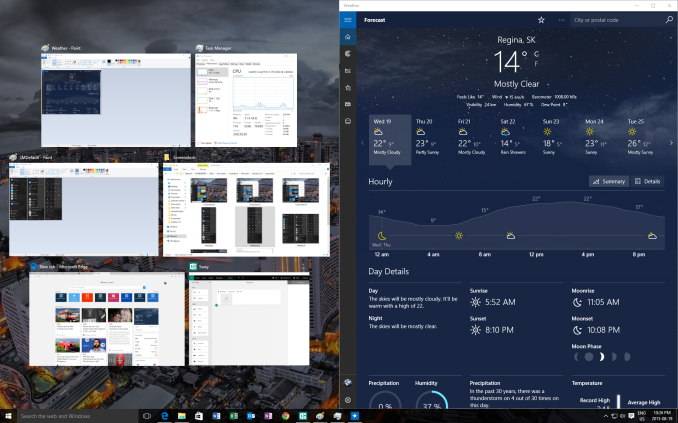
One feature that started its life in Windows 7 was Aero Snap, which let you position and resize windows by dragging them to the sides to split the screen, or to the top to expand the window to full screen. Windows 10 improves on that with Snap Assist. When you use Snap to split a window to half the display, Snap Assist will display a list of other windows that are open so you can easily pick the one you wanted in the other half of the display. Generally when you snap a window to the side, you want to snap another window to the other side, so this makes a lot of sense, but you can also hit escape to close Snap Assist or just click on the desktop to close it. Snap Assist is one of those features that you get used to really quickly, and moving back to a device that doesn’t have it feels like a step back.
One other perk of the new snapping features is that if you resize a window on the side to a value other than 50%, when you snap another window to the other side it will automatically fill whatever space is left. It’s a small change but once again another nice change that is welcome, especially when you consider how Windows 8 took a step back when it came to window management because none of the new apps could be run in a window. The changes introduced in Windows 10 have more than rectified this, and Windows 10 is a nice step ahead of Windows 7 in this regard.
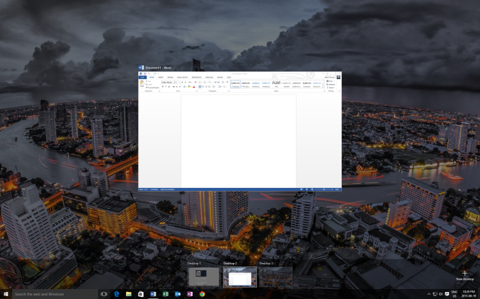
If you really have a lot of windows that you like to manage, you may be a fan of a long requested feature coming in the latest version of Windows. Virtual Desktops are now in. This has long been a feature of other operating systems, and you could always add it to Windows with an add-in, but it is now a native feature. I discussed this in our Windows 10 first impressions post, and that was very early on in Windows 10’s development cycle. Some changes have been made to how they operate which I find make the experience a lot better. By default, apps open on another virtual desktop no longer show on the current desktop’s taskbar. I think this makes a lot more sense, since if the point is to have lots of windows open, but separate, I would not want my taskbar packed full. Alt-Tab now, by default, only shows apps that are open on the current desktop, which once again helps to separate them and make them their own workspace. But if you would prefer to change these defaults, there are options in settings to allow you to choose virtual desktop behaviour.




293 Comments
View All Comments
StevoLincolnite - Tuesday, August 25, 2015 - link
FINALLY! And First. :Pwebmastir - Tuesday, August 25, 2015 - link
Typical YouTube user.dsumanik - Tuesday, August 25, 2015 - link
Would just like to say this is the first Non garbage pseudo viral marketing advertisement "review" I've read on Anandtech in months. Well done sir.Please pass on some editorial tips to Joshua Ho and Brandon Chester, imho, the two most corrupt authors working for this publication.
kenansadhu - Wednesday, August 26, 2015 - link
Came to a house and insult the owner. Classy.ddriver - Wednesday, August 26, 2015 - link
If truth is insulting to the owner, he outta stop and think about what he is doing.Windows 10 is the worlds largest and most obnoxious spyware, and it just sucks to see how many people are getting paid to shower it with accolades.
quidpro - Tuesday, September 1, 2015 - link
MS is allowed to compete with Google, Apple, and Facebook, or anything else you may have account for and are willing to sign in with which adds convenience of syncing of personal info across devices. To lambaste MS for playing catch-up is ridiculous. A keyboard on an android phone or iphone "tracks your keypresses". It has to. You can't have GPS and turn by turn worth having without allowing a service know where you are or where you intend to go. You can't have your contacts pulled down across devices unless you allow for access to your data. You can't get from one website to another without divulging your IP. This is the way things are. These are the services people want to make their lives easier and better. Windows 10 isn't the most obnoxious, it's just late to the game. As is your criticism.ibudic1 - Saturday, November 7, 2015 - link
dittobs grinder - Tuesday, December 26, 2017 - link
how many pieces of silver does ms pay u for ur quid pro bs????john rayburn Williamsburg nm
Lerianis - Thursday, October 1, 2015 - link
ddriver, cut the bull. Windows 10 tells you EVERY SINGLE THING that it will send back to Microsoft and allows you to opt-out or turn off the functionality that requires that stuff being sent back to Microsoft.Not a big issue in the real world and it is past time to realize that Windows 10 is not spyware anymore than OSX or Linux are.
zman58 - Thursday, October 15, 2015 - link
You are dreaming, you have no idea what is or could be gathered and sent at any point in time. Read the EULA, you agree and bless whatever they decide to collect and send for whatever reason they see fit. And you give up far more than that when you click "I agree".