Scaling Windows - The DPI Arms Race
by Brett Howse on April 15, 2014 2:00 PM EST- Posted in
- Operating Systems
- Windows
- Microsoft
- Windows 8.1
- High DPI
Where It All Falls Apart
As with many things in Windows, the operating system is too trusting of developers. Of course not all developers fall into this trap, but many applications in Windows (including many written by Microsoft) don’t follow the best practices on how to deal with High DPI displays. Let’s take a look at one example – VLC player.
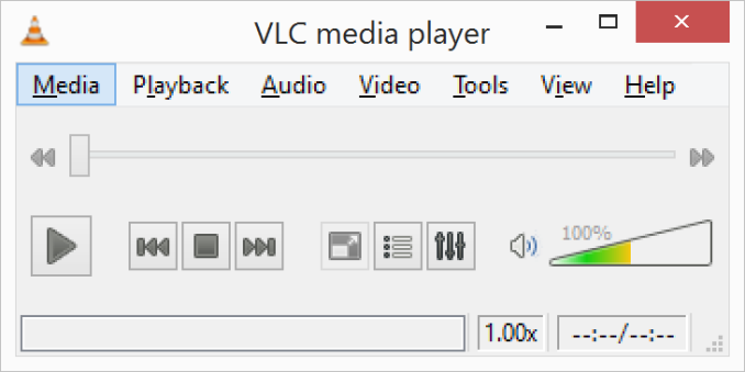
VLC 1.0 is what is referred to as a DPI-unaware application. The application was created to render at 96 DPI and it just expects the display to match. This makes the application undersized on a High DPI display, but thanks to DPI Virtualization Windows can automatically scale the application up to match the DPI settings of the display. This does introduce some blurriness to the appearance, but all menu controls and fonts are the correct size for the screen as seen here:
Looking at that image, it’s clearly upscaled but it’s also completely usable. So what’s the issue? VLC is a media player. With DPI Virtualization, media being played back through the application is also rendered at 96 DPI, and then scaled up off screen. This produces a video that appears blurry to the end user, which is not what VLC wants. To correct this issue, the VLC developers changed the application to declare it as System DPI-aware. This disables Windows’ scaling of the application, and Windows expects the application to scale itself. However, in the case of VLC player it doesn’t actually do any scaling at all as you can see in these screen shots of VLC 1.1.1 and the most current version 2.1.3:
Here, any of the UI elements that are handled by the operating system are scaled to the correct DPI settings, but the rest of the application is not scaled at all, which results in an application with unequal proportions. I’m not picking on VLC player here – it is just one of many applications that do exactly the same thing. It’s a great example to show the progression of when a coding choice was made to enable the flag and view the results of the change, as older versions of the software are still readily available. Also in VLC’s favor is the fact that their UI elements are somewhat oversized to start with. This could easily have been a design decision that their application was already usable at High DPI, so it’s not worth scaling the UI at this time.
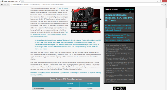
Let’s look at another application which has long been called out for having issues when Windows is run on a High DPI system – Google Chrome. The oddest thing about Chrome not scaling well is that Chrome does actually support High DPI. Chrome OS, Mac OS X, and obviously the Android versions of Chrome all scale well. But on Windows? There are issues. Here’s a screenshot of Google Chrome taken on my Lenovo Yoga 2 Pro at 3200x1800 with Windows scaling set at 200% (the default setting from the factory):
To see the issues, you’ll likely have to open the full resolution version of that screenshot. At first glance all seems pretty nicely scaled with Chrome – the “chrome” of the browser is not tiny, tabs appear to be the correct size – but look at the actual text on the webpage.
With the cropped image, you can instantly see that the font that Chrome is using is not scaling very well. Text in Chrome on a High DPI system is very poor, and defeats the purpose of using a high resolution screen since you actually lose fidelity rather than gain it.
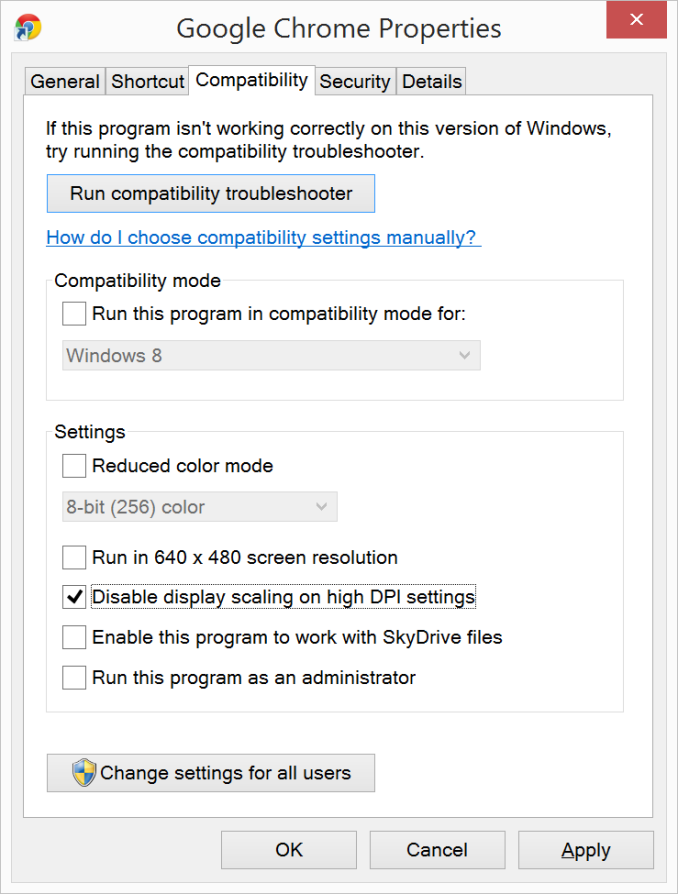
Chrome, unlike many other apps, does have some workarounds to this issue; unfortunately it’s not something the average computer user would ever be able to figure out. First, you have to open chrome://flags setting page and then enable HiDPI Support Windows. Next, you have to right click the Chrome icon on your desktop, choose properties, and then the configuration tab. Here you need to check the box that says “Disable display scaling on High DPI settings” and apply.
What this checkbox does is actually disable the DPI Virtualization on a per-application basis. Chrome will now use XP style scaling. If you don’t check this box, Chrome will disregard the flag in its own settings, and continue to render text very poorly. The only reason I can think of for Chrome to not use the newer DPI awareness API and instead use the old XP style DPI setting request would be because Chrome is still supported on XP. It’s a strange decision though because running a High DPI system on Windows XP is not a great experience. It’s unfortunate for Chrome users because most of them will never know just how poor of an experience they are getting on newer systems. However, with these changes in place, Chrome now renders correctly.
Next, let’s compare Chrome to an application which does follow best practices – Internet Explorer 11. IE11 correctly queries the operating system for the current DPI setting. When it receives the response, it rescales the UI elements as necessary, and then uses its Zoom feature to enlarge the actual web page. The result is a web page that looks exactly as it should.
IE11 also uses the queried DPI level of the operating system to set the default zoom level, so if you are a heavy keyboard user and you like to use Ctrl+0 to get back to 100% zoom, fear not. This still works, but the default zoom will be a higher number than 100% depending on the scaling factor chosen. Here’s another screenshot of IE11 with the resolution set to 3200x1800 and the DPI set at 96 DPI.
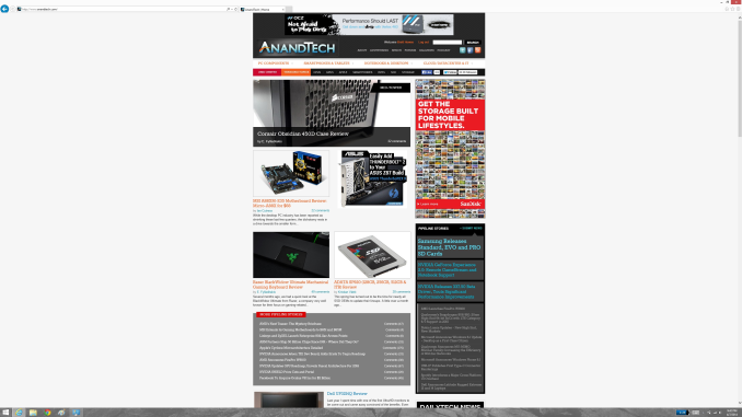 At first glance, it looks hilariously bad, but in fact it is doing exactly what it is supposed to. IE has queried the operating system for the DPI level (now set at 96) and scaled correctly to that level. Not all of Microsoft’s applications do this, but most are not as high profile as Internet Explorer.








114 Comments
View All Comments
SodaAnt - Tuesday, April 15, 2014 - link
This has always been one of my big issues with the surface pro. I really like it, and the high resolution display is great, but I'm stuck between a rock and a hard place. I'd like to use 150% scaling to get the UI elements to the size I want, but I find that everything is just blurry and unusable then, so I have to stick with 100% and deal with the small elements.Imaginer - Tuesday, April 15, 2014 - link
Fortunately, I haven't dealt with the applications that needed 100%. Even at 150%, I am fine, but to actually fit more work, a compromise for me is a blanket 125%.Still usable for me in both direct touch, pointer cursor work, and pen work. Virtual mouse trackpad is also fine.
I do not have the "fortunate" experience with Adobe's suites. So I cannot experience that "joy" with their software. Manga Studio possibly took some cues, being their window title bar areas are as custom sized and small at 125%, but everything else is usable. ArtRage, is one of the very good ones out the gate - from day one of the Surface Pro's release in pressure support for Ink.API and WinTab along with their UI elements.
And long before that, when I sometimes tried to view things in CAD on my HDTV, the scaling was set at 150% and 1080p, but the behavior of AutoCAD wasn't up to par. I believe that is fixed a bit as I did not have problems when I used the software upon the default factory scaling of the Surface Pro.
Some companies listen and go back to do things right, some do things right out the gate, some are more slower than others.
TimEMcGough - Thursday, April 17, 2014 - link
This is actually part of the reason why I really like my T100 and its 768p resolution. With a 10.1" screen, the ~155dpi to my eye is pretty darned good with 100% scaling. Much higher DPI and everything gets too small without scaling and, sadly, I use plenty of those Adobe applications on a regular basis. http://buyh.tk/wCcoastwalker - Sunday, April 20, 2014 - link
Pathetic. We have a generation of morons who think that a 16:9 video display is suitable for writing documents on. They also seem to believe that swiping the screen actually has something to do with productive activity. Its all a bit of a laugh watching civilization go down the plug hole.eddman - Tuesday, April 15, 2014 - link
"One of the problems holding developers back is that there have been few high resolution devices on the market"What?! Holding them back?! Nothing was/is holding them back except for their own laziness, incompetence and total lack of respect for windows programing guidelines; and they call themselves developers.
Yes, the desktop aspect of windows is quite open, but it doesn't mean you should develop a butchered application and then even be proud of it.
YuLeven - Tuesday, April 15, 2014 - link
And whist it's easy to accept 'developers' of freeware software being lazy to properly code their software with the current age of computing in mind, it's baffling to see Adobe charging hundreds of dollars for that rubbish UI of them, a problem that persists for years since the first HiDPI personal computers now.bountygiver - Tuesday, April 15, 2014 - link
and at the same time high DPI actually benefits designers the most, but the largest developer for designers' applications is one of these lazy bums...beginner99 - Wednesday, April 16, 2014 - link
Wasn't surprised Adobe is affected by this. Their software is general pretty bloated and crappy. I mean Acrobat is a 1 GB+ install for working with pdf's. WTF?gerz1219 - Wednesday, April 16, 2014 - link
Adobe's software is the best on the market. Their problem has always been is that there's a huge disconnect between the needs of creative/design professionals, and the needs of casual users. They design for the professional market, even though a lot of more casual users may want to edit a PDF or Photoshop their friend's face onto a dog.Acrobat is a 1 GB download because it includes all manner of print production, image scaling, and text recognition features, which the casual user doesn't need to delete a page out of a PDF. So if you only ever use the software to merge two PDF's, it looks bloated. But it's not! Almost every feature of Acrobat has saved me time at one time or another.
Regarding the scaling -- as a motion graphics and design professional, I *like* the small text in the UI. It gives me more screen real estate for my projects. The problem for anyone working in AfterEffects and Premiere is always that there's never enough screen real estate to see everything at once. Adobe has been slow to add in HiDPI scaling because their core market doesn't need or want it. It's a request from casual Photoshop users who only need the erase tool and the clone stamp tool to copy their friend's face onto a dog, and most of those users are still torrenting CS6.
chaos215bar2 - Wednesday, April 16, 2014 - link
As stated in the article, it's the professionals that are likely to be first to adopt high DPI monitors or (for a Mac example) case-sensitive file systems. It's rather telling that Adobe CS still don't work on case-sensitive filesystems after five major releases. All they have to do is make sure their apps always use the correct case when accessing a file! It's not that difficult, they just don't care.It's great that you like the small text, but you're always free to set Windows to 96 DPI. In fact, if Adobe properly supported scaling, you could even set it lower to get more working space if that's what you wanted..