The Chromebook Pixel Review
by Jason Inofuentes on May 31, 2013 8:00 AM ESTInput
A high pixel density isn’t the only thing special about the display. A capacitive 10-point touch layer is built-in, and though the OS isn’t exactly touch-centric, it is nice to have the option. The reality fo the market, though, is that touchscreens are inevitable. As the price of the technology drops and users become more accustomed to them the barriers to inclusion become nil. It feels gimmicky at times, and the keyboard/mouse schema has never seemed to me like one waiting to be disturbed. But including touch doesn’t detract from the experience, and I found myself putting it to use way more than I expected. Does a site render text too small to read? Resize in a flash. Scrolling through Google Maps looking for something? It’s probably quicker to do it with one finger on the screen than two on the trackpad. Even on-screen buttons are quicker to hit with your finger than by dragging the cursor to them and then tapping, provided the action area is large enough. It wasn’t long after I started using it that it just became the natural reaction. All sorts of buttons are just waiting to be pressed, and it becomes so instinctive that you will spend days after reaching up to lesser equipped screens.
Scrolling and other touchscreen gestures were at one point quite choppy. In the course of this review, though, updates to the software have drastically improved performance to the point I almost prefer it to the touchpad. That said, you’re often not sure what you’ll get when you open up a given app. Sites where a pinch to zoom gesture can have a useful impact, say Google Maps, can implement the appropriate APIs and often are. In sites with responsive designs, zooming can alter layouts for readability, though often that ends up feeling like two processes competing with each other. Pinch to zoom does simply that in less responsive designs, or sites that lock onto a particular layout, such as GMail. These features are hidden behind chrome://flags because they remain a work-in-progress, but I urge any users to turn them on and try them out. You’ll likely forget about that touchpad before long.
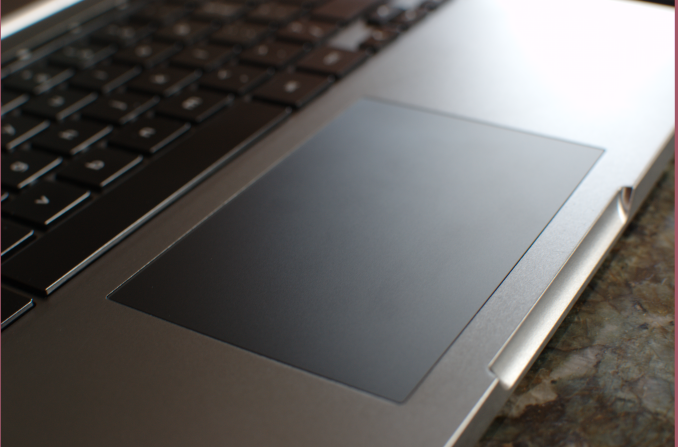
Speaking of that touchpad, it remains frustrating that so few players in the notebook space have nailed touchpads. It should be particularly embarrassing to other notebook manufacturers that this is Google’s first attempt, and they’ve done an excellent job. The large glass trackpad offers a novel tactile experience after so much time with Apple’s units, but is no less well performing. Taps and clicks are registered without fail and the scrolling experience with the touchpad is smooth and easy. Once again, the settings to activate more complex gestures on the touchpad are buried deep within chrome://flags/ so they’re not quite ready for primetime. But they offer something that Chrome has dearly needed, real multitasking.
Before I leapt into the world of OS X, or Linux for that matter, I was knee deep in Windows 7. Dozens of tabs spread across four or five browser windows and a few other applications, all in one space. OS X showed me that windows management was distinct from workflow management. The early days of Chrome OS were an experience that, then, felt all too familiar. When the hardware was incapable of handling more than a few tabs, it was easy to be diligent about culling the fat and closing unused pages. Better hardware made clear that something in software needed to be done to better manage the myriad of web apps and pages I could now keep open.
The technique that Google chose is familiar to OS X users, and revolves around that capacious touchpad. Buried in chrome://flags are options for three-finger touchpad gestures. Three finger swipes left and right let you scroll through a given window’s tabs, and three finger swipes up and down let you scroll through the available windows. The window switching is particularly useful and unique; unlike OS X, swipes don’t shift one position at a time, rather allow you to scroll through the open windows like a stack of cards. The gesture is not yet refined and requires some amount of practice to get right. The difference, though, makes this a multi-tasker’s tool.
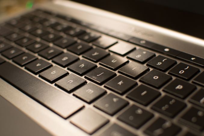
We’ll end our input discussion with my favorite of all, the keyboard. If the design of the Pixel advances the experience of an all aluminum notebook, the keyboard similarly moves the goal posts. This isn’t a revolutionary component; the keys are a little squarer but the layout isn’t novel. The CapsLock key is once again usurped by the dedicated Search button, which I might actually use more often if it sat where the Start/Option key did. Instead the CTRL and ALT keys are broad on the left side, which does make them easy targets when switching tabs/windows. I was surprised by the mechanical action of the keys. One of the compromises of thin notebook designs is the depth of the keys, and their motions. Laying your fingers on the Pixel’s keys they feel slightly wobbly, and I was expecting a quite squishy typing experience. Instead, though shallow, the keys action is quite refined, with an easy to discern and trigger point that makes precise typing a breeze. The broad palm rests made for a very comfortable typing experience and overall I had no problems clicking away for hours at a time. This fountain of praise for the keyboard ends with the row of function keys. Controls for volume, brightness, window switching and dedicated back, forward and refresh make up this row, and you’ll make haste to find ways to avoid them. The keys are remarkably stiff and their action ill defined so lighter depressions don’t have any effect. Can’t have it all, I guess.


74 Comments
View All Comments
cjb110 - Friday, May 31, 2013 - link
Excellent review, would be perfect for my intend usage...just need to be able to afford one:)Adhib - Friday, May 31, 2013 - link
Why don't you just get one of the Samsung Chromebooks?jeffkro - Monday, June 3, 2013 - link
They're ok, but the screen resolution kind of stinks.xyzzy1 - Friday, June 14, 2013 - link
I'd rather buy the mackbook and run windows on it. Overall better specs and better overall build quality.Belard - Friday, May 31, 2013 - link
Wow... I know I read it before... but still... the thing has far higher resolution than my 24" display.Even thou its a desktop and twice the distance away from my eyes... I can see the jaggy pixels on my 24" monitor that I cannot see with my Android phone or a modern tablet.
Its good to see something going against the dead-end Windows platform.
Interesting thou... and funny in a way, Dailytech is a malware site?
damianrobertjones - Friday, May 31, 2013 - link
What? 'Dead-end windows platform'? Yeah ok.This might have a higher resolution than your 24" screen but which has more 'working' space...
Alexvrb - Saturday, June 1, 2013 - link
This might compete with expensive Apple hardware, but it's not a direct competitor to Windows-based Ultrabooks/Ultrathins. Maybe if it was $500 cheaper. The display is awesome, the chassis is pretty, but that's it. The memory is on the low side, and is not upgradeable. The internal storage (fairly fast) is very limited and also not replaceable. The CPU is inferior even to the one in the Air. Etc.There's little chance anyone who has the word "affordable" in their vernacular would buy this over an Ultrabook. I don't personally think browserOS is all that great anyway, but if you're going to buy a Chromebook the cheap ones are the way to go. If Google was really out to help the open source community (like they pretend to be, meanwhile using them like any other tool), they would have built their own flavor of Linux with Google Happyware integrated and would use that instead.
Selden - Saturday, June 1, 2013 - link
Alexrvb: The CPU spec is identical to that in the 13" Macbook Air: 1.8 i5 @ 1.7gHz, with Intel® HD Graphics 4000.jeffkro - Monday, June 3, 2013 - link
Have you used chrome OS? Its extremely lightweight and doesn't need much in the way of cpu and memory. Its even blazing fast on a celeron 847.JDG1980 - Friday, May 31, 2013 - link
"So, how do you cope 4 million pixels and just 4GB RAM? In this case, the first step is to render all pages at 1280 x 800, unless HiDPI assets are available. The final product is upscaled to the full 2560 x 1600, but the memory doesn’t take nearly the punishing you might expect; unless, of course, every site you visit has HiDPI assets."So you're not even getting sharper text, just blurry low-res text upscaled? That sucks. What's the point of having a HiDPI display at all?
I'm not at all impressed with the notion of a browser-only OS. It is not and never will be enough for serious users. And I don't want Google to be monitoring every single thing I do on my local PC. "The cloud" can go take a flying leap.