Utility
Every time we revisit Chrome OS we ask ourselves “Can we work with it?” As a writing tool, there's no question. The hardware and software limitations of earlier Chromebooks was like slipping blinders on. No distractions, just you and a writing web app. That’s not all you can do with Chrome OS, though; web apps are becoming more powerful and appeal to users because of their ubiquity. Any modern device with a browser can run a web app and offer the same experience no matter the device context. The appeal is currently primarily for developers who don’t have to worry about keeping separate branches of their code updated and optimized on different platforms. As HTML5 and Java progress, the apps built with them will both be more capable, and better able to tap into local resources for compute and data. You could almost imagine a chart that parallels Intel’s “Compute moves to zero” chart, where instead of measuring size, you’re measuring the limitations of browser-based code. So, once anything can happen in a browser, why not live entirely in the browser? Simply put, because we’re not there yet.
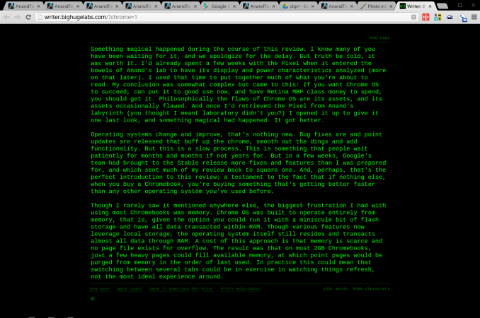
Web app Writer, a very minimalist text editor
Why not Android?
The argument goes something like this: Google has a great browser, and a great app platform, they should combine them in a laptop. Thus, the Chromebook should become the Androidbook. It comes up every time a new Chromebook is announced. It’s an idea not entirely without merit. Android runs on ARM and x86 chipsets. It runs Chrome. It has an enormous stable of apps. But that all misses a key fact: laptops aren’t phones or tablets. Chrome OS works because the PC is an utterly different user experience than mobile. And Google believes the conceits of a desktop environment can be best served by just one app: Chrome.
Google SVP Sundar Pichai, introducint Chrome OS at Google I/O 2011
Despite singing this song since the introduction of Chrome OS in 2009, the recent musical chairs at Mountain View has lead many to revive speculation of a future Android/Chrome OS marriage. Andy Rubin, father of Android, is tucked away in some Google skunkworks, and Sundar Pichai caretaker of Chrome OS now manages both experiences. Bringing all of the user facing software divisions under one leader makes sense to me, and not as a harbinger of fusion. During the last 18 months Google has gone through an extensive redesign of all of their assets, trying to bring a unified style and user experience to every product they offer. That experience has been lead by teams in Rubin’s and Pichai’s divisions, along with teams for GMail, Google+ and Search, and all the other products Google offers. But the only division that handles discrete software, and not just services and websites, were Rubin’s and Pichai’s. Bringing those two groups together for closer collaboration makes sense from a design and philosophy standpoint. Merging the very functions of the two into one monolith does not.
Chrome is about the best web experience possible, no matter the platform. Android is about a mobile software and compute experience that relies on apps and integration with Google services to offer utility. Those are two separate directives, the web and apps, and Chrome OS is the purest distillation of the Chrome experience. Shoehorning Android into the Pixel wouldn’t offer the best of both worlds, it would mean forcing a portrait app designed for a phone onto a really nice notebook. If fragmentation remains an issue for Android developers, imagine what happens if you ask them to design their apps to work on phones, tablets, televisions and notebooks. It wouldn’t be pretty.
Utility Continued
For many of us, browsing is about communication and consumption. We watch movies and listen to music in a browser. We chat with friends, send e-mails, engage with our social networks and even partake in video chats and telephony through our browsers. And, of course, we read and peruse images. If we’re going to get work done, though, we need to do more than just communicate and consume, we need to do produce. That means opening an honest to goodness application. Right?
Writing has always been one of Chrome OS’s strong points, and in earlier reviews we mentioned that the limitations of the OS actually helped make this an excellent writer’s tool. It’s hard to not write when all you have is a text field. Plenty of writing apps are just a click away, like the excellent Google Docs, Microsoft’s Office 365 and the minimalist Writer. The advent of Packaged apps is opening the opportunities for more immersive apps that step outside of the browser window. Txt is an early favorite, simple but adaptive, and it isn't stuck in a tab.
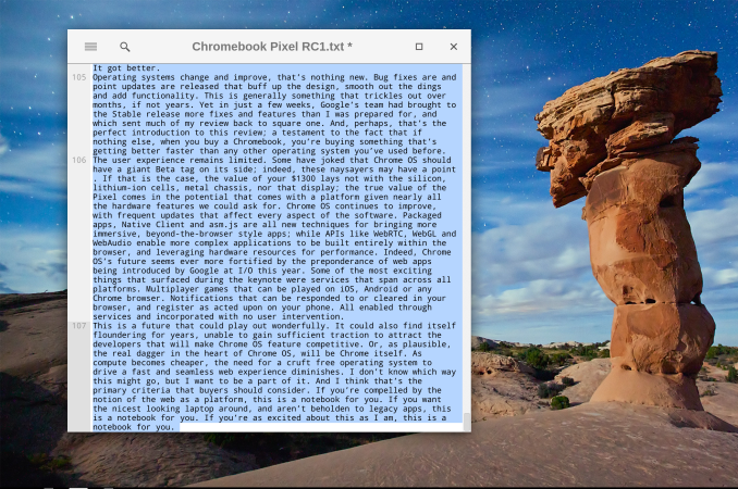
<TXT>, a packaged app
Most publishing, web and otherwise, needs more than just text. A few years ago, there was an explosion of excitement around image editing web apps, and everyone and their mother joined the fray, including Adobe and Flickr. Since then, the hype has died down, and the innovation. There are two factors that limit the appeal of these apps. First, there are limitations regarding file size and type. This is mostly owing to bandwidth concerns, both for the user and for the service host. If we had carte blanc to upload all our massive RAW files into an online editor and then edit them and save multiple copies, as we do on our local apps, we would end up with gigabytes of transferred data. So, even on paid apps you’re often limited to a medium sized JPGs, enough for web publishing to be sure, but given that high DPI content has truly arrived this approach is limiting.
The second limitation is in the apps themselves; they’re just not... enough. Several apps take the wizard approach that you might be used to from the likes of Shutterfly. Upload your images and then make modest edits in an interface that’s simplified and easy to navigate. Great for modest work, not so great if you’re planning on doing some serious editing. Want granular control of an image’s rotation? In Lightroom you grab that rotation slider in the Crop tab and adjust it to your comfort; in several image editor web apps, you’re only option is to rotate by 90 degrees at a time. So, yeah, that’s not going to cut it. There are more feature complete apps, but they come at an almost unbelievable cost: Flash. Pixlr is a great example of a web app with a desktop UI, driven by Flash, though the software itself is still limited to JPGs. So, for now, we’re hopeful for the future of photo editing web apps, but it isn't quite there... yet.
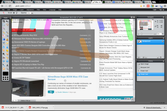
Photo editing app Pixlr, driven by Flash
So, you can write, but not do pictures. Video? Not quite yet. Development? That only requires a text editor, right? We thought about a variety of work flows and almost all ended with users putting the included Chrome Remote Desktop to use, to boot up some missing app or function. Even web developers would find themselves hampered by the inability to test IE or Firefox compatibility, and by the limited number of browser based IDEs rolling out. In the end, what we felt comfortable with remained writing and consumption. Those experiences are great, truly, but utility remains a sticking point. It may be time for Google to step-in and start to develop their own advanced productivity tools. Provide a powerful imaging tool and this becomes a powerful web publishing device. Provide the ability to emulate different browsing environments and we might see developers flock to Chromebooks.


74 Comments
View All Comments
cjb110 - Friday, May 31, 2013 - link
Excellent review, would be perfect for my intend usage...just need to be able to afford one:)Adhib - Friday, May 31, 2013 - link
Why don't you just get one of the Samsung Chromebooks?jeffkro - Monday, June 3, 2013 - link
They're ok, but the screen resolution kind of stinks.xyzzy1 - Friday, June 14, 2013 - link
I'd rather buy the mackbook and run windows on it. Overall better specs and better overall build quality.Belard - Friday, May 31, 2013 - link
Wow... I know I read it before... but still... the thing has far higher resolution than my 24" display.Even thou its a desktop and twice the distance away from my eyes... I can see the jaggy pixels on my 24" monitor that I cannot see with my Android phone or a modern tablet.
Its good to see something going against the dead-end Windows platform.
Interesting thou... and funny in a way, Dailytech is a malware site?
damianrobertjones - Friday, May 31, 2013 - link
What? 'Dead-end windows platform'? Yeah ok.This might have a higher resolution than your 24" screen but which has more 'working' space...
Alexvrb - Saturday, June 1, 2013 - link
This might compete with expensive Apple hardware, but it's not a direct competitor to Windows-based Ultrabooks/Ultrathins. Maybe if it was $500 cheaper. The display is awesome, the chassis is pretty, but that's it. The memory is on the low side, and is not upgradeable. The internal storage (fairly fast) is very limited and also not replaceable. The CPU is inferior even to the one in the Air. Etc.There's little chance anyone who has the word "affordable" in their vernacular would buy this over an Ultrabook. I don't personally think browserOS is all that great anyway, but if you're going to buy a Chromebook the cheap ones are the way to go. If Google was really out to help the open source community (like they pretend to be, meanwhile using them like any other tool), they would have built their own flavor of Linux with Google Happyware integrated and would use that instead.
Selden - Saturday, June 1, 2013 - link
Alexrvb: The CPU spec is identical to that in the 13" Macbook Air: 1.8 i5 @ 1.7gHz, with Intel® HD Graphics 4000.jeffkro - Monday, June 3, 2013 - link
Have you used chrome OS? Its extremely lightweight and doesn't need much in the way of cpu and memory. Its even blazing fast on a celeron 847.JDG1980 - Friday, May 31, 2013 - link
"So, how do you cope 4 million pixels and just 4GB RAM? In this case, the first step is to render all pages at 1280 x 800, unless HiDPI assets are available. The final product is upscaled to the full 2560 x 1600, but the memory doesn’t take nearly the punishing you might expect; unless, of course, every site you visit has HiDPI assets."So you're not even getting sharper text, just blurry low-res text upscaled? That sucks. What's the point of having a HiDPI display at all?
I'm not at all impressed with the notion of a browser-only OS. It is not and never will be enough for serious users. And I don't want Google to be monitoring every single thing I do on my local PC. "The cloud" can go take a flying leap.