Vizio Thin+Light CT15: Something New and Edgy
by Vivek Gowri on February 14, 2013 9:00 AM EST- Posted in
- Laptops
- Intel
- IPS
- Ivy Bridge
- Vizio
- Ultraportable
- Ultrabook
The Vizio is clean and sleek, really a notebook that looks like it was designed by actual industrial designers. This should be a pretty foregone conclusion, but there’s a large number of notebooks out there that don’t look like designers had any say in the designs, especially at the lower end.
The aesthetic is crisp and the entire notebook is very unadorned. There’s nothing glossy on this notebook—not the display, bezel, nor any of the aluminum or the soft touch plastic pieces that make up the chassis. It’s fantastic and I love it.
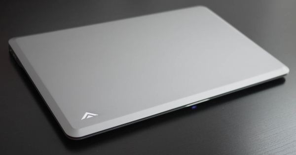
The body is a single piece of anodized aluminum with a gunmetal finish and the bottom half of the casing is soft-touch plastic. The lid is almost entirely clean, with a small Vizio logo in the top left corner. In profile, the notebook is mostly flat, with tapers at the front and side edges to enhance the perception of thinness. It’s a neat design trick, but I feel like it’s starting to be overused in the world of thin (and not so thin) notebooks. The sides have small portions that are flat, in order to house the meager assortment of ports. The flat part continues across the back of the notebook where the hinge is.
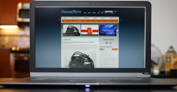
The bezel around the display is perfect—dark plastic with a matte finish, relatively thin, webcam and mics centered above the display, thin aluminum band at the bottom, and a very small Vizio logo at the bottom left corner. Whoever designed it could teach a course on notebook interior design that a lot of other notebook manufacturers could really benefit from.
I’m a fan of where Vizio has gone with their industrial design language, though there’s some refinement that remains on the build quality side of things—the anodization is noticeably coarser than what you find on recent Apple or ASUS devices, while the edges are sharper and more abrupt than they should be. I’ve seen variable build quality between units, with greater degrees of variance in the panel gaps and fit of the keyboard and touchpad. They’re glitches for sure, all signs that point to Vizio being very new to the PC hardware game still, but these are all relatively minor details that they should pick up on and fix as they move forward
Being only 0.68” thick and weighing less than 4 pounds, the CT15 is still slightly bulkier than the smaller and more svelte S9 15” (0.58”, 3.63lbs). Something about the ultrathin 15” form factor, like the Vizio and Samsung, as well as things like the Retina MacBook Pro 15” and the ASUS Zenbook U500, is very aesthetically appealing even though they lack the out-and-out portability of machines with smaller footprints. Even with the superlight weights in play here, the increased size makes this class of system more difficult to use in cramped spaces (such as a plane or lecture hall desk). But damn if they don’t look fantastic.
There’s one huge flaw in this entire design that I’ve been rhapsodizing about though. Surprisingly, it’s not the touchpad—the Sentelic pad that plagued the first run of Windows 7-based Vizio systems has been chucked in favor of a Synaptics unit that’s an absolute breath of fresh air in comparison. Nobody was lying to you, the Sentelic pad actually made the CT15 downright unusable, especially in comparison with the increasingly stellar Elan and Synaptics pads. Sure, they aren’t Apple, but they’re close. The Sentelic was closer to the dark ages for PC touchpads and the series of misguided buttonless pads used by HP and Dell. (Interestingly, my last experience with Sentelic was with the Dell Inspiron 11z from the CULV days. It had a similarly awful touchpad.) But that’s history, and thankfully we have Synaptics and their multitouch gesture suite.
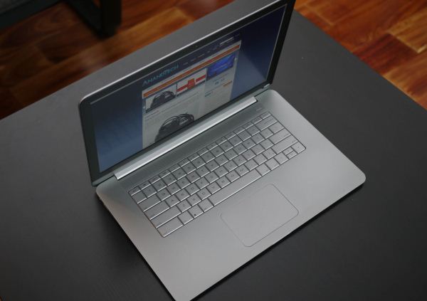
No, the real issue here is the keyboard as well as the metal surrounding it. The keyboard was a problem spot before, too, and hasn’t been fixed. It’s one of the few notebooks that I’ve seen in the last four or five years without a chiclet style keyboard. Even the ThinkPad line, that bastion of old-school notebook design, has moved into the modern world, so it was a bit odd to see the older style of keyboard on this. But I have no quarrel with the keyboard style; the flatness seemed to go well with the rest of the industrial design. Unfortunately, there’s way too much flex involved, and not just in the keyboard itself. The interior aluminum flexes heavily as well, which is odd and indicates a very thin chassis material used. The display also exhibits a bit more flex than I would like, though it’s not a day to day issue like the keyboard and interior is. It’s pretty bad, and a major oversight for a company that seemed to be so detail oriented with the rest of the design.
The upcoming Thin+Light looks basically the same as the current one, but goes a long way towards fixing the interior flex. They made the interior aluminum panel a bit thicker, paired with a stiffer keyboard, and made all the build quality related issues go away. The typing experience is significantly better, though I still think they should move to a chiclet keyboard. You do get used to the flex in the current-gen CT15; it’s not a dealbreaker like the touchpad was previously, but it definitely does detract somewhat from the user experience.


55 Comments
View All Comments
ChronoReverse - Thursday, February 14, 2013 - link
So what's the typing experience on the keyboard? That's more interesting than knowing the unit flexes (when relating to how the typing goes).What's the key spacing? Any weird key positions? How's the key response (rubber dome mushy or springy?)?
Frankly, the non-use of chiclets is the plus but I need to know how it actually types.
GiGoLo - Thursday, February 14, 2013 - link
i'm pretty nitpicky when it comes to keyboards (went through 4 different mechanicals with different types of switches before settling on one), and I can say the typing on this vizio unit was pretty poor. The keyboard itself started to get slightly bowed after just a few weeks, some keys were super sensitive while others were not, and the left CTRL and ALT keys would often take several tries before it would respond (might've just been a defective unit, but can't really tell)Kudos to vizio for being one of the few PC manufacturers to use high res screens (infuriates me to find these awesome spec'd ultrabooks with 1366x768!)
For me though, the true deal breaker was lack of Wireless Display. This to me is one of Intel's most overlooked (and least advertised) gems. Horrible for gaming, but works great for streaming media, presentations, slideshows, or even just an extended monitor
ChronoReverse - Thursday, February 14, 2013 - link
Okay that sounds terrible. Uneven key response is unacceptable for sure. Anyone else with experience? I wonder if it's just a single defective unit like you surmise.VivekGowri - Thursday, February 14, 2013 - link
I wish WiDi had taken off. It's awesome, right? I do love that every system with an Intel CPU and WiFi module is WiDi capable, I don't love that Vizio went Atheros with the CT15.The typing experience is fine, except that the keyboard flexes like hell. The sizing of the auxiliary keys is weird (the shift key especially seems oddly large) but it takes like 5 minutes to get used to. Spacing is fine, it's not hard to move back and forth between it and my other array of systems. The response is kinda springy, but the feedback isn't that positive, and the flex doesn't help with that at all. It's not that pleasant of a typing experience, not an untenable one or a deal breakingly-bad one, but still not a good one. And that's about all you can say for it.
Penti - Thursday, February 14, 2013 - link
They can activate Miracast which is based on WiDi, should take of this year and Intel has supported it for a while.blueboy11 - Friday, February 15, 2013 - link
Except that my Toshiba laptop that I currently use that's 3 years old and counting doesn't have the dual Wi-Fi that I'm currently looking for in a laptop (although I do have to admit that it does occasionally disconnect from the Internet at times but it's rare), along with 1080p matte display and even the anemic ports (which imo is a MAJOR improvement from what I have) is worth it. We need to start seeing some of these specs on more laptops, especially the IPS display, which is desperately needed on most laptops, which should be standard on most if not all laptops...MobiusStrip - Sunday, February 17, 2013 - link
They should also be lauded for using a MATTE SCREEN.Glossy screens are the biggest regression in computing ever. Moronic.
Sufo - Monday, February 18, 2013 - link
Depends on the quality of the anti-glare coating. Glossy screens are a lot nicer to watch movies on due to the free boost to black depth, not to mention essential for touch enabled devices. Overall, I prefer matte finish, but "biggest regression in computing ever" is a vast overstatement.Voldenuit - Thursday, February 14, 2013 - link
A thousand dollar laptop with (non-upgradeable) 4 GB of RAM and poor battery life gets a recommendation?If anything, Vizio should be raked over the coals for their RAM configuration, not lauded. Not just the size, but also the fact that it is soldered on.
Props for the 1080p IPS panel, but 4 GB is not enough in a premium product. Microsoft erred here with the Surface Pro, and Vizio did it too. Granted, Win8 is very efficient with resources, but that doesn't help users when their legacy software is still bloated and RAM-hungry (Adobe, I'm looking at you).
With 6-8GB as the default configuration, Vizio could have hit it out the park for users who want a high quality screen and are unconcerned about the limited mobility.
cknobman - Thursday, February 14, 2013 - link
The less than 4 hours of battery life is a real deal breaker for me.Its a shame because at the price this just might have been on my short list.