iPad mini Review
by Anand Lal Shimpi & Vivek Gowri on November 20, 2012 6:10 PM ESTDesign & Smart Cover
The smaller screen of the mini is joined by the super-slim industrial design from the fifth generation iPod touch that debuted a couple of months ago. I’m actually a pretty big fan of the direction Apple’s mobile design teams have taken recently, the overall visual style is much cleaner and focused now, with less pronounced radiusing and more rectangular profiles across the board. The edges are rounded enough for a very smooth in-hand feel, but the front edge has the same highly polished, chamfered ring around the bezel as the iPhone 5.
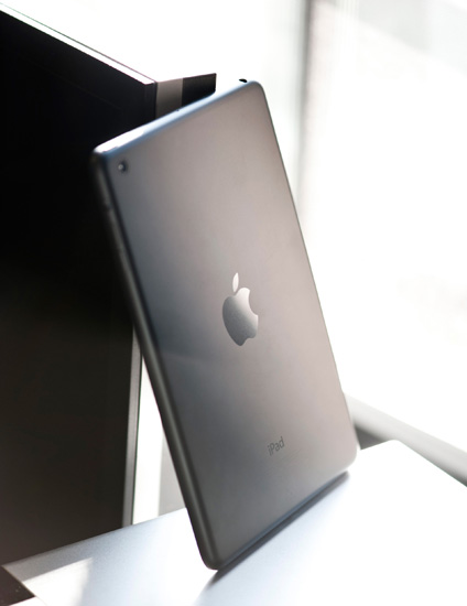
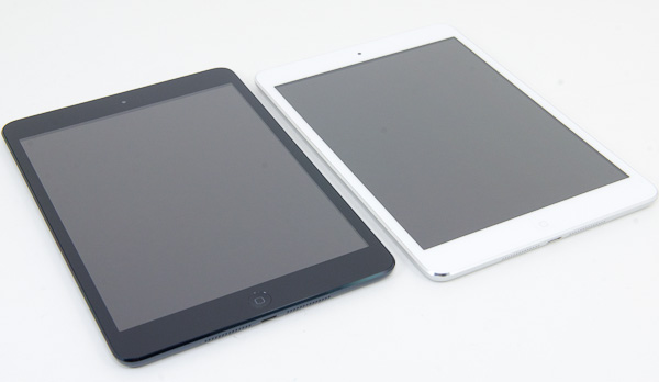
The dark monochromatic look is very sleek; combined with a brightly colored Smart Cover like the red one, the effect is pretty striking. The white/silver colour scheme, as on the iPhone 5, is elegant, but nowhere near as visually striking as the uniformly dark mini.
The face should be very familiar to iDevice users - a front facing camera centered at the top, an ambient light sensor to the left of it, and a home button at the bottom. The home button has been shrunk, though it’s set far enough away from the screen that I feel like they could have easily kept the same home button that is used in the other iDevices. I’m assuming there’s a reason for the downsizing, probably relating to the placement of the hardware around the display, because this isn’t the type of thing typically overlooked by Jony Ive and Co.
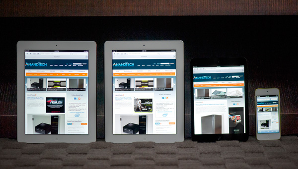
From left to right: iPad 4, iPad 2, iPad mini, iPod Touch (5th gen)
The bezel has been reduced considerably in size in all four directions, but more so on the sides than to the top and bottom. The result is a device with a slightly different physical aspect ratio than the 9.7” iPad - 4.45:3 instead of 3.90:3 (where, in both cases, the display has an aspect ratio of 4:3). The narrower bezel looks good - cleaner and more modern, and I think the iPad mini is better proportioned aesthetically. Of course, the smaller footprint is also one of the main factors in the awesome in-hand feel, so it’s a functional decision as much as an aesthetic one. Surprisingly enough, the lack of bezel on the sides of the mini doesn't impact normal use. Apple tweaked iOS a bit to improve touch rejection along the edges of the mini.
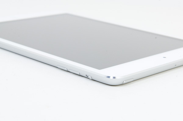
Button and port placement is identical to the preceding iPads, with a few minor but important changes. The silence/rotation lock slider in particular feels much more robust than in previous editions. The top edge has the power button on the right and headphone jack on the left, with volume buttons on the right edge, next to the camera. The buttons themselves are now metal, and offer better feel and feedback than the plastic buttons of the 9.7” iPad.
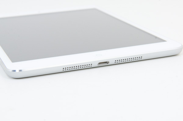
Coming around the edge to the bottom, we see that the 30-pin dock connector has been replaced by the new Lightning port, centered as always. The mono speaker in the right corner of the back is now gone, superceded by a pair of speakers set on either side of the Lightning port. That’s right - the iPad finally has stereo speakers, and they’re actually pretty decent. Clean sound output, and loud enough to fill a 400 sq ft room without distorting at high volumes. As with most mobile devices, the sound is a bit thin, but a decent improvement over my admittedly low expectations.
Given that the iPad mini shares the same colors and materials as the iPhone 5, I was curious to see whether the paint would be as fragile and whether we’d see a repeat of the quality control issues Apple had with it at launch. Thankfully, the anodization seems far more robust and significantly more resistant to scratching, even on the polished aluminum band at the front. I didn’t see any material or paint defects when I unboxed it, even after a thorough going over, and through two weeks of not particularly gentle use, I haven’t seen any scratching. It’s a very different experience than my iPhone 5, which came out of the box with the front panel not properly clipped into the aluminum frame and scratched whenever I looked at it wrong. This isn’t a device that needs any other kind of case unless you plan on abusing it, and I feel like a larger case would undo some of the benefit of the ultralight chassis.
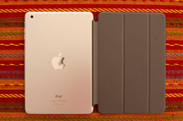
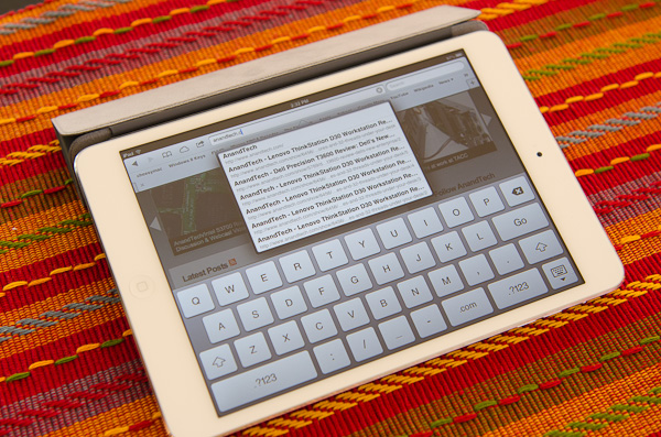
Apple does built a custom Smart Cover for the mini, available in a number of colors. Unlike the bigger Smart Cover, the mini's cover integrates the magnetic hinge into the same material as the rest of the cover, resulting in a very cohesive design:
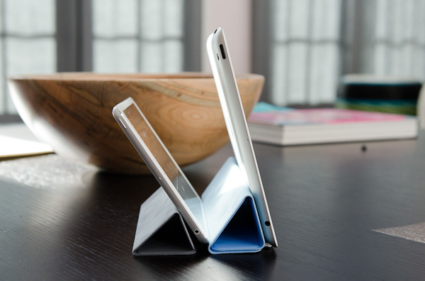
The big benefit of the Smart Cover is the ability to use it as a stand:
The angle of the folded Smart Cover is considerably larger than on the standard iPad, making the iPad mini lean back more vs. standing upright on the bigger model:
I would recommend getting a Smart Cover for the versatility of the stand and to have some form of protection for the screen. Plus, the black iPad mini + red Smart Cover combination just looks awesome.




140 Comments
View All Comments
Greg512 - Tuesday, November 20, 2012 - link
I haven't read through the whole review, just the conclusion, but the side-by-side photo with the Nexus really accentuates how much larger the Mini is. Other than that difference, I think ecosystem is the only significant reason to buy the Mini over a competing tablet. The hardware just doesn't impress like the iPad 3.Jorange - Tuesday, November 20, 2012 - link
But is it too wide to hold one-handed for long periods?Greg512 - Tuesday, November 20, 2012 - link
I tried it out at a store and my impression is holding it one-handed is pretty uncomfortable. I also find the Nook tablet pretty uncomfortable to hold one handed, but the Mini is certainly no better, probably worse. Plus, holding it one-handed in portrait (if you grip from the side) blocks some of the screen.Pantsu - Wednesday, November 21, 2012 - link
I'd have to agree. While the mini is thinner and has perhaps somewhat better build quality compared to the nexus 7, when comparing them side to side, I'd have say my Nexus 7 was more comfortable to hold in one hand. Also it just happens to fit in my jacket pocket while the mini is too wide.Even though the aspect ratio in the mini might be preferable for web, you still end up zooming, and then again video is better with a 16:9 display.
DERSS - Thursday, November 22, 2012 - link
But yes, it is 15 mm (1.5 cm, 0.6 inch) wider, it has to be taken into account. Though most of its width is compensated by lesser thickness, so overall perimeter just a little bit bigger than that of Nexus 7.DeciusStrabo - Thursday, November 22, 2012 - link
I think the backside material of the Nexus 7 is what makes it so comfortable to hold, next to the size. Unlike my iPad 2 it simply doesn't feel uncomfortable at any point. Can't get to cold or hot or be slippery.Oh, a Nexus 7 with the hardware of the Nexus 10 and a 1600x1200 8" screen and the Nexus 7 backside... My dream tablet. Alternatively a iPad Mini with a full Retina screen and a A6X/2 GB RAM (the 512 GB is the worst part of my iPad 2 and I can't believe they did it again in 2012 with the Mini).
Solandri - Wednesday, November 21, 2012 - link
Standard paperback book sizes are:A: 110mm x 178mm
B: 129mm x 198mm
Trade: 135mm x 216mm
Nexus 7: 120mm x 198mm
iPad mini: 135mm x 200mm
The A format paperback is the kind you can shove in your back pocket. Easy to hold in one hand. The B is slightly bigger, and most people can hold it in one hand. The trade paperbacks are the bigger more expensive kind, more like a hardcover book but with a soft cover. Most people have to bend them to hold in one hand.
The Nexus 7's width falls between A and B paperbacks in width. The iPad Mini is trade paperback size in width, even with the reduced bezel. Personally I think Apple goofed here, picking a size larger than what the publishing industry settled on as ideal for one-handed carrying and reading after decades of product testing.
I'm pretty sure Apple chose to make the iPad Mini 7.9" instead of 7" because the 4:3 aspect ratio would've made movies on a 7" iPad smaller than on 7" 16:9 Android tablets. By making the iPad Mini 7.9" they make movies on it slightly bigger than on a 7" Android tablet. But the cost in one-handed holdability isn't worth it IMHO.
They tried to make up for it by cutting down weight, which makes it easier to hold by one edge. But that carries its own drawbacks:
http://www.youtube.com/watch?v=5MMmLQlrBws#t=0m30s
Jakers Ugly Brother - Thursday, November 22, 2012 - link
Actually, the iPad mini is almost exactly the same size and shape as the Amazon Kindle 2 (the old white keyboard one), differing only in slightly higher weight. The dimensions are so close that I have to believe that Apple was using the K2 as a reference for the mini.Most K2 users agree that it is extremely easy and comfortable to hold one-handed for hours, and very easy to carry.
Put a $5 silicon or TPU case on the mini, and it too becomes extremely comfortable to hold for hours.
darwinosx - Friday, November 30, 2012 - link
Apple did nothing with 7' Android tablets in mind.stfuyolo - Sunday, February 17, 2013 - link
no i own one and if your hand gets tired then you can balance it on one hand, i can grip it for a while and I have a case aswell on it so that is thicker!!