Samsung Galaxy Note 2 Review (T-Mobile) - The Phablet Returns
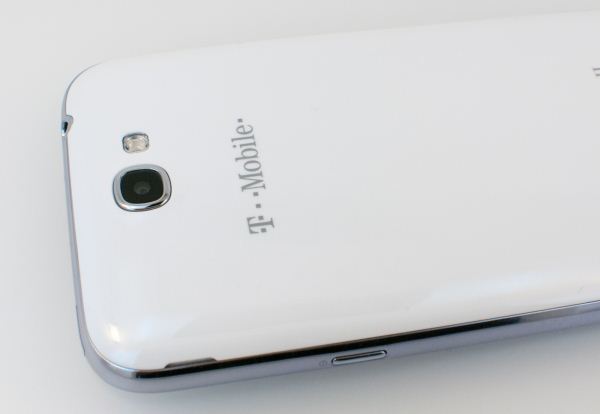
by Brian Klug on October 24, 2012 9:00 AM ESTThe Galaxy Note 2 is very much an enlarged, slightly tweaked Galaxy S 3, and nowhere is this more evident than the camera system. In fact, after lots of digging I’ve determined that almost all of this is exactly the same as the Galaxy S 3, which isn’t a surprise at all. Samsung has tweaked the camera UI and added features, and compared to the Note there’s definitely a marked improvements, but for Galaxy S 3 users the experience is entirely the same.
To start, the Galaxy Note 2 uses the same 8 MP S5C73M3 CMOS as Galaxy S 3 on the rear facing camera, which is a CMOS which on paper has specs up to par with the competition. There's no official disclosure about this part, but people still know about the specs. Optical format is 1/3.2" which is very common right now, 1.4µm square pixels, and of course the sensor is backside illuminated. From what I can tell the optical system on top of that is exactly the same as well, F/2.6 with a focal length of 3.7 mm. From what I’ve seen of the Galaxy Note 2 camera, performance is as expected basically the same as Galaxy S 3.
Likewise the front facing CMOS is a S5K6A3, also same as Galaxy S 3, which is 1/6" format with 1.75µm BSI pixels and a total size of 1412 x 1412 pixels. Captured images end up being 1280 x 960, F/2.8 with focal length of 2.5 mm.
.gif)
Milbeaut ISP Roadmap
In addition, Samsung continues to use a discrete Fujitsu Milbeaut 5th generation ISP (Image Signal Processor) for their cameras, you see references to this as M5MO throughout. This is the same setup as I saw on the Galaxy S 2, and though I didn’t dig into the original Note I bet it’s there too since that camera was analogous. There wasn’t much of a jump in camera performance between the Galaxy S 2 and 3, it seems as though Samsung is largely content keeping things the way they are this generation, perhaps waiting for the next generation of the Milbeaut ISP or a dramatically different CMOS to come around from Samsung Semiconductor before they mix things up. Meanwhile F/2.6 isn’t the most aggressive target for a fast optical system, considering other players are at F/2.0. I think Samsung expects those interested in a smartphone with emphasis on camera to go after the Galaxy Camera or something.
 This sign just comes off sounding so sarcastic (sample Galaxy Note 2 Photo)
To evaluate still image quality we turned to our standard set of tests which seems to keep growing. That consists of a scene in a lightbox with constant controlled illumination of 1000 lux taken using the front and rear cameras with as close to the same field of view as possible, images of a distortion grid, GretagMacbeth ColorChecker card for white balance checking, and an ISO12233 test chart for gauging spatial resolution in an even more controlled manner. Because I’ve moved houses and lighting will never ever be exactly the same, I have decided to move the three test charts into my lightbox as opposed to putting them on a wall and illuminating them with studio lights. This warrants a completely new set of comparison images, hence the smartphone 2012 camera bench for the three charts and front facing camera.
There’s a lot to go through here, but the test charts tell the most objective story. To me, flipping back an forth between Galaxy S 3 and the Samsung Galaxy Note 2 confirms what I already know, that performance is very similar between the two because they’re basically the same system. Locations 3–7 remain in the bench photo locations, and unfortunately due to time constraints I could only get photos on the one day I was in town with some overcast skies and not the usual lighting I like.
Honestly probably the biggest improvement over the original Note is that the center purple colored spot is completely gone as you can see with the following toggle.

Samsung’s camera UI continues to be very comprehensive and offer a wealth of options and shooting modes. I spent a lot of time playing around with HDR, which now has a Normal and Strong mode that adds even more dynamic range with exposures bracketed even further from the center. There are a couple of those in the MISC gallery of camera shots.


131 Comments
View All Comments
jigglywiggly - Wednesday, October 24, 2012 - link
is samsung in a contest to creating the ugliest looking soap bars?They had it right with the GS2, then they just decided to fuck it with the GS3
Skiddywinks - Wednesday, October 24, 2012 - link
That's because the SGS2 was basically an iPhone 4/4S, and they aren't allowed to make similar shapes, it would seem.Don't blame Samsung, they want to give you what you want, they just aren't allowed. I do agree though, I do prefer the SGS2/iP4 shape.
Samus - Wednesday, October 24, 2012 - link
Yeah its amazing how much my wife's GSII is mistaken for an iPhone in the line at ****bucks.I know what you mean, though, and its sad Samsung is basically banned from making "attractive" looking phones. Because appearantly, Apple invented attractive looking phones?
aegisofrime - Thursday, October 25, 2012 - link
I'm sorry, but anyone who can mistake the GS2 for an iPhone is an idiot.I mean, the size difference alone should be a dead giveaway. How about the rectangular home button vs the round home button on the iPhone? How about that big Samsung logo plastered on top of the GS2?
The only resemblance the two have is the shape. I simply cannot see how anyone can confuse the two.
sleepeeg3 - Friday, October 26, 2012 - link
They confuse the two, because the average consumer doesn't know anything beyond iPhone. They think all phones are iPhones. When someone owns one of the more popular alternatives, the question I always get asked, "is that an iPhone?"Death666Angel - Wednesday, October 31, 2012 - link
When I had the SGS2 a lot of people around me asked if that was the new iPhone. But most of them thought that iPhone was a generic term like "PC" or "Console".I now have a Galaxy Nexus and find it and the new Samsung phones to be just as attractive.
CeriseCogburn - Friday, February 1, 2013 - link
I am amazed by the constant artsy fartsy droning on how a device looks, and how all people are expected to agree, with of course, the iPhone as the "beautiful one".Of course it's brainwashing, just like all the lemmings want their computer parts and cases black - a thousand websites all have the drones exclaiming the same thing - black black black.
So, anything BUT the sad sorry rectangle of the iPhone is great by me. It's a freaking rectangle - and worse yet, the stupid public pubes in charge of the PC worshipping of a rectangle always claim thinner is also better.
Thinner is not better, especially when gripping. It's better in their lemming brainwashed gourds and not IRL, but their estrogen doused public opinion persona would have them believing anything peer pressure desired them to, so of course we have that thin to win crazed insanity everywhere as well.
It's a freakin rectangle. That's super, superior styling to these god for saken morons - it's amazing they can even drool.
medi01 - Thursday, October 25, 2012 - link
I'm sorry, but anyone who can mistake the GS2 (and GS1 for that matter) for an iPhone is an idiot.PeteH - Thursday, October 25, 2012 - link
Depends. I can understand it at a glance, but not upon close inspection.n13L5 - Wednesday, November 7, 2012 - link
I agree on the weird soapy curve of the S3, but the Note 2 looks more like a large SII, which is fine by me.By the way, in Boost mode, the Galaxy Note II works extremely well as a portable guitar amp. You just get a toggle for gain, rather than a knob for fine adjustment of the level of distortion :D