The HP TouchPad Review: webOS on the Big Screen
by Anand Lal Shimpi on July 17, 2011 11:11 PM ESTwebOS Vernacular: Cards, Stacks and a Whole lot of Awesome
Two years ago I was still having webOS withdrawals. No one had even come close to duplicating the webOS multitasking experience and at least with iOS, you couldn't even multitask. I also missed Synergy and the unified messaging I got with my Pre. Every now and then I'd wish I was using webOS.
Since then I'd moved on. While the HP announcements earlier this year were interesting to me, they just didn't spark the same sort of excitement that I got from webOS in the early days. Perhaps it was just that I had gone too long without using a Palm device.
When I first picked up the TouchPad it started to come back to me. The webOS UI hasn't aged terribly well. It does feel a little bland compared to the effects you get in Android or iOS but the functionality is definitely still there.
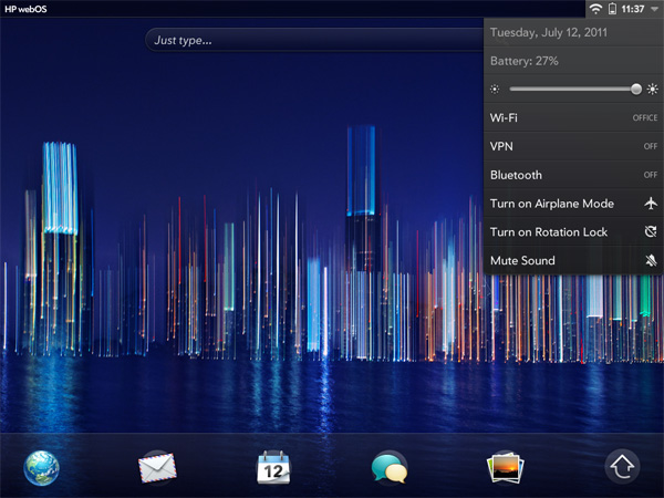
There are three basic elements to webOS: the home screen, the launcher and the card. The home screen is unlike Android or iOS, there's just one single home screen. You also can't put icons on the aforementioned home screen, it's just there to act as a background.
Along the bottom of the screen are five quick launch icons. You can customize these but you can't add any more than five. Next to those icons is an up arrow, tap it and you'll bring up the launcher.
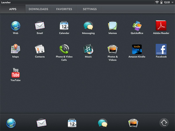
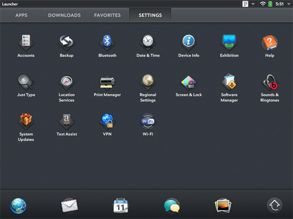
The launcher is the webOS equivalent of the iOS home screen or the Android all apps list. Like Honeycomb, the webOS launcher is divided into multiple tabs: apps, downloads, favorites and settings. You can move apps between any of these tabs, you don't have to actually obey their categories (e.g. you can put Pandora on the settings page, or move Print Manager to downloads). App icons can't exist in two tabs at the same time so once you move one it's no longer exists in its original location.
You can tap the category names to switch between tabs or simply swipe left/right to flip between them. Each category can hold more than a screen full of apps, you just scroll down to reveal more.
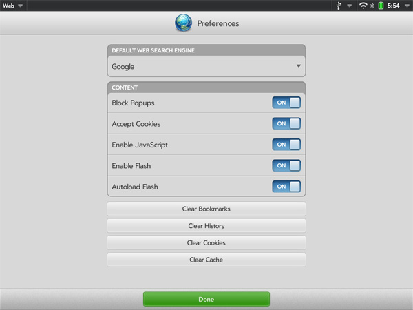
Settings in webOS take on more of a Mac/PC-like role. General system settings are accessed via the appropriate icon on the settings tab, but you also get per-app settings through each application's own app menu. I personally believe this is a more scalable setup to the iOS approach which puts all settings in one centralized location.
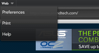
Having a really long page of settings just doesn't seem to be as good of an idea for scalability when you start adding a lot of apps, not to mention it slows you down when you want to change a setting within an app you're currently using.
So far everything seems pretty standard, albeit well executed. No bad decisions here. Now this where webOS gets awesome.
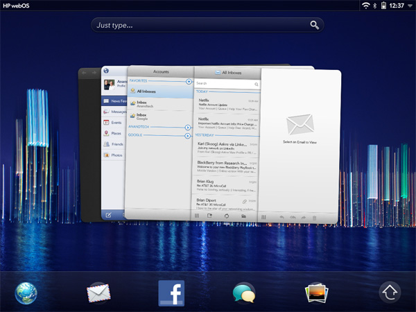
Apps launch as cards. Go to launch an app and it'll actually first start out as a small card before going full screen. Launch another app and it will appear as a card next to the first. Launch another and it gets tacked on to the end of the list, and so on and so forth.
You switch between apps in card view. To get to card view either hit the home button to zoom out of your currently active app or just swipe up from the bottom bezel. Unlike webOS based phones, swiping up from the bottom bezel is the only bezel gesture supported by the TouchPad.
Apps will continue to execute even when you've switched focus to another card, and they'll even continue to update if you're in card view and swiping around. To quit an app just flick the card up off the screen. No tablet OS does a better job of quitting apps than webOS. As soon as you throw a card off the screen, its memory is freed and available for use by other apps.
If you don't like flicking up, you can always drag a card all the way down to the bottom of the screen and let it go to rubberband shoot it off the screen. You'll even get a bad rubberband stretching sound while you do it.
The webOS card concept is the closest thing you can get on these mobile devices to having multiple windows on a desktop. They remain active when you switch away from them and it's super quick to switch between them. The webOS UI is really key in making this all happen. While Android and iOS both rely on icons or a thumbnail of the app for their task switching, the webOS approach gives you much more information about the current state of each app as well as a more intuitive UI for switching between them. Decades of innovation in GUI based desktop OSes have taught us that we can be more productive with multiple windows on a desktop and the webOS card system is the best approximation of that among mobile devices.
How do cards scale up to the big screen on the TouchPad? Very well indeed. One of my biggest complaints about tablet usage today is that multitasking is still a pain. Honeycomb addressed this with its task switcher but I honestly don't believe anyone does it quite as well as HP on the TouchPad. I'm both more likely to multitask on the TouchPad and get less frustrated (at least with the UI) while doing it. I'll get to this later but although the UI is the best I've seen on a tablet, the performance issues with webOS really keep it from reaching its potential - at least with this current iteration of webOS on the TouchPad.
While cards have been around since webOS 1.0, the concept of stacks was introduced with webOS 2.0 late last year. The idea here is simple. Whereas webOS originally just let you lay cards side by side, with webOS 2.0 and later you can actually stack cards on top of each other. The idea here is that when you have a lot going on at once your horizontal list of cards can get pretty long. It defeats the purpose of having a great multitasking UI if you have to spend several seconds scrolling just to find the card you're looking for. By stacking related cards on top of one another you cut down on the amount of scrolling and ideally keep UI efficiency high.
Stacks are created either by manually dragging a card on top of another one, or when an app spawns a new card which then appears on top. Cards in a stack fan out so you can still see a bit of what's behind the topmost card, you can also manually reorder cards within a stack or even move them out of the stack entirely.
While stacks definitely address the problem of dealing with long lists of cards, they don't solve it. Not everything makes sense to put in a stack and you don't always take the time to neatly organize your cards while you're off using your tablet, at least I don't. The one aid I believe webOS desperately needs is an Exposé like feature where you can get a look at all of your cards when you need to quick switch between the current app and one that's 10 cards away.




67 Comments
View All Comments
vision33r - Sunday, July 17, 2011 - link
I am not kidding, because I don't think these tablets today are useful at all. I've used the Asus Transformer with the KBD dock since it was out and I find the experience from counter-productive to just plain atrocious. Today's ultra portable laptops and netbooks got it all covered.Honeycomb is really a poor Tablet OS because without my keyboard dock, I felt the touchscreen UI is really lacking in this form factor. So many apps just aren't well designed for the landscape mode. Even native apps like Zinio or book reader apps perform so awfully slow on Honeycomb like they aren't optimized.
I've used the HP Touchpad just the other day and found it to be snappy and a pleasurable experience. But I'm not sold, it felt like it was missing something. Apps!
That's why I said people don't really want a tablet, they want the iPad because there are thousands of apps for everything that you need.
The OS really is not the most important feature of these OSes, it's the apps. The OS with the best and most abundant quality apps is the one people want.
Conner_36 - Monday, July 18, 2011 - link
thats why people choose pc over mac more often than not.tecknurd - Tuesday, July 19, 2011 - link
Not true. Gamers will be using Windows. Mac still works for everybody except gamers. Game industry is housed in Windows.FYI, Mac is a PC too. I prefer to say Mac VS Windows.
cknobman - Tuesday, July 19, 2011 - link
Sure a Mac will work but the majority of people do not choose them, sorry that is a fact not an opinion.The reason for that is also in large part due to the selection of applications and compatibility.
Lask001 - Monday, August 22, 2011 - link
No, people use macs because they are easy. Windows still have better applications, they just aren't as idiot proof.anishannayya - Monday, July 18, 2011 - link
The iPad is a tablet.I'm still rocking the traditional tablet: running Windows. :)
Can't go wrong with a ThinkPad X Series Tablet Computer (running Win. 7).
dookiex - Wednesday, August 17, 2011 - link
I have one of the old school traditional tablets. It's one of the most useless things ever thought up since the touch interface is rarely used and the damn notebook is like a brick. I'll stick with my iPad thank you very much ;)thesaxophonist111 - Monday, July 18, 2011 - link
Exactly. No one cares that the iPad runs iOs. What they care about is the thousands of apps it has. If another tablet comes out with that many apps, and a competitive price, Apple's in hot water. That will be hard.vol7ron - Monday, July 18, 2011 - link
I'm not sure that's true.The number of useful apps is really limited, which is one of the reasons many people never complained about the initial 200 app limitation - you just delete one of the silly apps that you never really used. Those that are useful are very popular and programmers have ported them across multiple OSes.
I think people are more likely to get the OS that also meshes with existing devices, mainly because they're app-locked. If you spent $300 on apps for your phone, you probably don't want to switch OSes and spend another $300 for your tablet. Plus, your existing apps will sync between devices (notes, email, budget apps). Having everything Apple (notebook, phone, tablet, TV, Air) makes things easier for some people.
People might not care about the OS so much as efficiency and performance (battery life and run speed).
dookiex - Wednesday, August 17, 2011 - link
Actually, it is true. Let's forget the total number of apps available and instead focus on the number of USEFUL apps. iOS and the App Store still has that in spades. For the casual consumer, the App Store is filled with quality casual games and misc. entertainment apps. For the productivity-minded user, iOS and the App Store is STILL the go to place for productivity apps. Just take a look at professional apps that are available to business users (most if not all DM vendors have their own apps that will hook you into your enterprise DM, there's also CRM apps that hooks into the big CRM enterprise apps, same goes for RM, Gotomeeting and Webex first appeared on iOS outside of their desktop counterparts, etc. Heck, there's been actual court trials where the counsel brought in the iPad to show all their exhibits because out of all the different means of presenting exhibits, the iPad was the best fit for the purpose).The reality is that the BULK of the iPad customers purchased it because of what was promised in the commercial and news articles. Namely something that is easy to use and serves basic computing needs well (browsing the internet, watching videos, listening to music, and of course, apps). They've also heard about how the iPad has been utilized in many different professional capacities (education, medical, etc.). THAT'S what is moving the iPad off the shelves as soon as it arrives on aforementioned shelves.
For all intent and purpose, the majority of iPad owners bought it not because they wanted a tablet. The reality is that they may not even know that there's a class of computers called tablets. All they know is that Apple makes this product called the iPad and that the iPad does pretty much everything they think a computer can do and it's like carrying around a magazine. Luckily the iPad fits into the minds of most consumers as to what a computer is and should do. We of course know better and know that a full computer is MUCH more capable than any iPad but then again, we're not just some Joe Shmoe, we're at the minimum, power users. We're not the core iPad customers but luckily, the iPad has been sufficient even for folks like us.
So, ultimately how does something like webOS, Windows Phone 7, and android fit into the equation? Well, they basically don't because they really haven't been able to promise the "does almost everything your computer can do" as well as Apple has. The reason for this is due to 3rd party app support. Face it, the core audience is not going to give a hoot if something like whatever the iOS game of the week is will eventually hit android. They just want whatever device will play whatever app that is buzzing around with hype now. For the enterprise, the enterprise is not going to go for a device which currently isn't supported currently by their DM vendor (you can tell that I work in IT and deal a lot with content management systems). They need the support now, not later. Developers and vendors alike develop for iOS first and android they often will or will not develop for but there is a big delay before it hits platforms other than iOS. Now you might argue that android outsells iOS but think about this. The devices that are flying off the shelves for android are phones. If you go into a mobile phone shop or a big box retailer, the bulk of the phones they sell are android devices. Even for a person who just wants a simple phone to make calls and text on, there's a VERY high possibility that they will walk out with a android device. Do they necessarily care or even know about android? No, they just wanted a phone and it was probably on sale or free so they walked out of the store with it. It can be pretty safe to say that a HUGE chunk of android users didn't intentionally go out to buy a android device, they just needed a phone and that was the one that was probably pushed on them at the store. Let's face it, if dad or mom who just needs a phone to replace their broken dumb phone and they walk into Verizon and the sales rep goes "Oh, you want something economical? Here's a great phone, it's $50 with contract AND it's JUST LIKE AN IPHONE!" guess what, they are probably going to leave the store with that phone because #1 it's cheap and practically free #2 they don't really know what android or iOS is but when someone says that "it's just like an iphone" it sounds like a good thing.
To summarize, the majority of users DO NOT CARE. As long as the thing does what they expected it to do. In this regard, Apple keeps winning because out of everything else out on the market today, their products requires the LEAST amount of learning to use (admittedly there are quite a number of confusing settings and features for most users in Apple products but the key take away is that even without knowing about those features and settings, one can be pretty sure that the product will still work up to the customer's expectations because the core features are pretty straight forward and anywhere that Apple could cut down on direct user intervention, they do, think of it like a toaster, you really don't need instructions to operate a toaster, Apple is basically making things as close to brain dead operations to a toaster as possible).