ASUS MS238H Review - Slim and Affordable
by Brian Klug on December 24, 2010 1:47 AM ESTViewing Angles
First up in our objective analysis are viewing angles. We're on a TN panel here and thus shouldn't expect much in the way of excellent viewing angles, however the MS238H actually performs very well, potentially thanks in part to WLED backlighting. ASUS advertises 170 degrees horizontal and 160 degrees vertical with a 10:1 contrast ratio. That's a bit low of a cutoff contrast ratio for viewing angle consideration, but in the horizontal direction the MS238H performs very well.
Vertically we see what we're used to with TN panels and get serious color distortion when viewed from extreme angles below the display, but not much when we view it from extreme angles above.
Color Gamut
Next up are the ever-important color quality metrics. As usual, we report two main quality metrics: color accuracy (Delta-E) and color gamut. Color gamut refers to the range of colors the display is able to represent with respect to some color space. In this case, our reference is the AdobeRGB 1998 color space, which is larger than the sRGB color space. Our percentages are thus reported with respect to AdobeRGB 1998, and larger is generally better unless you're dealing with sRGB content and colorspace-unaware software.
Color accuracy (Delta E) refers to the display’s ability to display the correct color requested by the GPU and OS. The difference between the color represented by the display, and the color requested by the GPU is our Delta-E, and lower is better here. In practice, a Delta E under 1.0 is perfect - the chromatic sensitivity of the human eye is not great enough to distinguish a difference. Moving up, a Delta E of 2.0 or less is generally considered fit for use in a professional imaging environment - it isn’t perfect, but it’s hard to gauge the difference. Finally, Delta E of 4.0 and above is considered visible with the human eye. Of course, the big consideration here is frame of reference; unless you have another monitor or some print samples like a Gretag Macbeth color checker card to compare your display with, you might not notice.
As I mentioned in our earlier reviews, we’ve updated our display test bench. We’ve deprecated the Monaco Optix XR Pro colorimeter in favor of an Xrite i1D2 since there are no longer up-to-date drivers for modern platforms.
For these tests, we calibrate the display and try to obtain the best Delta-E we can get at both 200 nits of brightness for normal use, and 100 nits for print brightness. We target D65 and a gamma of 2.2, but sometimes the best performance lies at native temperature and another gamma, so we try to find what absolute absolute best-case performance for each display. We also take an uncalibrated measurement to show performance out of the box using either the manufacturer supplied color profile, or a generic one with no LUT data. For all of these, dynamic contrast is disabled, and displays are left to settle for a half hour after making changes. Of course, the MS238H is LED backlit so settling time is essentially instantaneous, as compared to CCFLs that often take a half hour or more to settle.
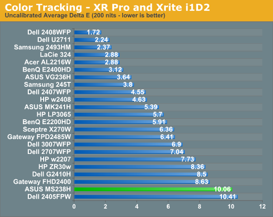
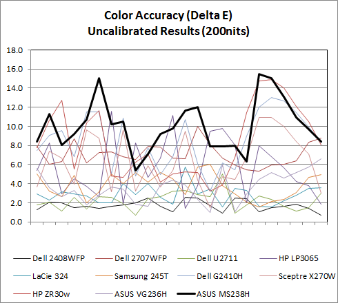
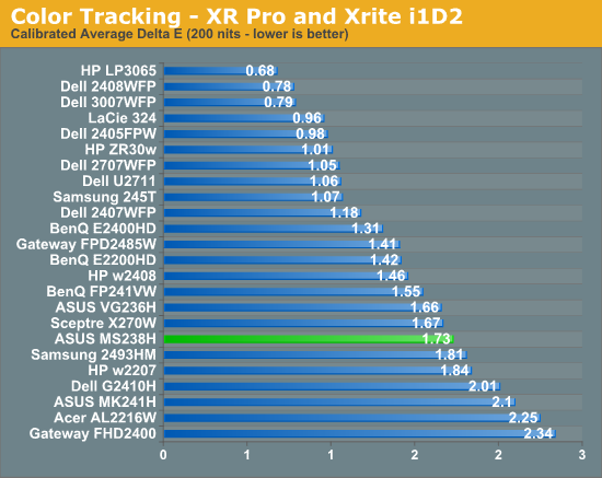
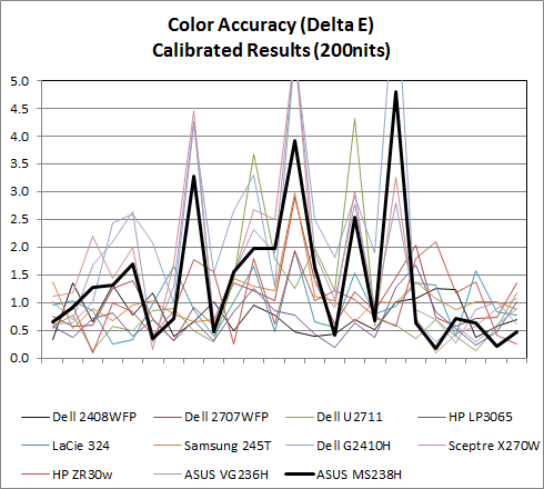
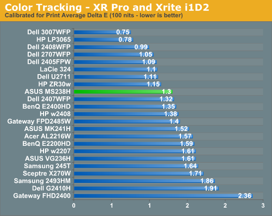
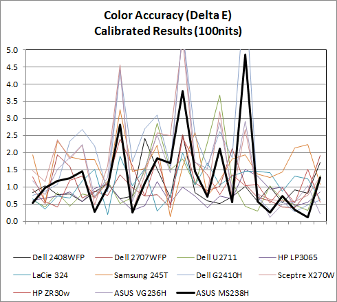
Uncalibrated and set to 200 nits, the MS238H is among the worst we've seen. Out of the box, the display is noticeably blueish. Initial measurements put white point around 7300K. After tweaking the RGB controls to nail D65, 200 nits, and a few calibration tweaks later, the MS238H actually performs pretty decent, with a Delta-E of 1.73. It's nothing stellar, but not bad considering our comparison is chock-full of IPS panels. Performance improves a bit at 100 nits, moving the MS238H almost up into IPS territory.
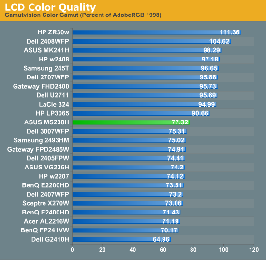
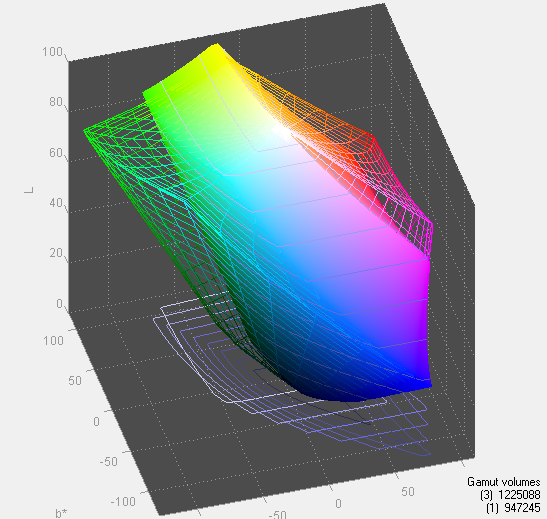
When it comes to gamut, the MS238H actually leads our stairstep-pattern of display results. Gamut could be better if the MS238H had RGB LED backlighting instead of WLED, but again this is a budget monitor with slim profile and power-sipping priorities.




38 Comments
View All Comments
CharonPDX - Friday, December 24, 2010 - link
Is this what you are looking for?http://www.amazon.com/Male-3-5mm-Stereo-Female-Y-C...
Brian Klug - Saturday, December 25, 2010 - link
Wow, this is actually exactly what I've always wanted. I've got a million RCA->female 3.5mm stereo jacks with female-female connectors on them for when I use my consoles with my FP241W displays. This is awesome! Our commenters rock! Thanks!-Brian
jmunjr - Friday, December 24, 2010 - link
16:9 is absolutely absurd for a computer monitor... I don't know where this trend came from but my guess is the LCD makers realized they could make more profits this way and did some nifty marketing to dupe the morons in the world into thinking it was actually a better format for computing...In protest I have modified a dozen or so of my popular websites by reducing their widths to require even more vertical space.
bhopfner - Friday, December 24, 2010 - link
It's totally true! A widescreen monitor is 20% smaller than the same monitor at 4:3. So of course the LCD industry went with that format. They must save millions. Sure a movie looks great and some games take advantage of the format but for general computing it doesn't help. I want my 20% extra screen real estate!sprockkets - Friday, December 24, 2010 - link
This is dumb. My web browser fits just fine here, and compared to my old 1280x1024 monitor resolution on a 17" monitor, it isn't losing any pixels.This is just another stupid made up issue.
How about I can't use my cable box with a 1920x1200 box without some distortion happening without correction? Ever thought about why they went to 1920x1080? Really missed those 80 pixels on a 1280x800 vs. 1280x720 either?
dertechie - Friday, December 24, 2010 - link
If a 23" monitor barely gains vertically on a 17" monitor, that's not a good thing.You can't use your cable box with a 1920x1200. That's an indictment of the cable box or a monitor designer that neglected to include a 1:1 or preserve aspect ratio mode, not an indictment of the aspect ratio.
We have thought about why they went to 16:9. They can get 11% more panels from a sheet of mother glass (and that's not even counting being able to find more efficient ways to cut it, it may be more). HDTV popularized it, they sell better, and economy of scale compounds that. I actually like seeing 1080p on screens below 24", it's a step forward there.
For media, 1080p is great. Where I don't like 1080p is when I see it in the areas I used to see 1920x1200. 24"-28" monitors used to be mainly 1920x1200. Now, they're mainly 1080p and you have to actually look to find a 16:10 one. It feels like we've regressed instead of going forward. For those of us doing vertically oriented work (like programming), those 120 pixels actually do matter. Nice monitors let you turn the screen, but cheap monitors (and especially cheap TN monitors) don't allow that.
Fritzr - Monday, December 27, 2010 - link
Your cable box should work just fine with a 1920x1200 display. You should see a black band above and below the TV picture though. What you cannot do on a 1920x1080 display is use 1920x1200 wallpaper (a standard size) without distorting it with the 'stretch to fit' display setting.Those blsck bands are NOT a failure of your cable box. It is called letterboxing. The black bands represent the unused portion of the display. If you watch SD broadcasts without reformatting, you will see the same banding on the sides as the picture is not wide enough to fill the screen.
Many HD TVs have an automatic adjustment that stretches the picture to fit the screen. This results in distorted video when viewing 16:9 content on a 4:3 screen and vice versa.
Personally I will accept the penalty imposed by a 16:10 aspect ratio where I am forced to see more of the web page than an HDTV can display.
I would like to get one of the higher resolution screens also. You should avoid those like the plague though...A 3840x2400 cinema class monitor would display your TV screen as a tiny box in the center of the display ... at least until you enable 'stretch to fit display' anywho.
Really scary though is the next generation UltraHiDef TV standard that has been demonstrated in Japan 7680x4320 (16:9) and tbe WHUXGA monitor standard at 7680x4800 (16:10) Those would be nice for big screen displays :)
MobiusStrip - Saturday, January 1, 2011 - link
You won't see this in the U.S. Our asinine "advanced" TV "standard" still allows interlacing and a non-integer frame rate, caps the bitrate at 19 megabits per second, and did not require sets to have updatable firmware. Nor does it define what "HD" means. How many ways can you fail?Then again, we're talking about the successor to the governing body that came up with 29.97 FPS in the first place.
mike8675309 - Thursday, December 30, 2010 - link
People just don't get it, and it is a flaw due to the shift in technology from analog monitors to digital monitors. Their expectations are just so much lower because the common use case simply doesn't demand the vertical resolution.Back in the day where dot pitch and image masks everyone understood what was better, and what was worse. These days they see 24" vs 17" and assume it's better, when in fact it can often be worse and at best, only minimally better.
Sure, movies work at these low vertical resolutions. So do web pages, for the most part. But for software developers and many other technology professionals these low vertical resolutions completely bite and are a tremendous step backward from the reasonably priced performance levels achievable with CRT's in the early 90's.
Sepidoel - Friday, December 24, 2010 - link
Very unfortunate, in my country it's sold way pricier than Amazon (about 340 USD). In regards of 23" LCD, perhaps you may compare it with AOC iF23 - an IPS LED LCD with very affordable price (about 270 USD in my place). I bought one for my sister and I say this is great monitor for the price. I'd like to write an article for Anandtech, but I just simply don't know how to bring up the benchmark numbers.Amazon URL for the 22" one: http://www.amazon.com/22IN-LCD-1920X1080-30000-Pia...